
Shawarma Classic
Rebranding, Packaging, Signage, Space Branding, Social Media
Industry: F&B, Hospitality
Date: 2022
Photography unknown
Interior Designer: Diane Tabet
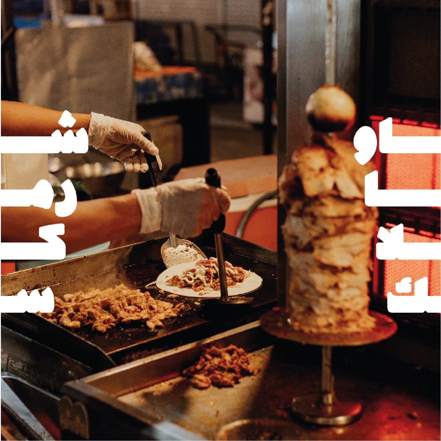
Credits: Shop images from @clicks.by.rayyan & @alqairawan_live
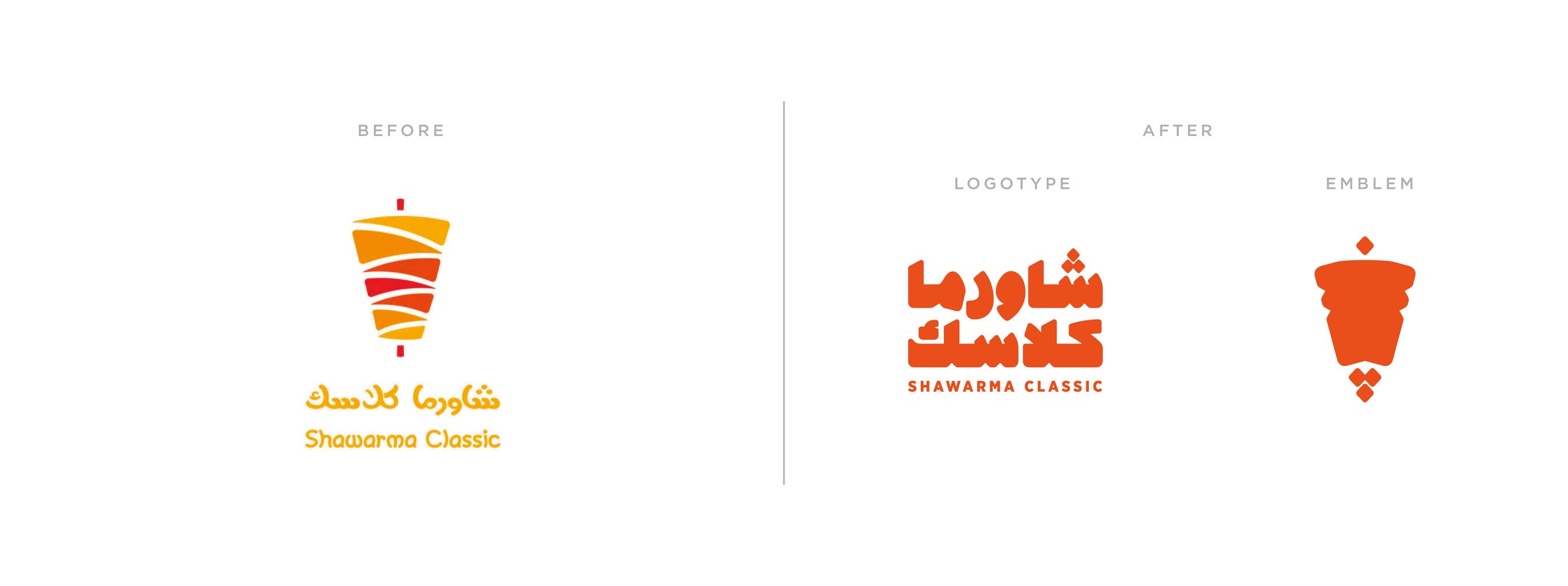
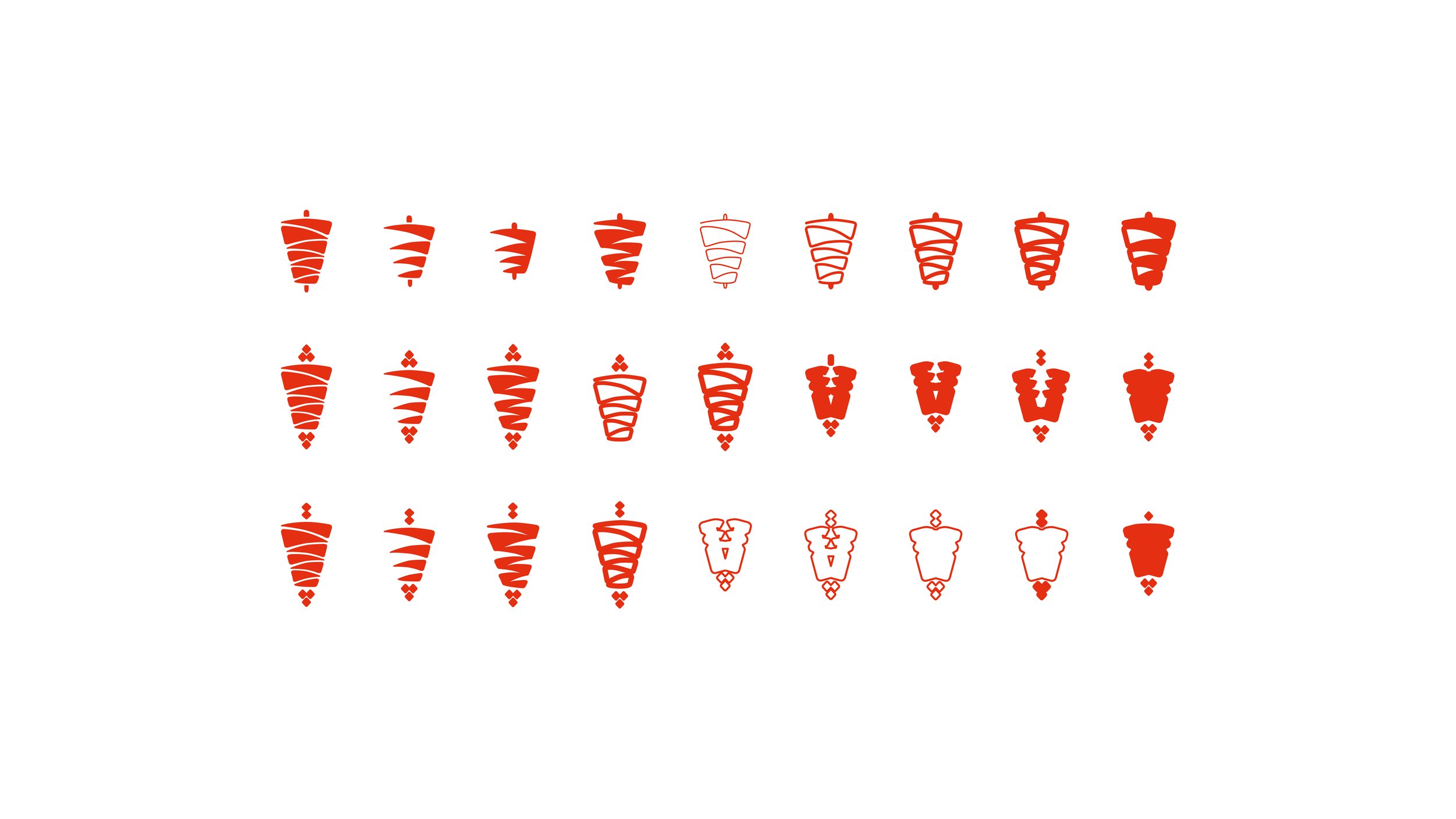
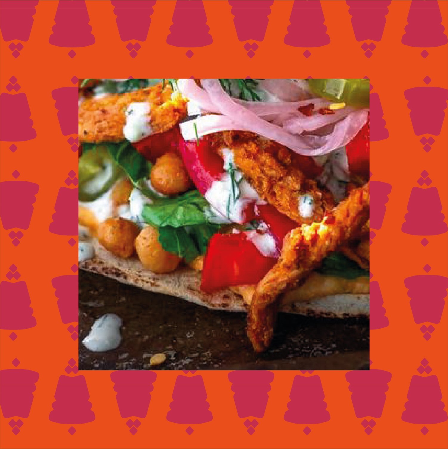
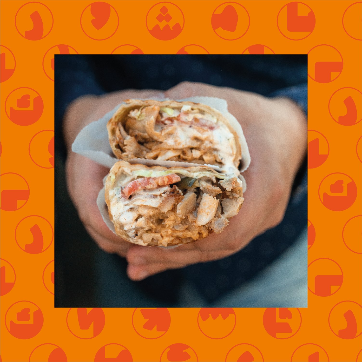
Shawarma Classic is a Saudi-based traditional shawarma shop. The project began as a brand up-lift where some elements of the original logo, such as the Shawarma emblem, were asked to remain part of the new identity. We decided to focus, thus, on typography and to update the logotype for a more modern and fresher feel.
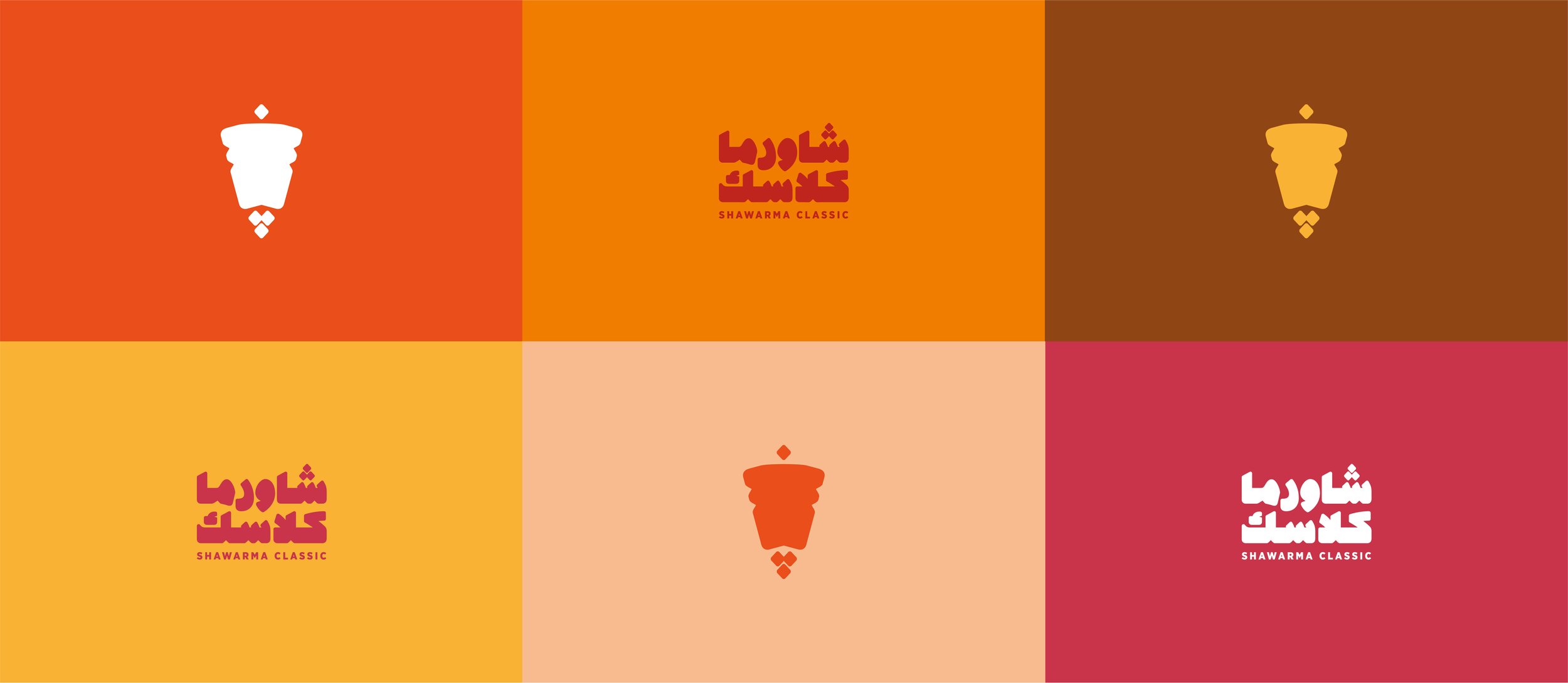
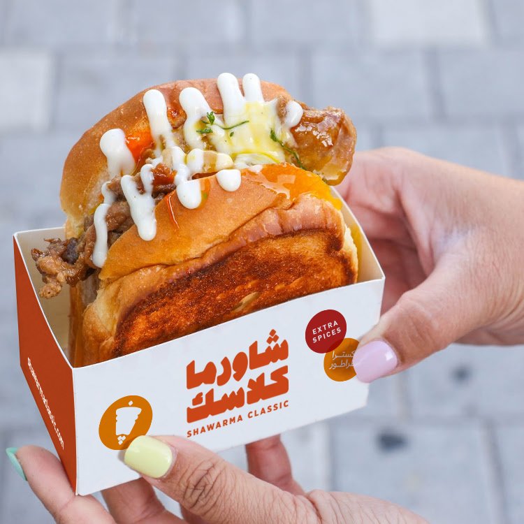
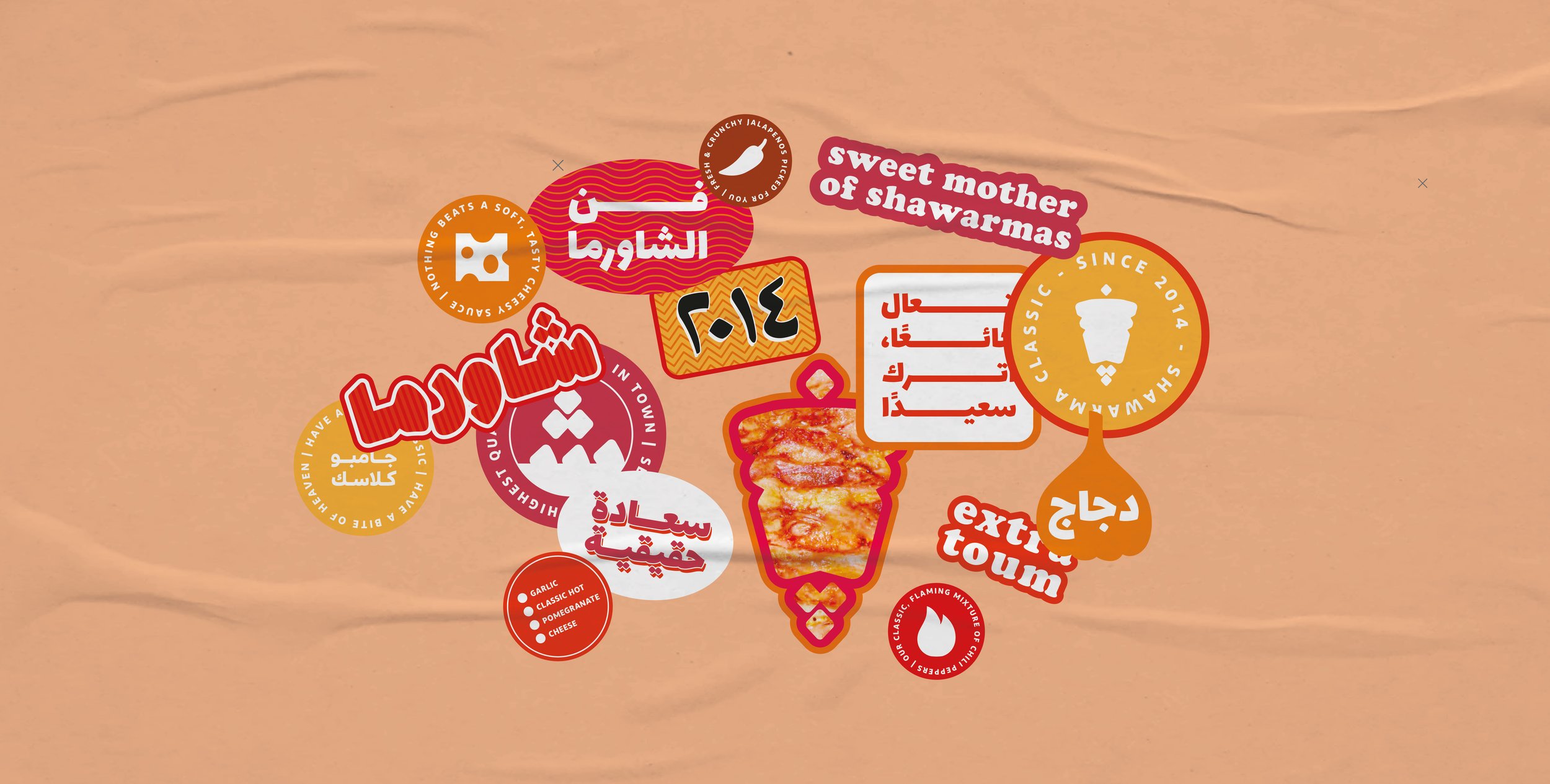
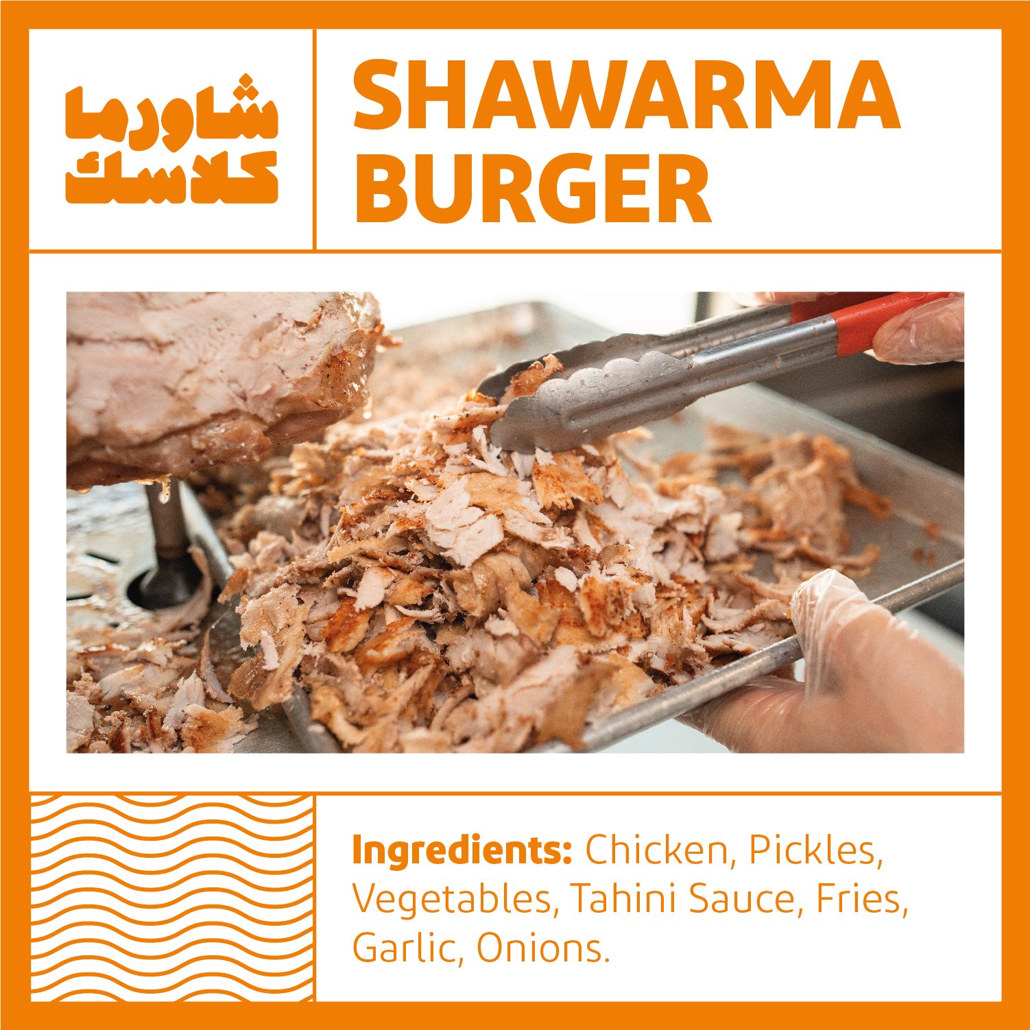
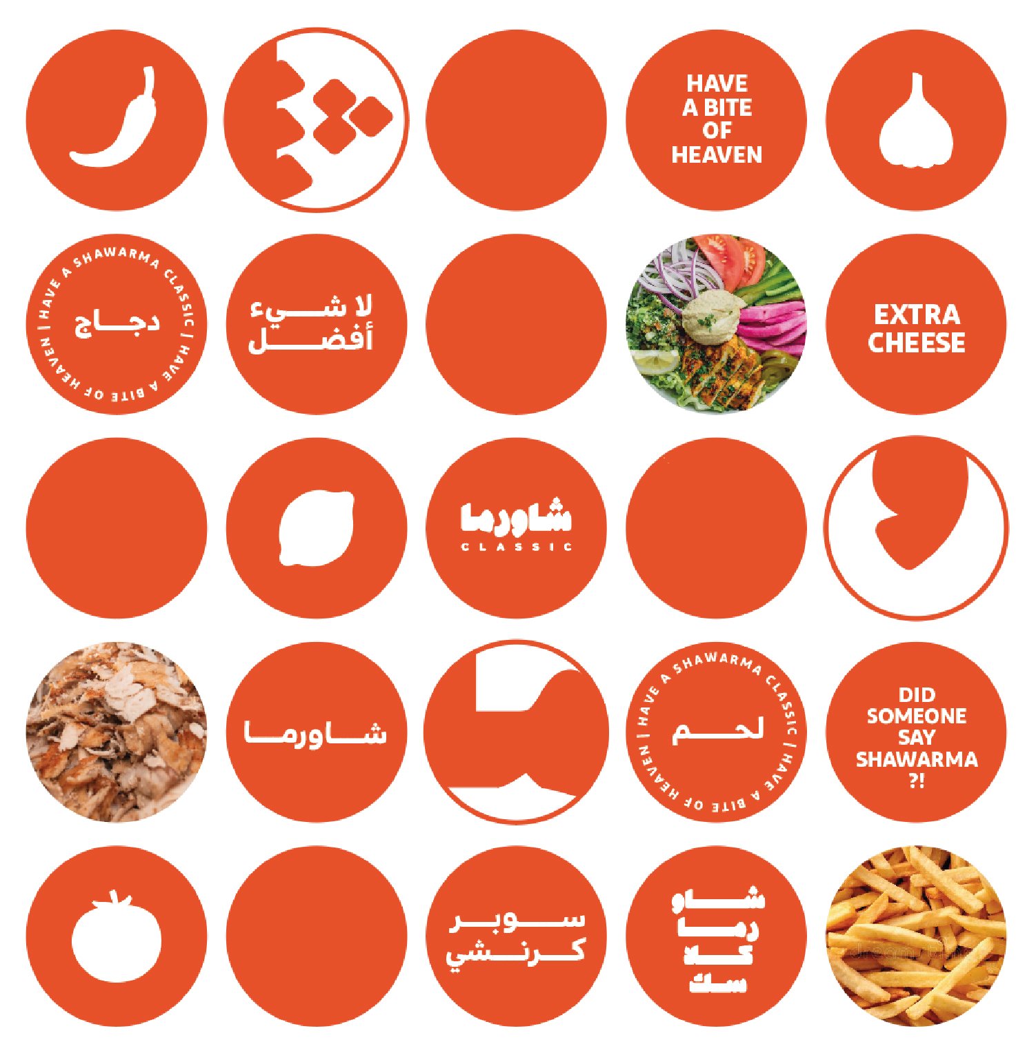
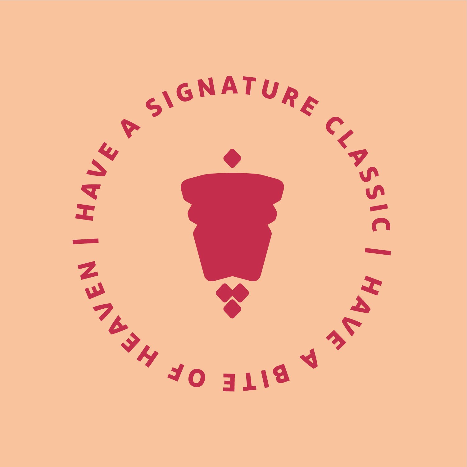
The bilingual logo gave precedence to the Arabic language to appeal to the Saudi-based audience. We decided to give the Arabic logo a thicker look reminiscent to the thickness of the shawarma sikh or the wrapped shawarma sandwich. We wanted the logo to be bold but not too sharp to create a friendlier and approachable look. The shawarma emblem became a secondary logo, inspired by the letter Sheen of the Arabic alphabet, we create an emblem that mimicked the shape of the shawarma while staying true to the typographic visual identity. The bulky logo and emblem then could act as stamps, signage, etc. We also created a one-line variation of the logo to complement the stacked version.
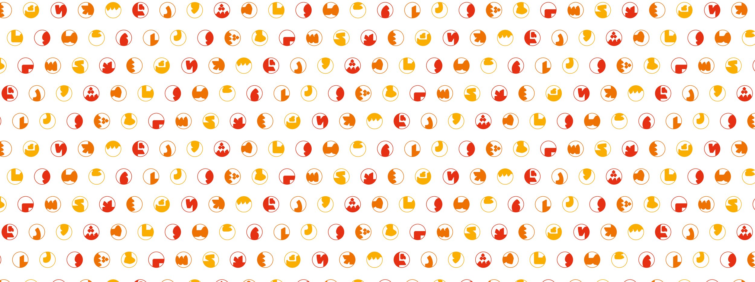
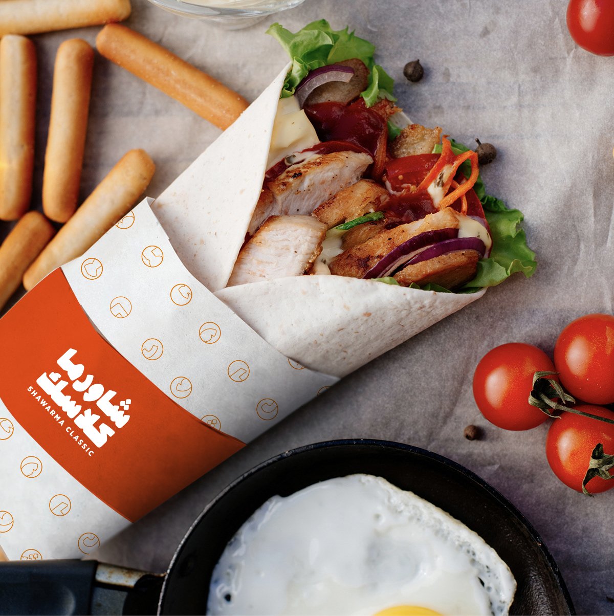
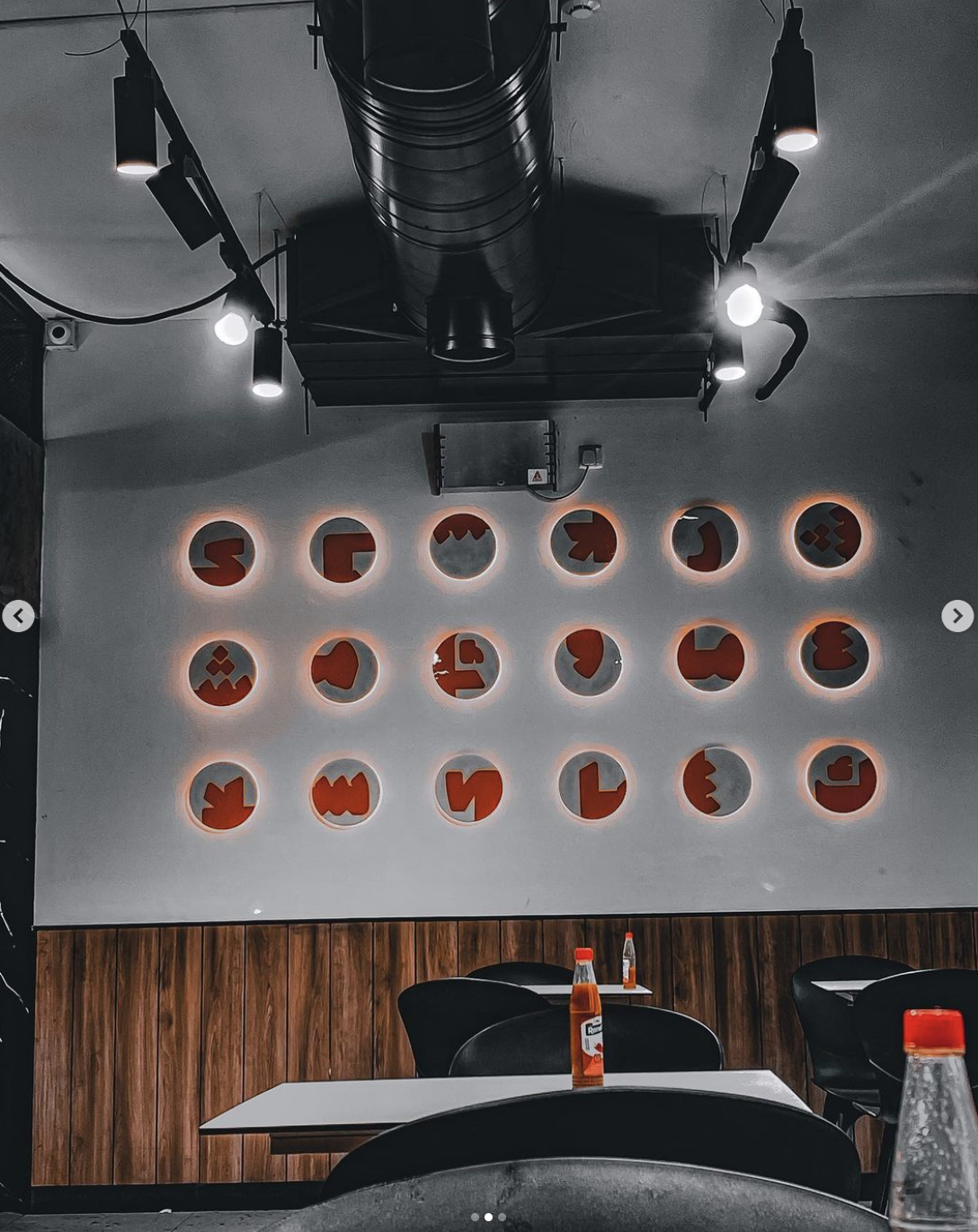
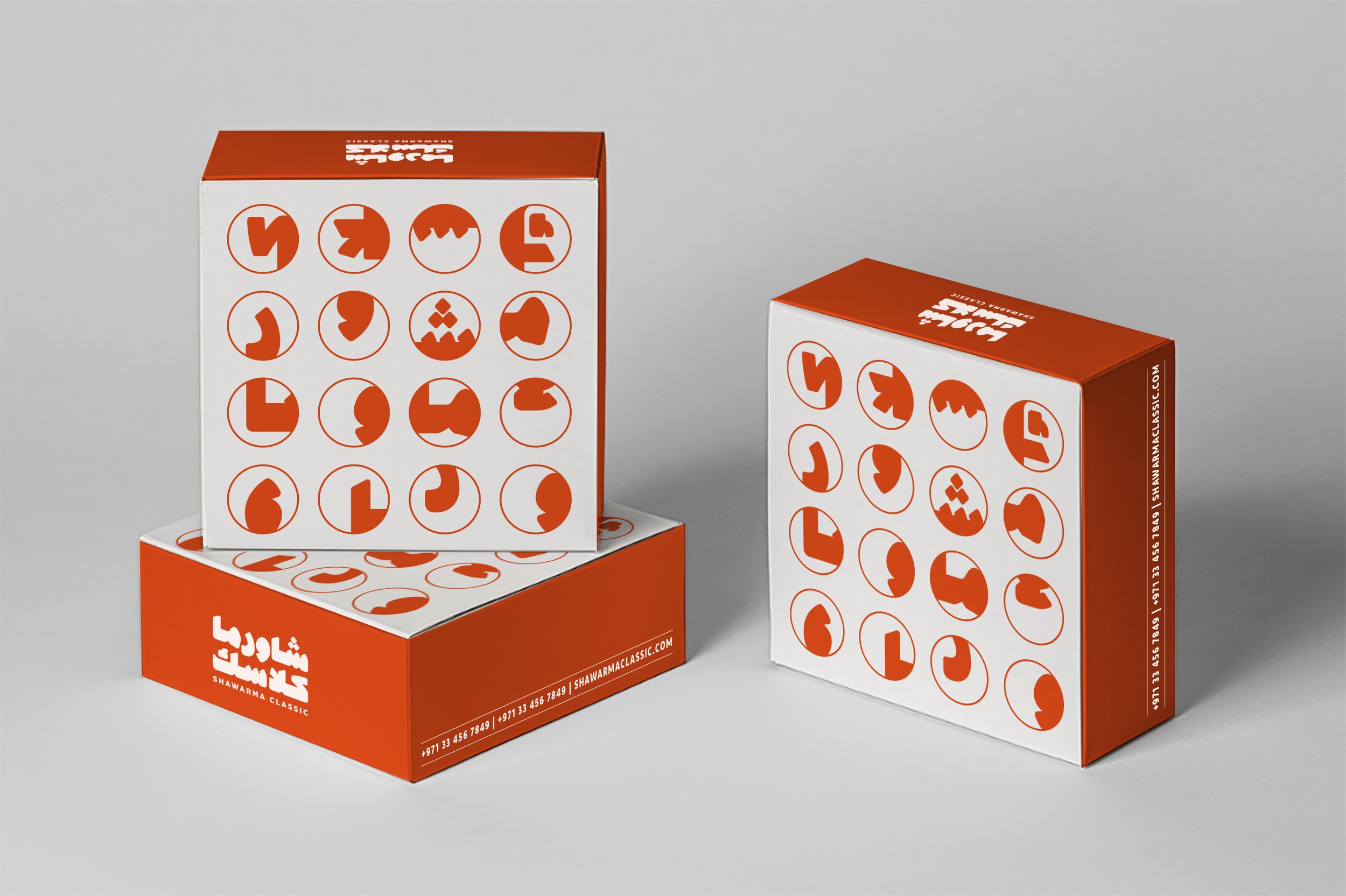
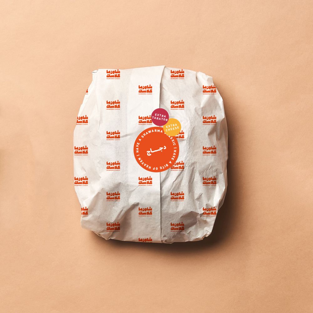
We then created a series of visual elements inspired by the circular top view of the shawarma sandwich. The circle became a grid for the cropped letters of the Arabic logotype, creating patterns to be used in the packaging and wrapping paper.
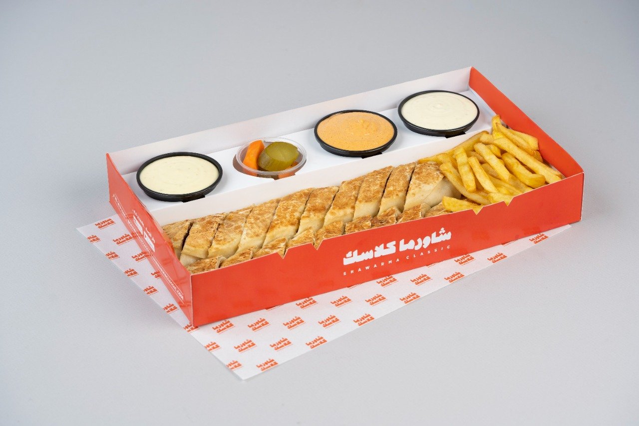
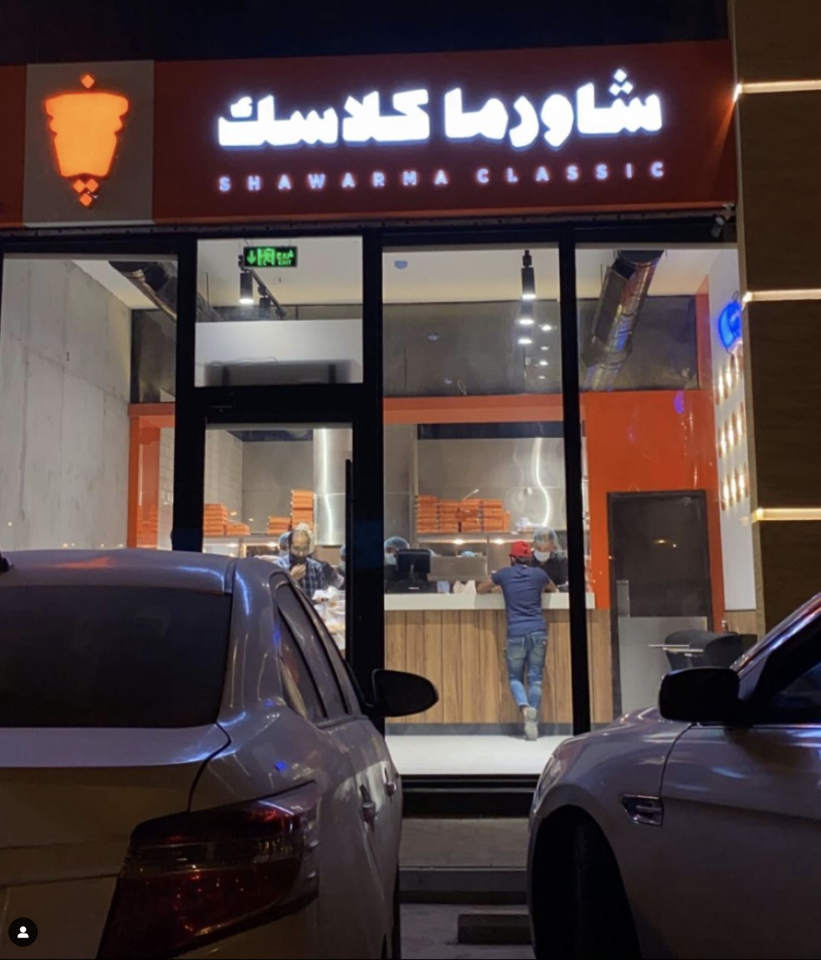
We adjusted the original color palette of the brand, keeping only the striking and bold colors like the vibrant orange. We then adapted the interior of the store to match the new visual identity by changing the color of the façade and placing the cropped grid of letters as interior decoration. We placed the one-line variation of the logo with the shawarma emblem as the store’s signage, making sure that both cannot be lit at the same time so that one doesn’t overpower the other.