Basma
Brand Identity, Packaging System, Packaging Space
Industry : Beauty & Medical
Date: 2019-2020
Credits: Sama Beydoun (Photographer)
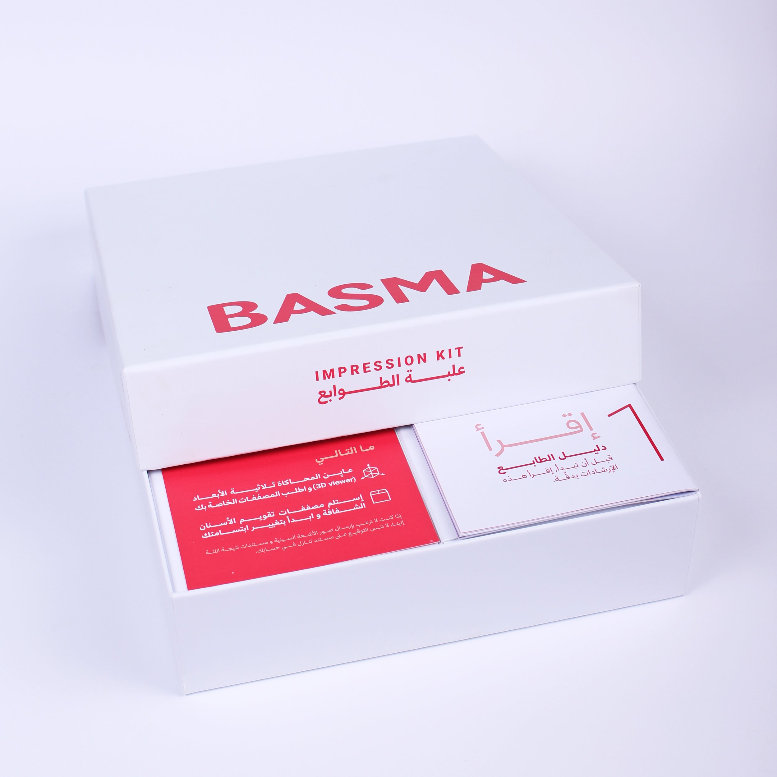
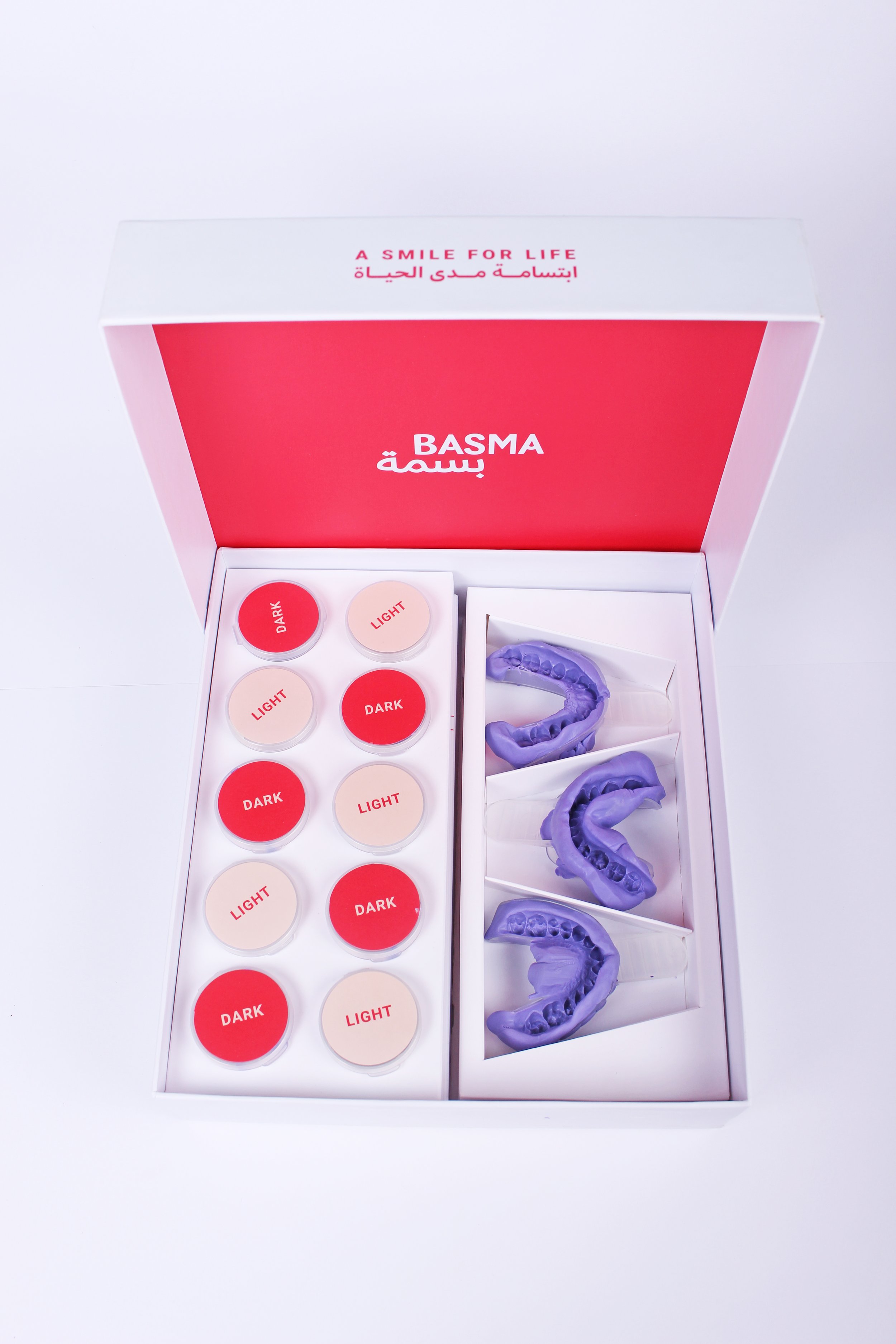
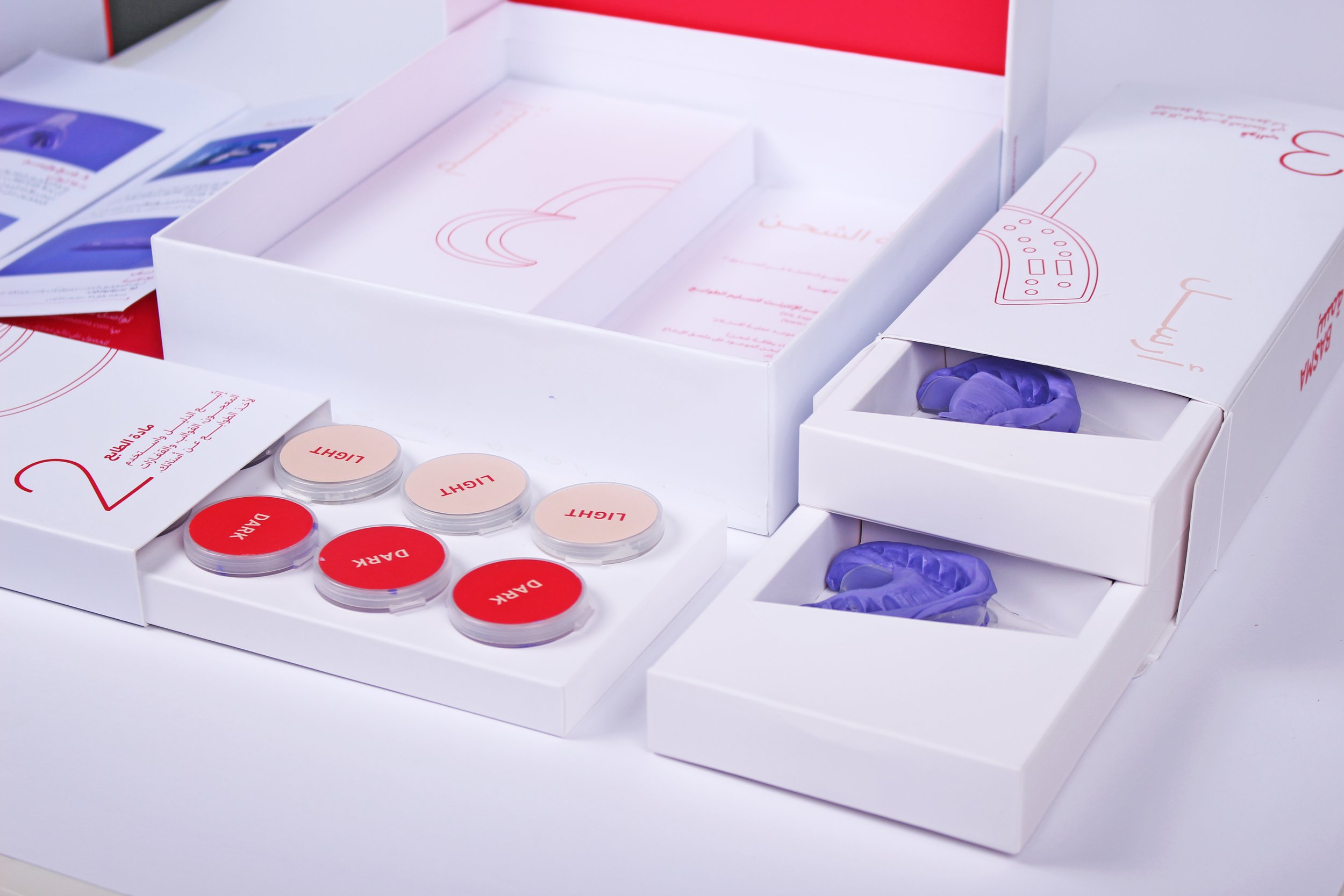
Basma is a revolution of dentistry, making a beautiful smile easier than ever, and accessible to all. The two-part treatment comes in the form of two do-it-yourself kits: the Impression Kit and the Aligner Kit. It is also remotely monitored by an orthodontist, offering a safe and easy experience.
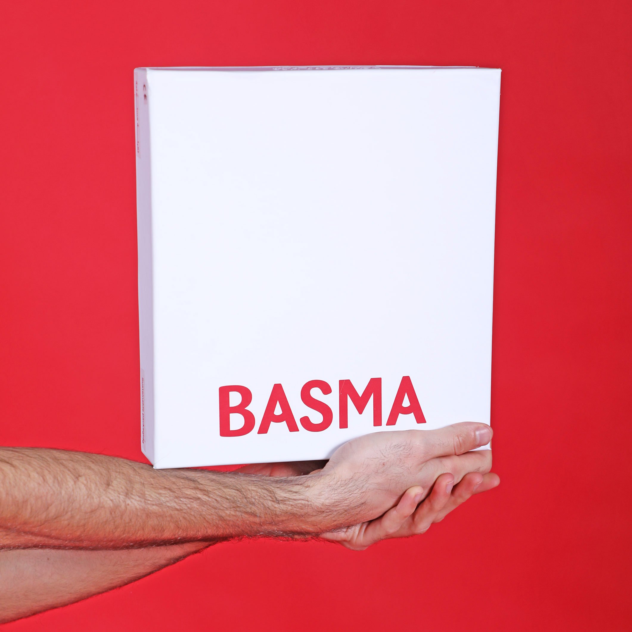
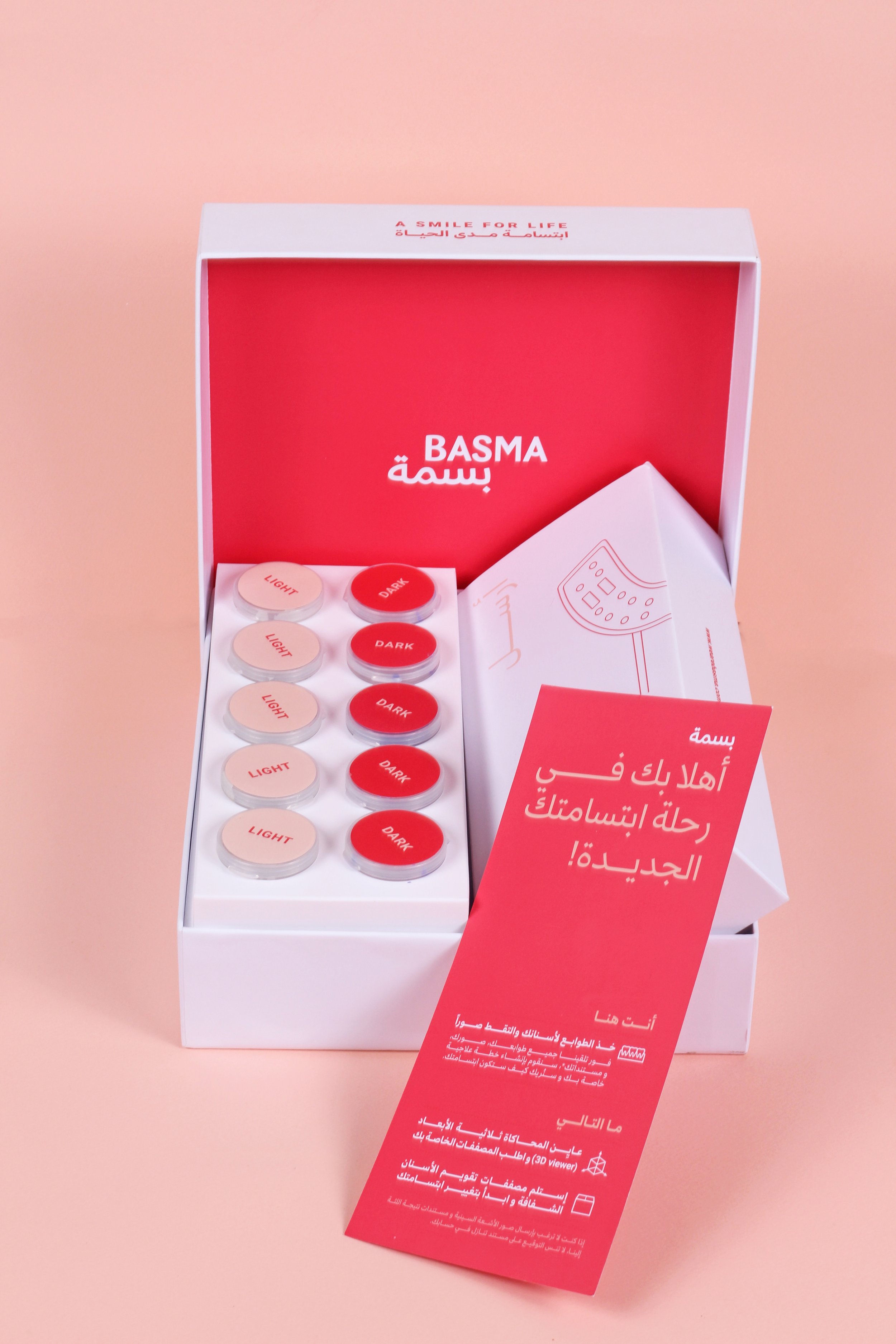
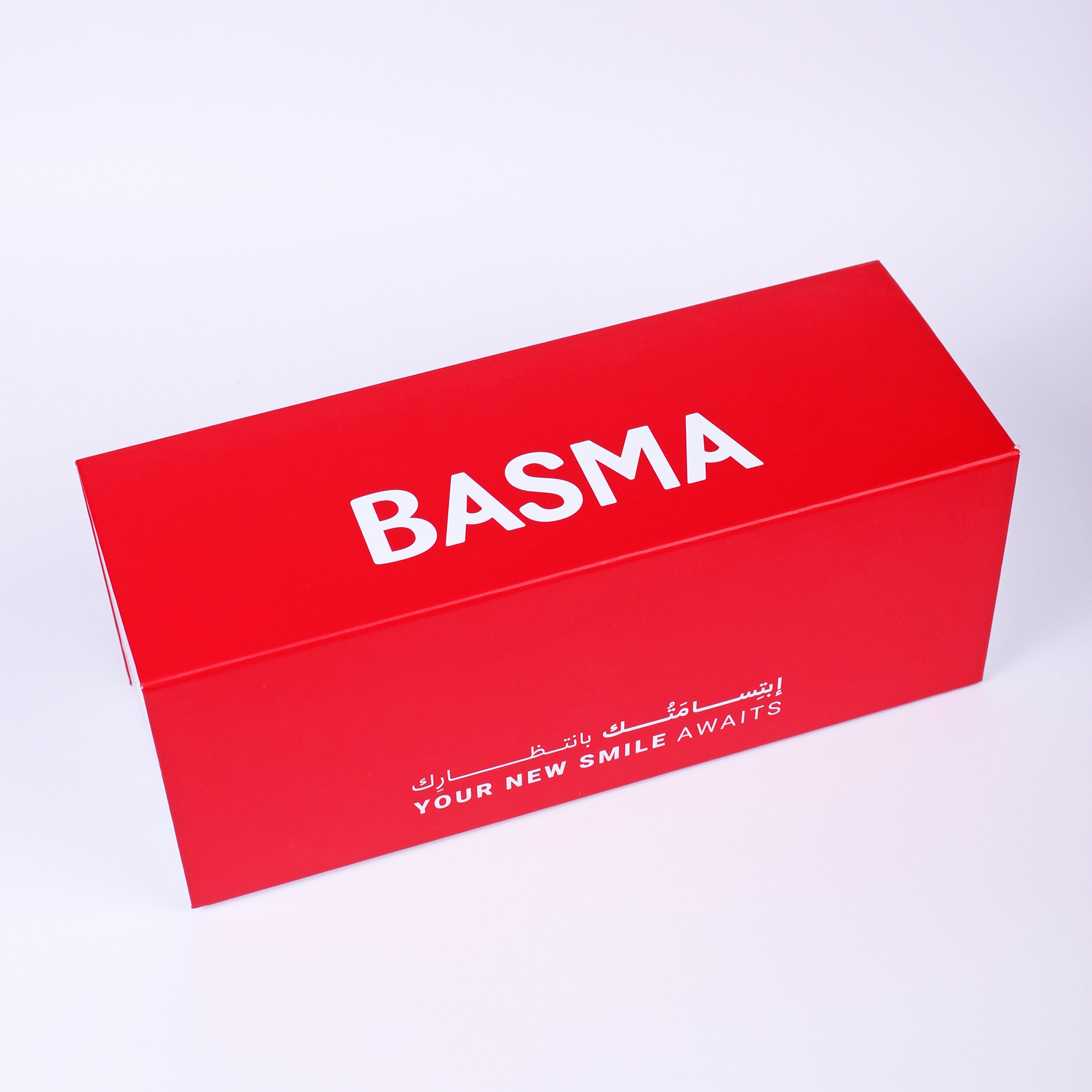
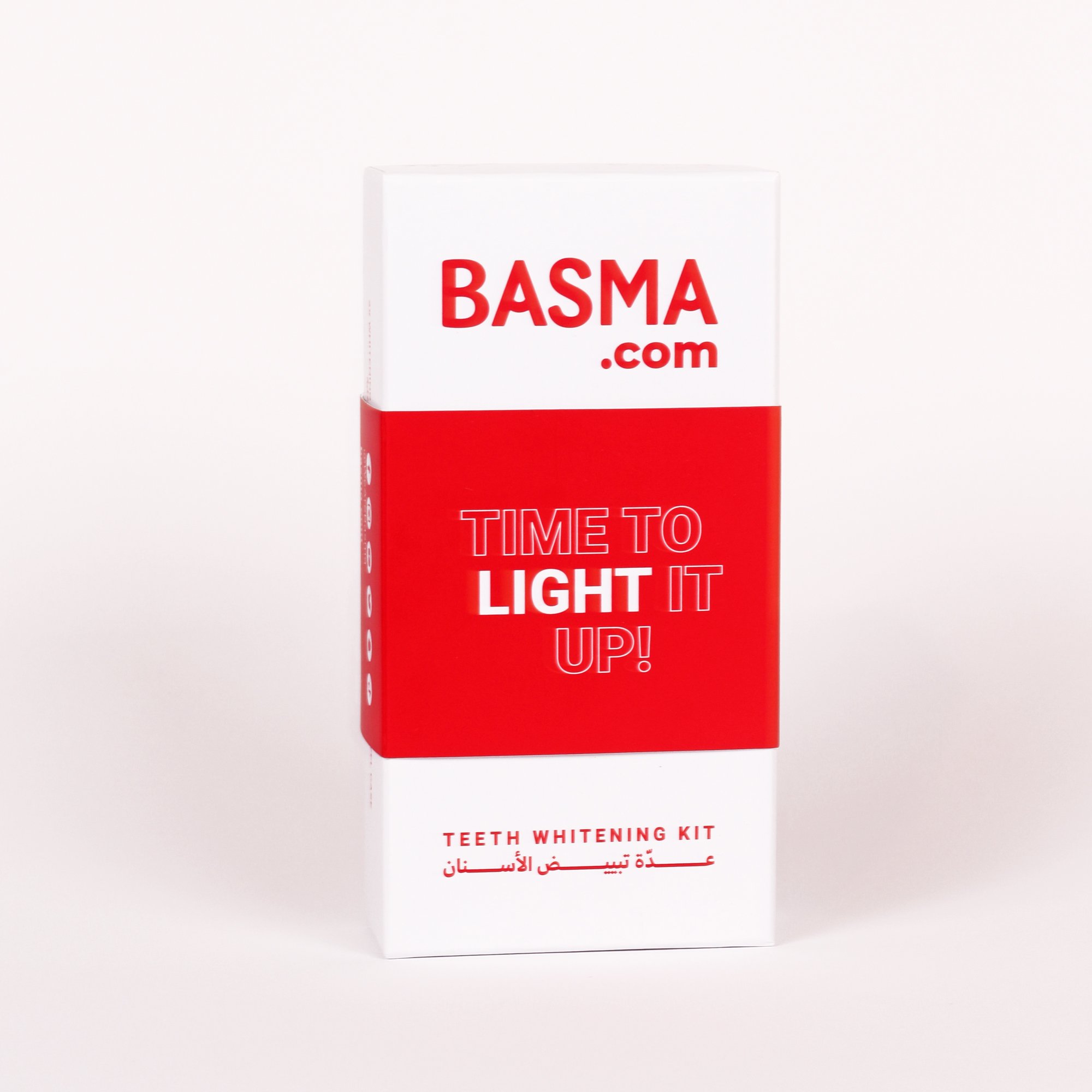
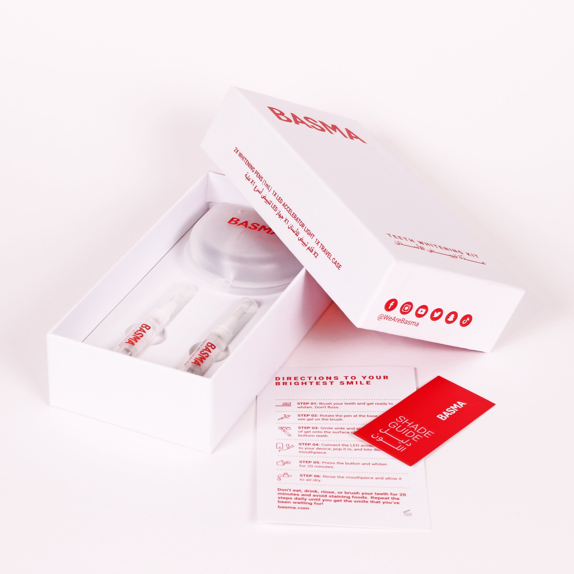
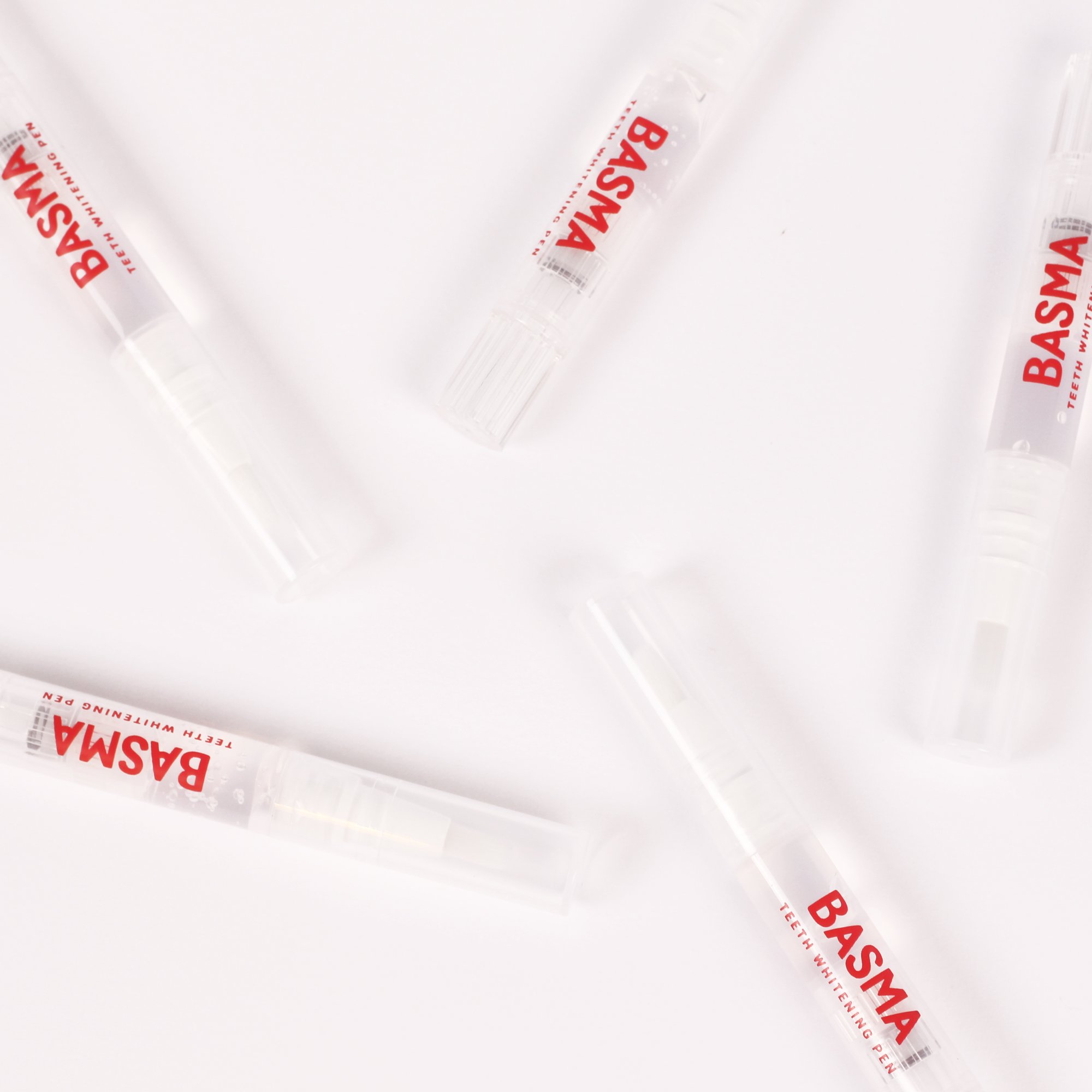
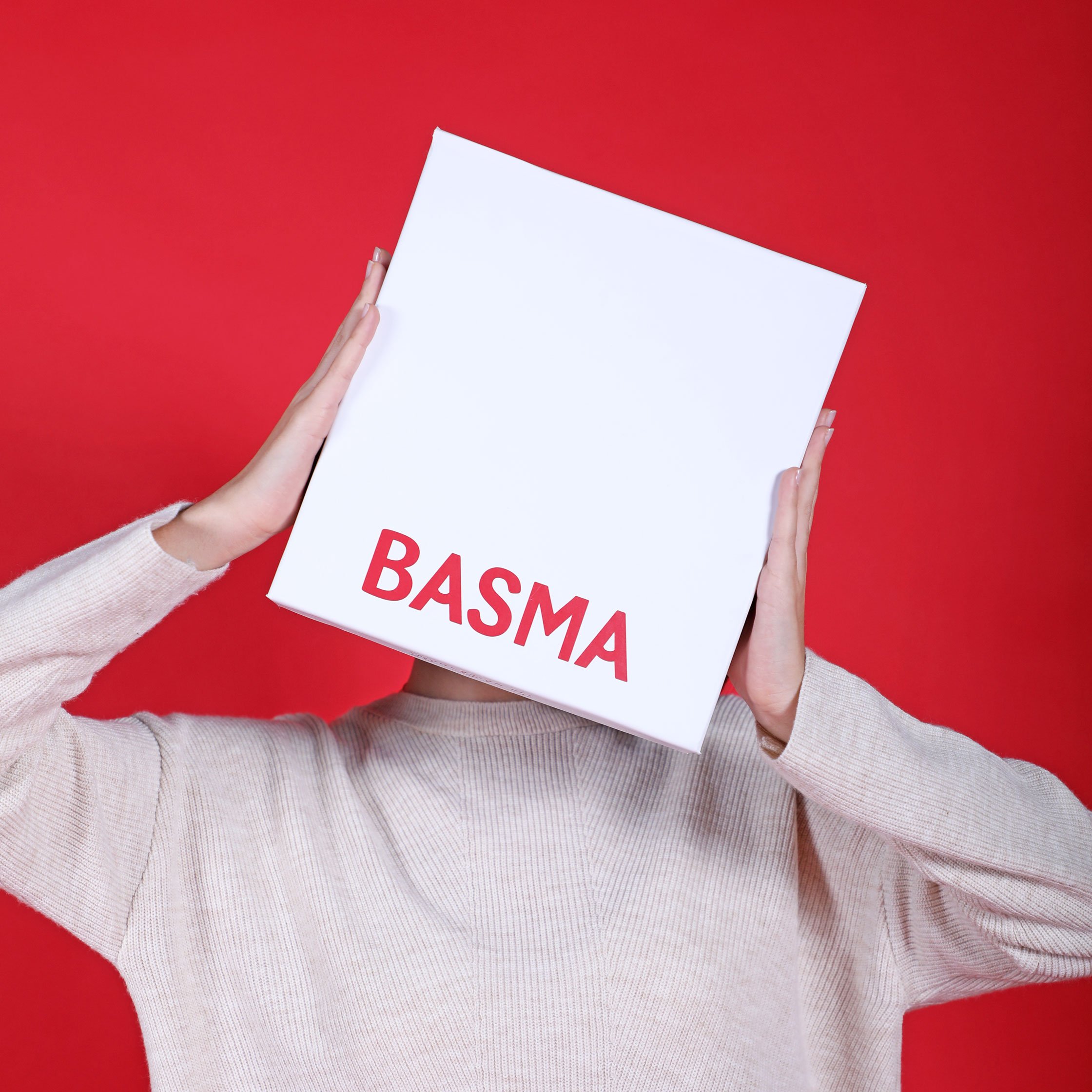
Basma is approachable and trustworthy, with a fun twist. The brand’s flexible identity starts with a bilingual logotype, set apart by a small twist on the crossbar of the A. Basma’s eye-catching bright red can be found across packaging lines, manuals and on its characteristic mono-line elegant illustrations.
The brand identity merges the medical and the accessible, the professional and the fun, the easy and the trustworthy.
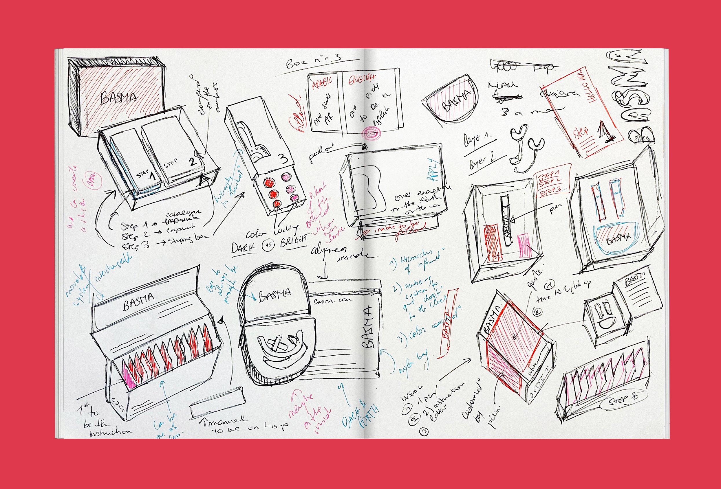
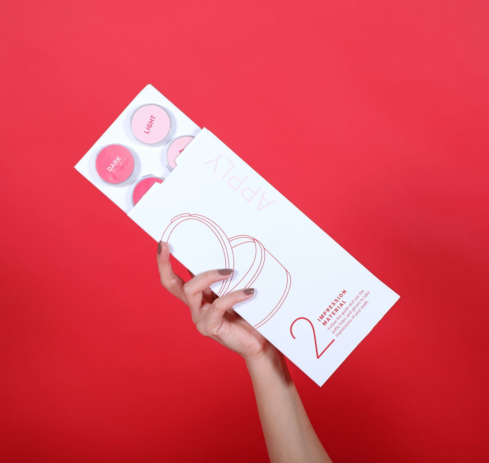
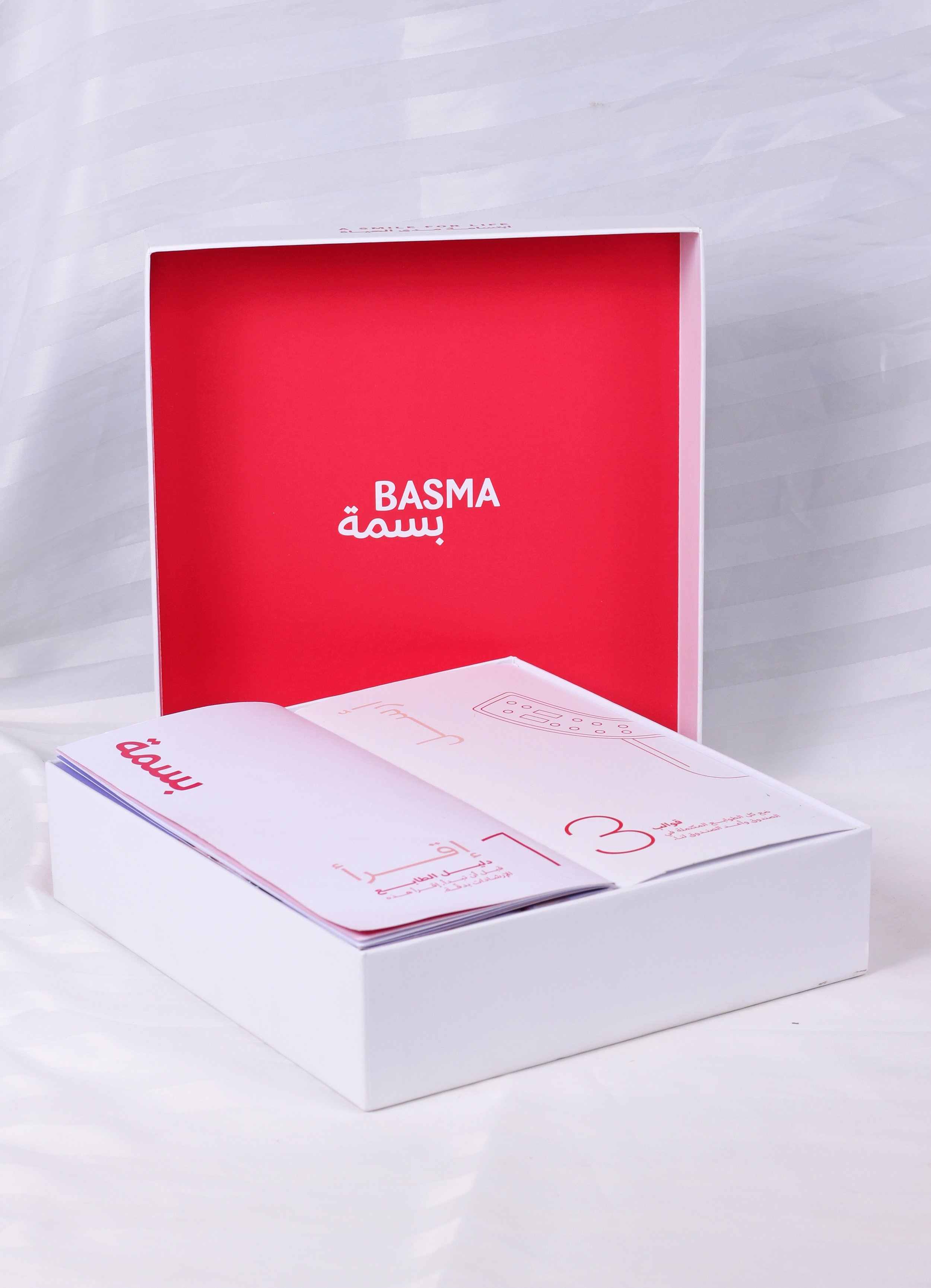
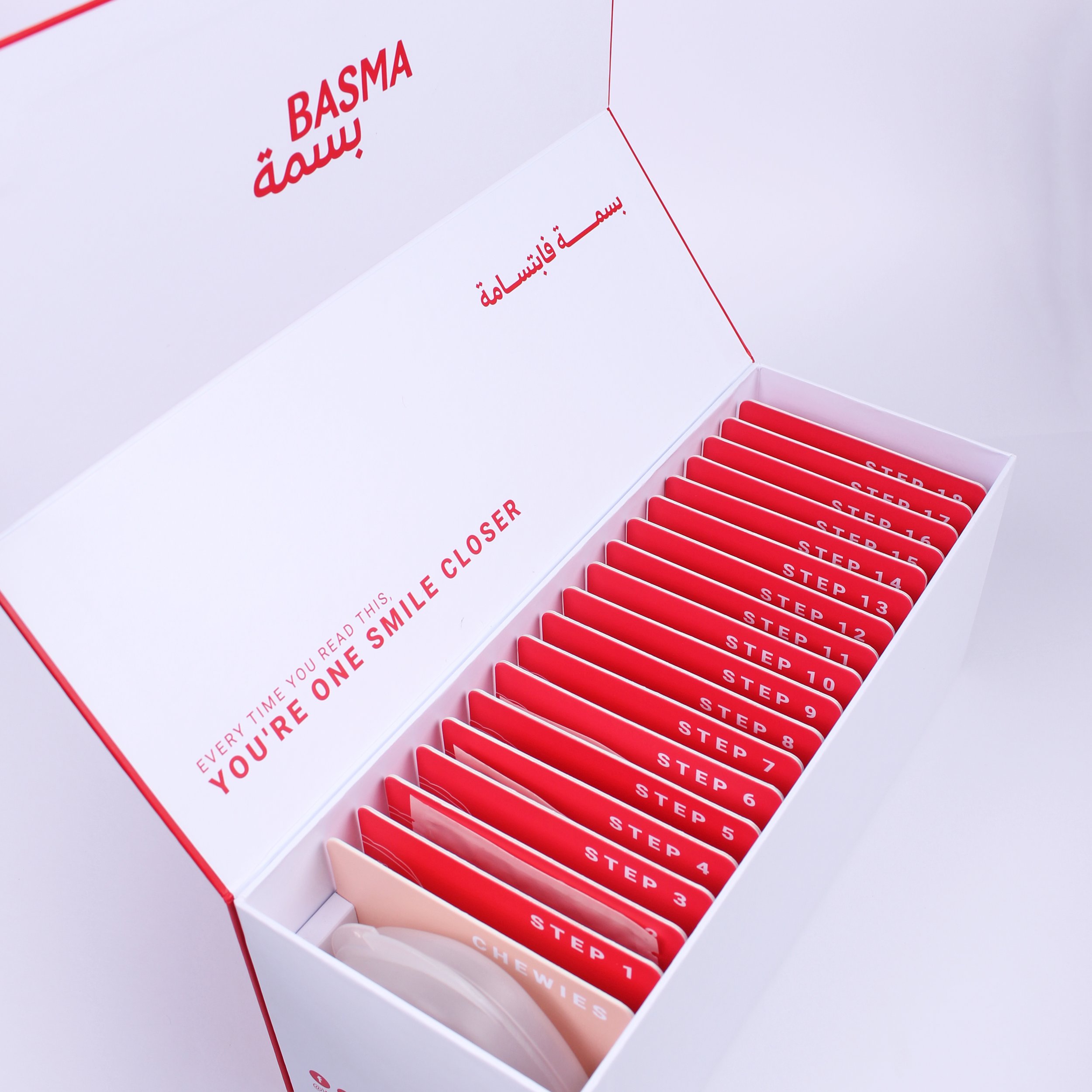
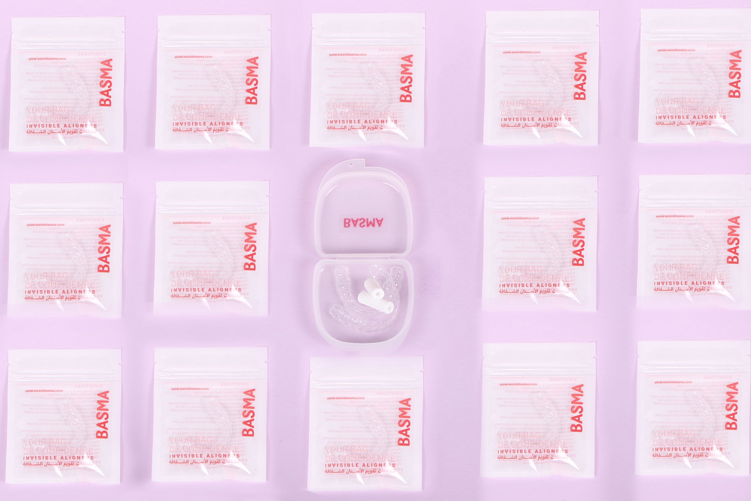
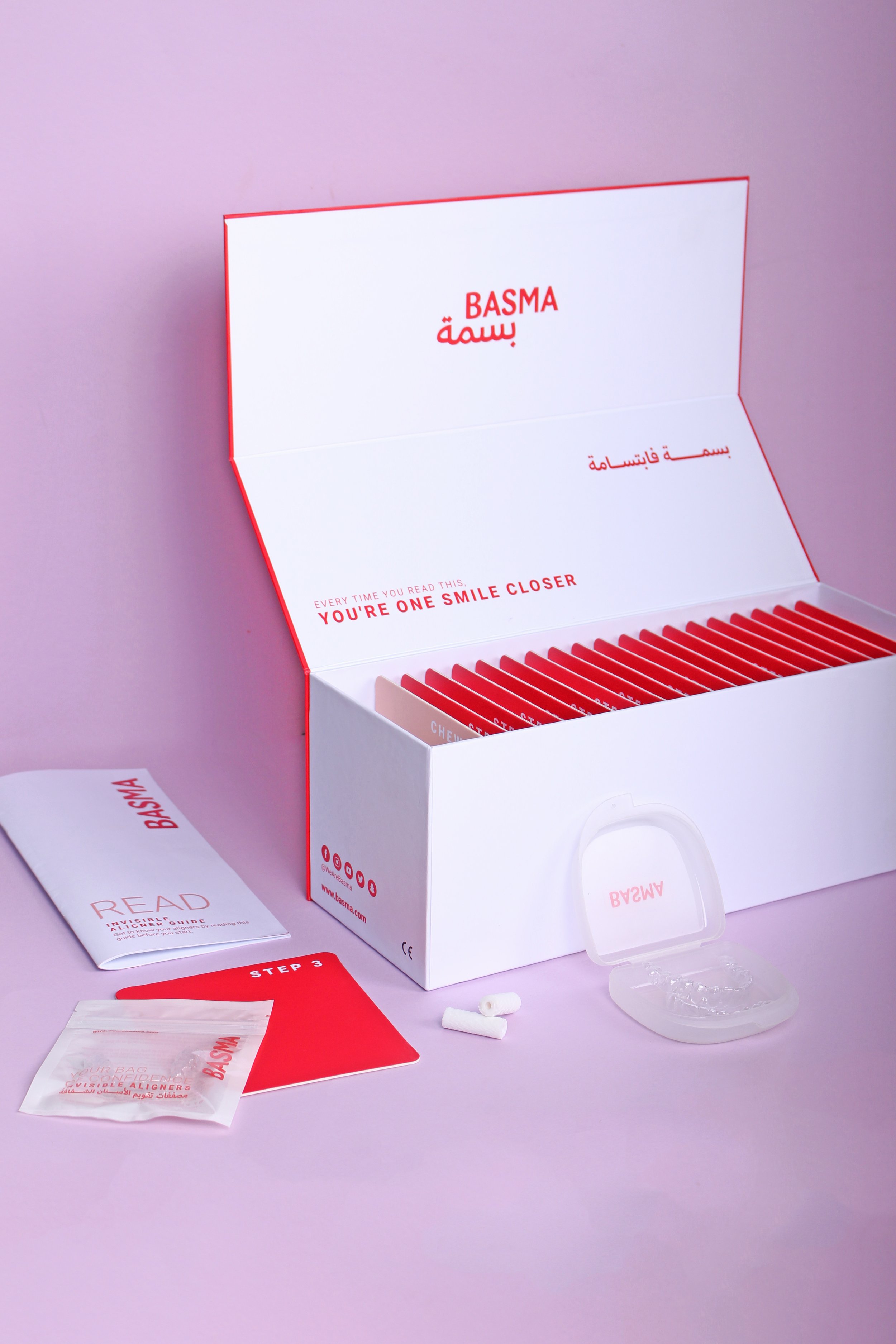
The key to Basma is an organized packaging system that takes the user step by step through the treatment, while keeping the brand’s distinctive approachable feel. The boxes, bags and manuals were designed with the customer’s needs in mind, as they discover each and every step in their order of use, while going through their Basma package. The boxes are designed to fit within one another in an orderly manner, ensuring a safe and smooth experience.
