Ca Plait
Branding, Packaging, Social Media Strategy, Photographic Style, Menu
Industry: Food & Beverage
Date: 2023
Ça Plaît's journey began in a loving mother's kitchen, where she found joy crafting desserts for her family.
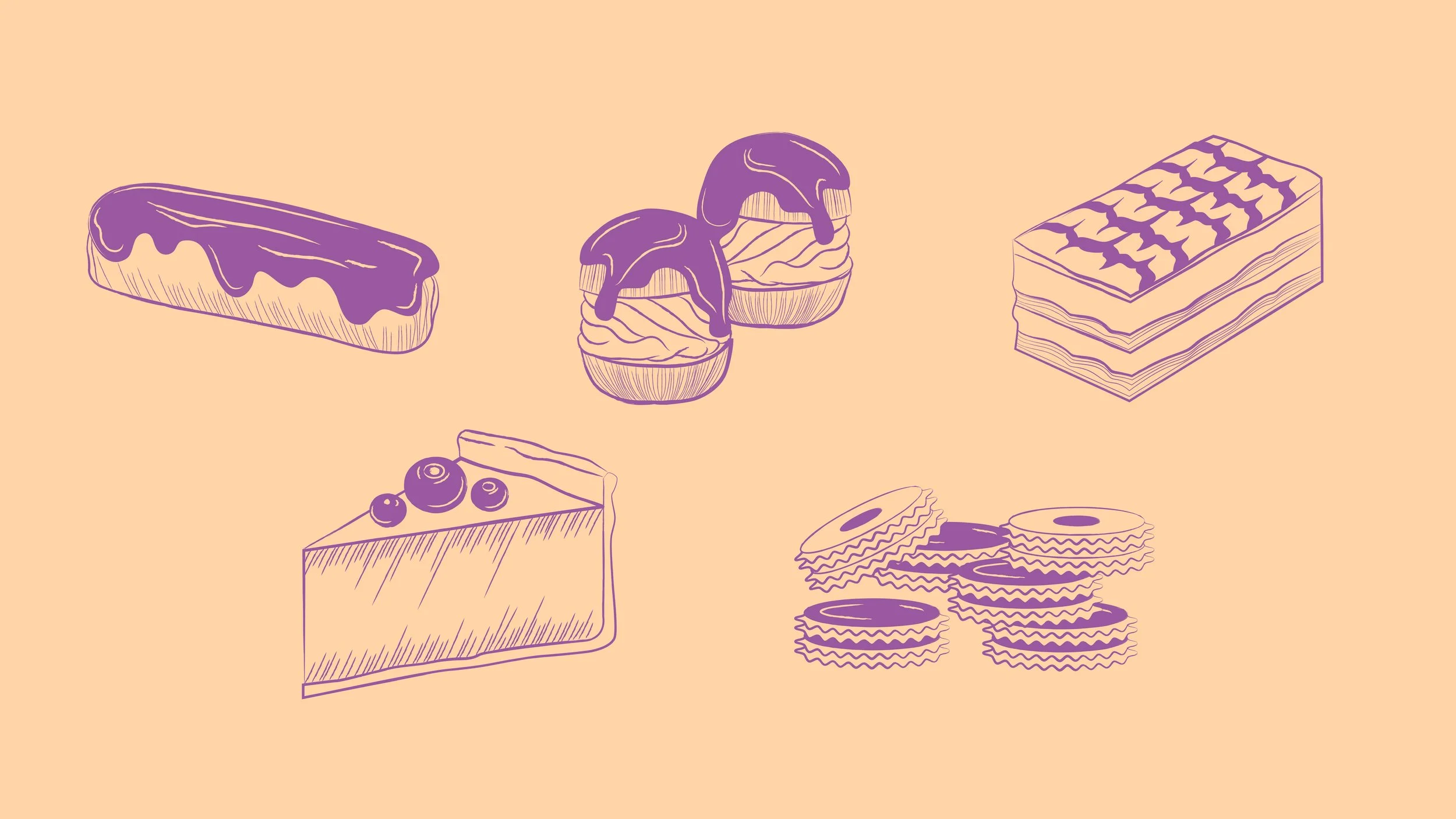
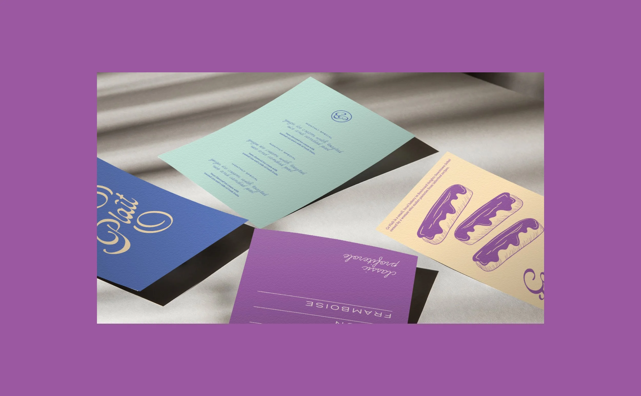
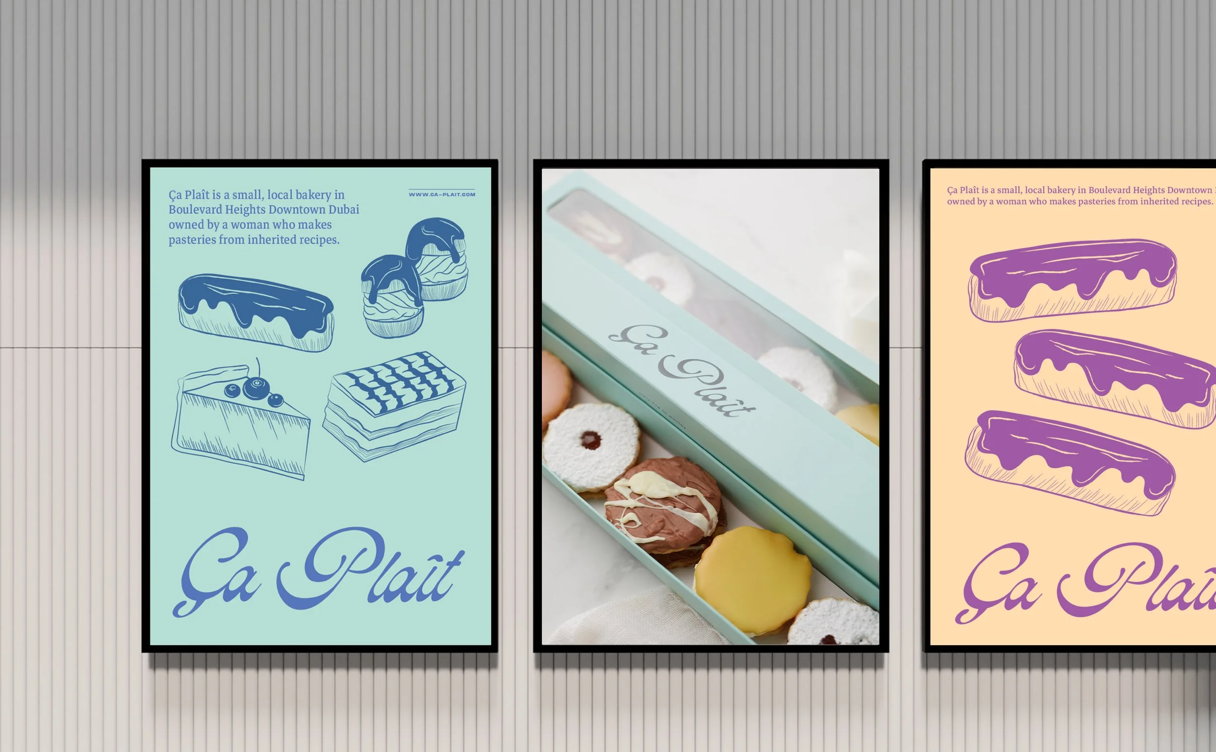
The team explored classic dessert shops and French patisseries known for their artisanal creations. We began the design process with the development of a logotype reminiscent of vintage dessert boxes. This distinctive mark was enhanced by hand-drawn detailed illustrations and an elegant blend of typefaces, forming the foundation of Ça Plaît's visual identity.
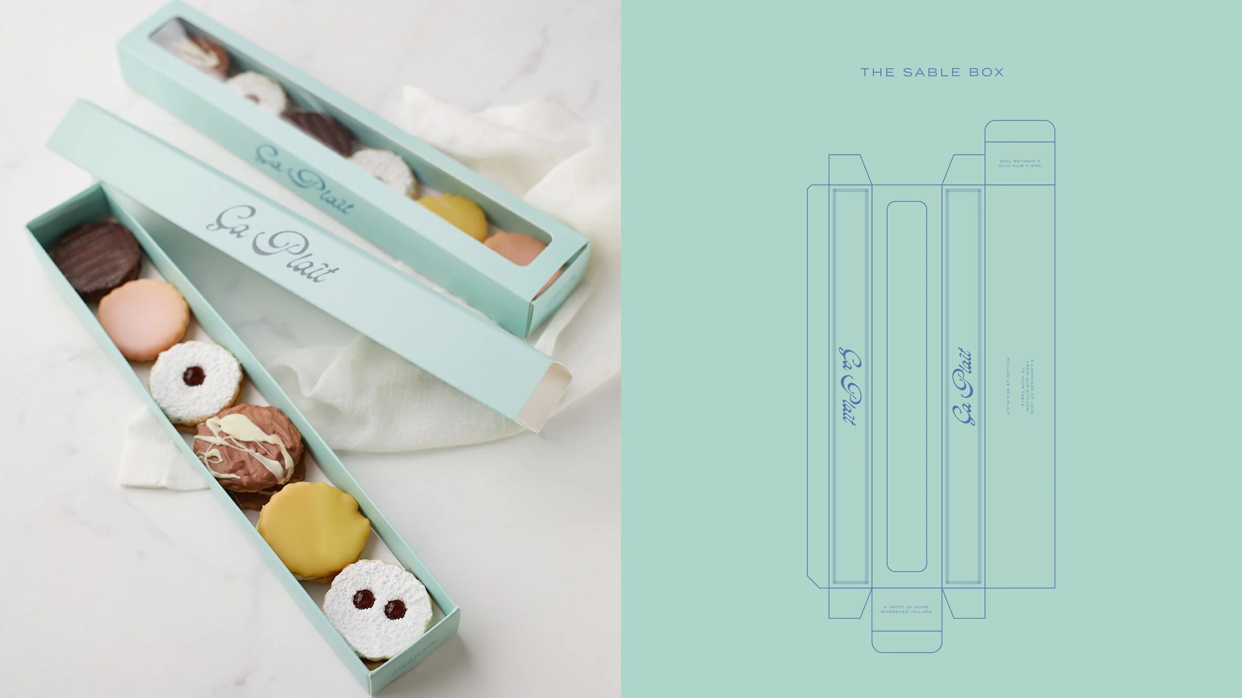
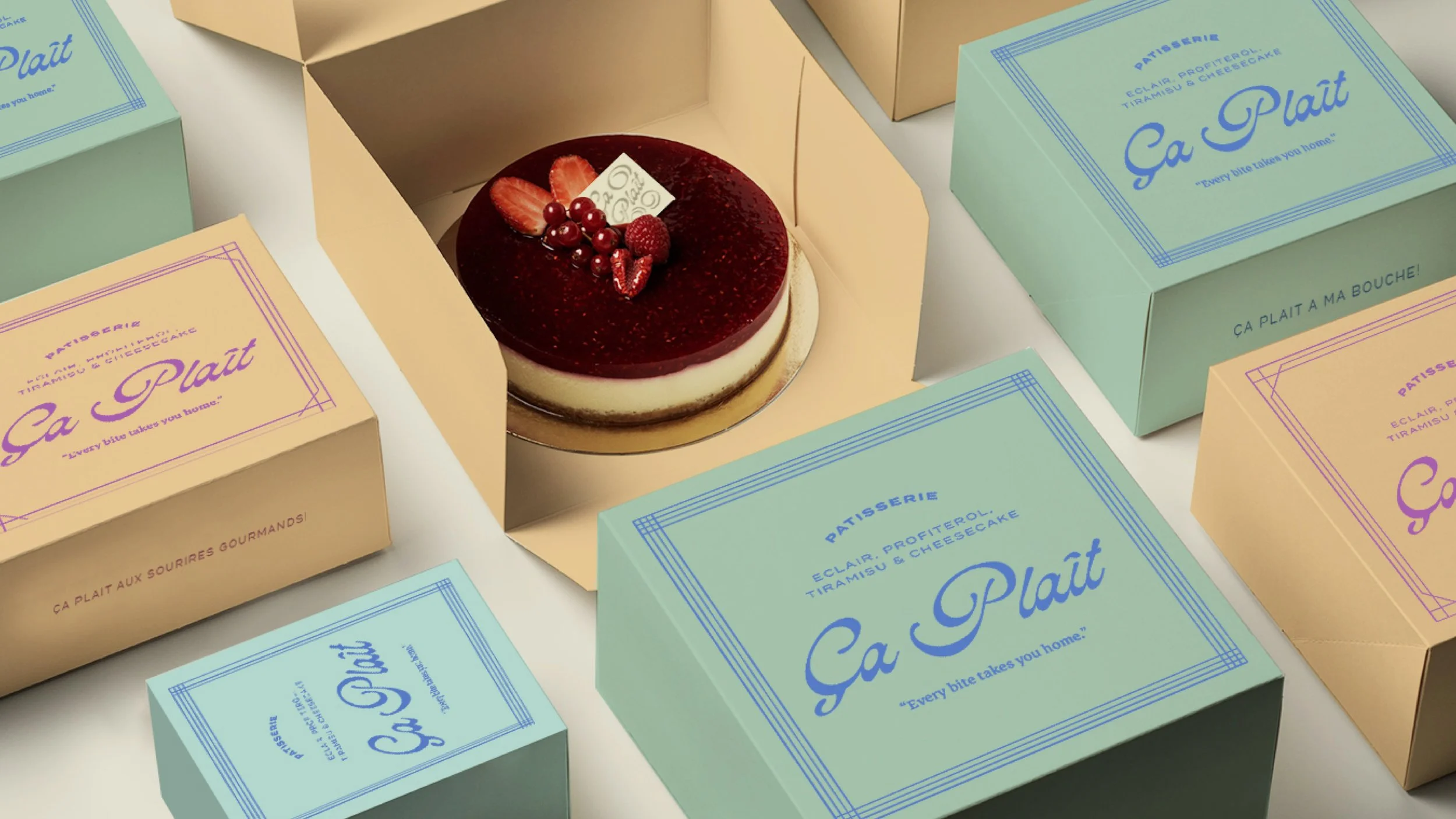
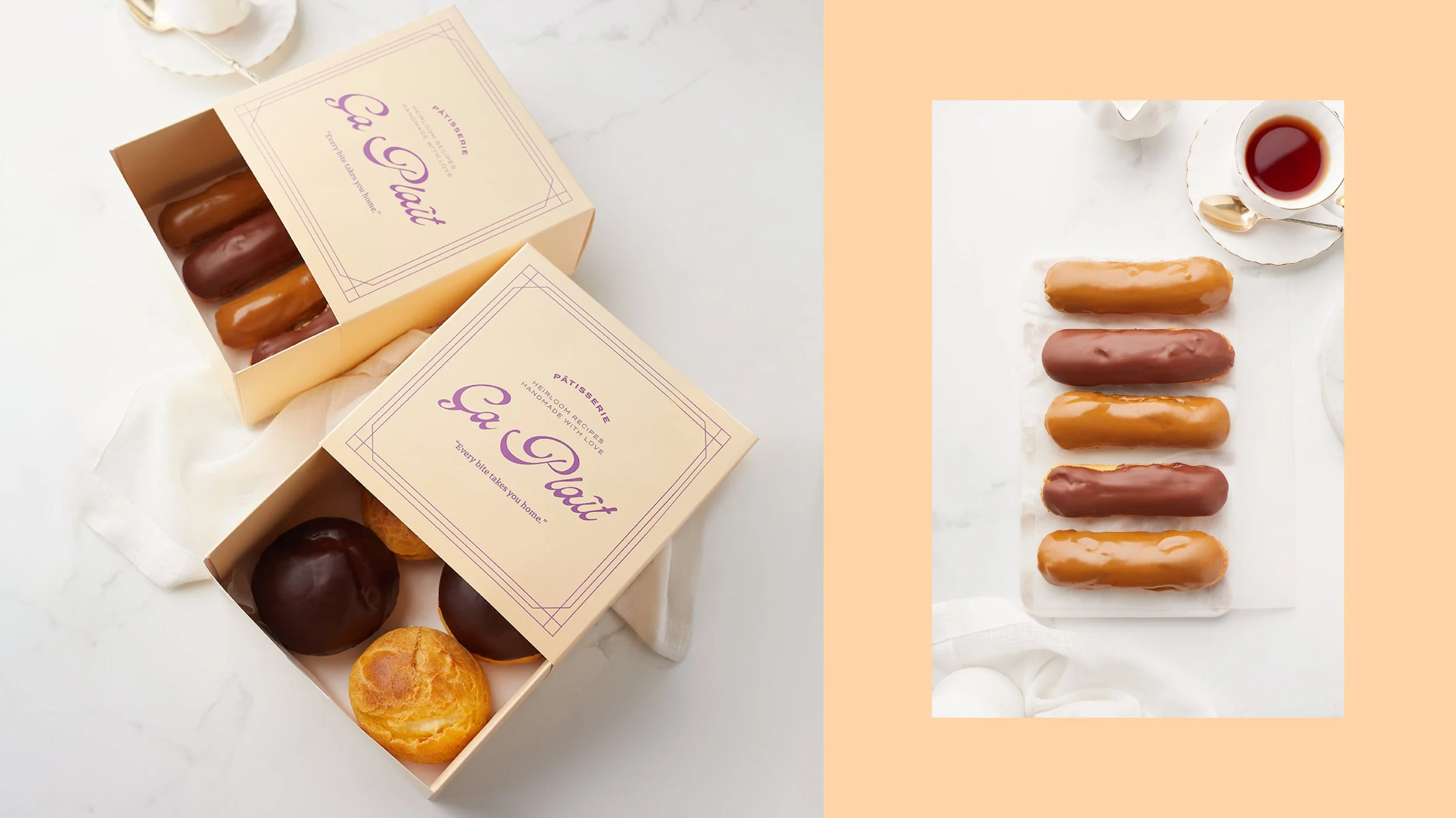
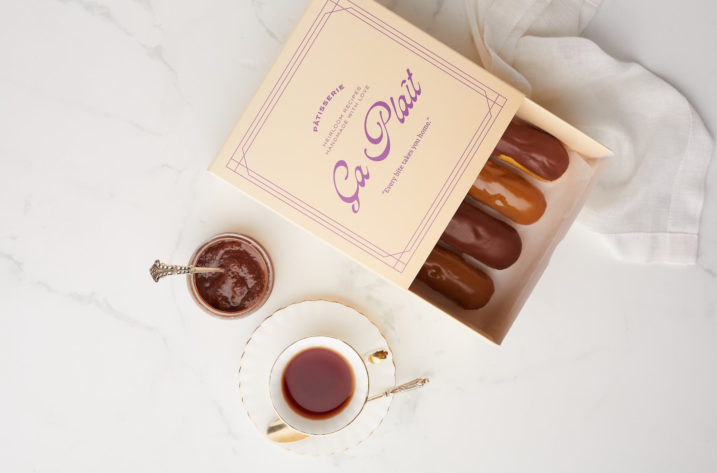
Packaging plays a key role within the brand, serving as the vessel for these handmade desserts. We sought to strike a balance that allowed the desserts to shine, while also presenting the packaging as a beautiful and thoughtful token for gifting.
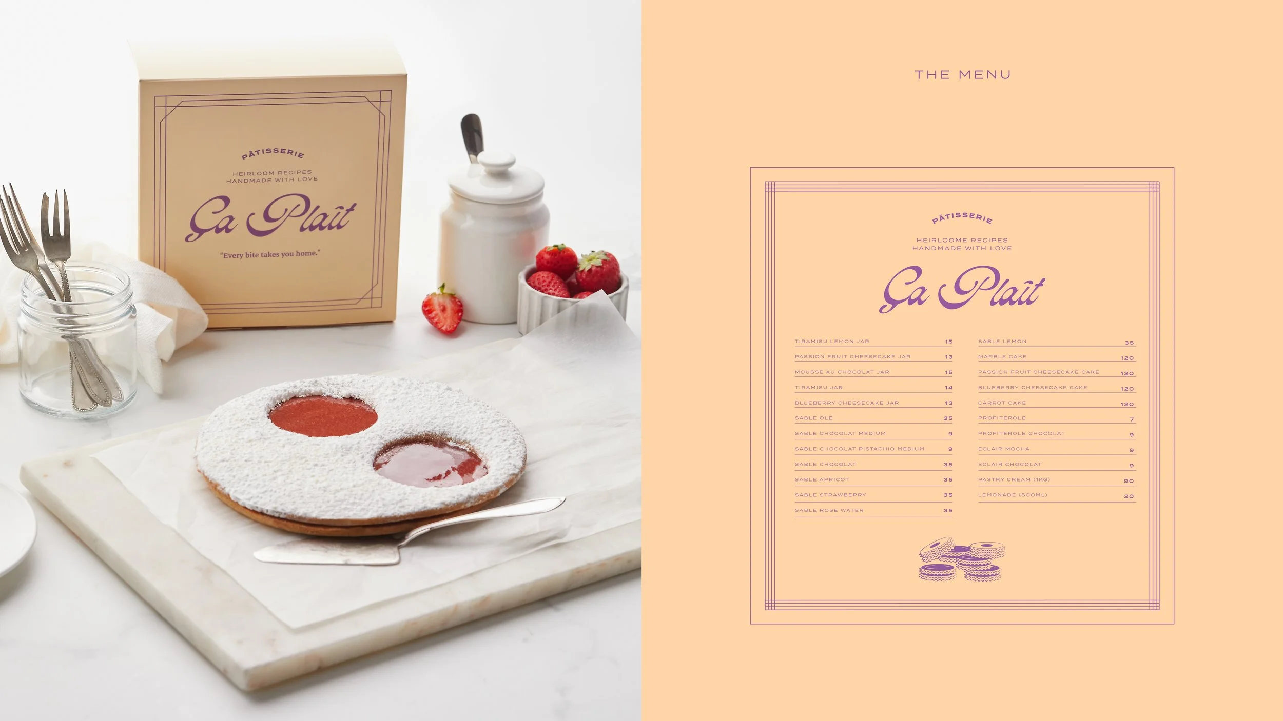
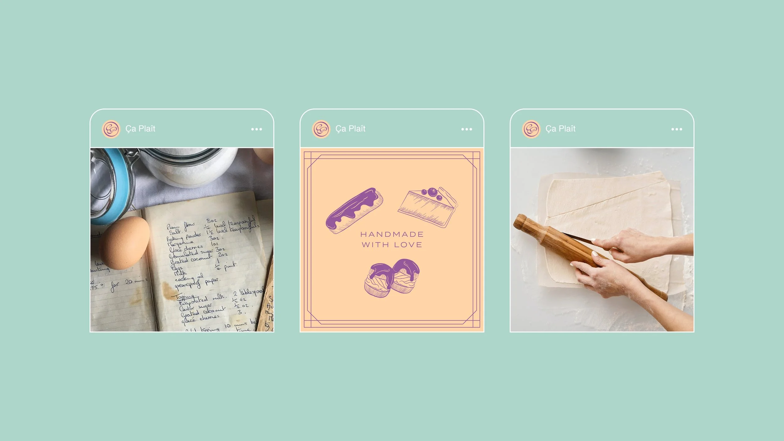
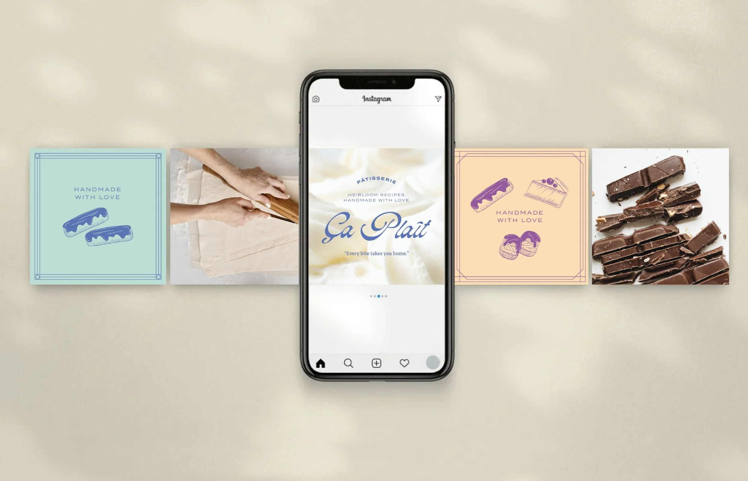
To extend this narrative online, we curated the tone and direction of Ça Plaît's content and photography. With an emphasis on clean, soft, and textured imagery, we brought Ça Plaît's story to life through visual storytelling. We showcased not only the final creations but also the quality ingredients, process, packaging, and glimpses of the mother behind the recipes.
The result is a timeless, classic brand that encapsulates the spirit of the mother and her exquisite desserts.


