Mr.Regimen
Logo Redesign, Branding, Social Media,
Ui/Ux, Website
Industry: Beauty
Date: 2022-2023
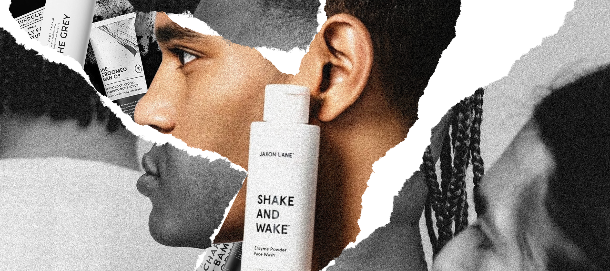
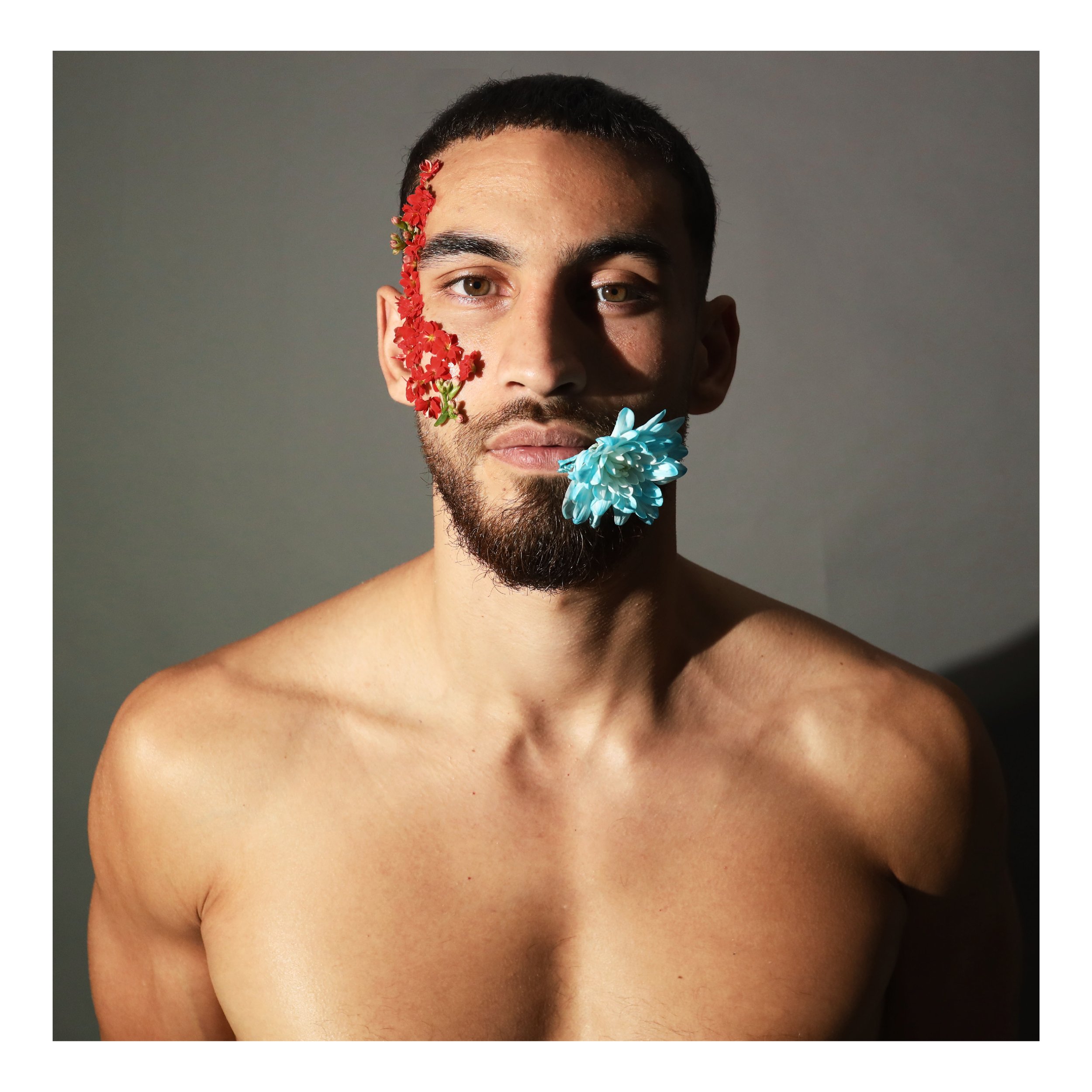
In a world led by toxic patriarchal thinking, Mr. Regimen aims to create a safe space for conversation about a new approach to masculinity. One that does not shy away from vulnerability and battles stereotypes. We wanted to create a platform which appeals to a modern male audience specifically in the Middle East that discusses beauty and cosmetics.
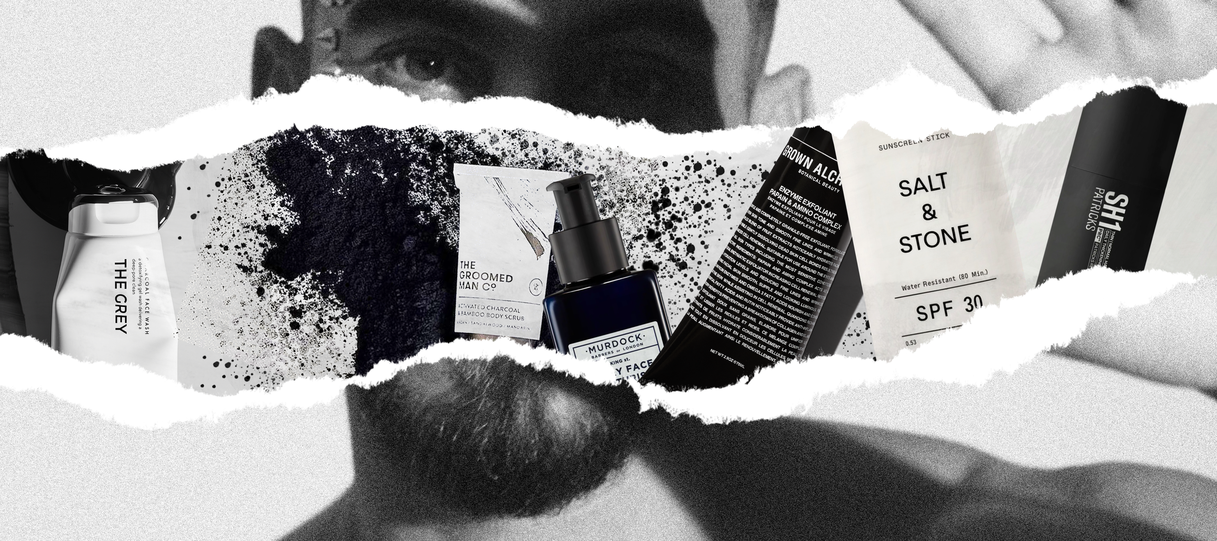
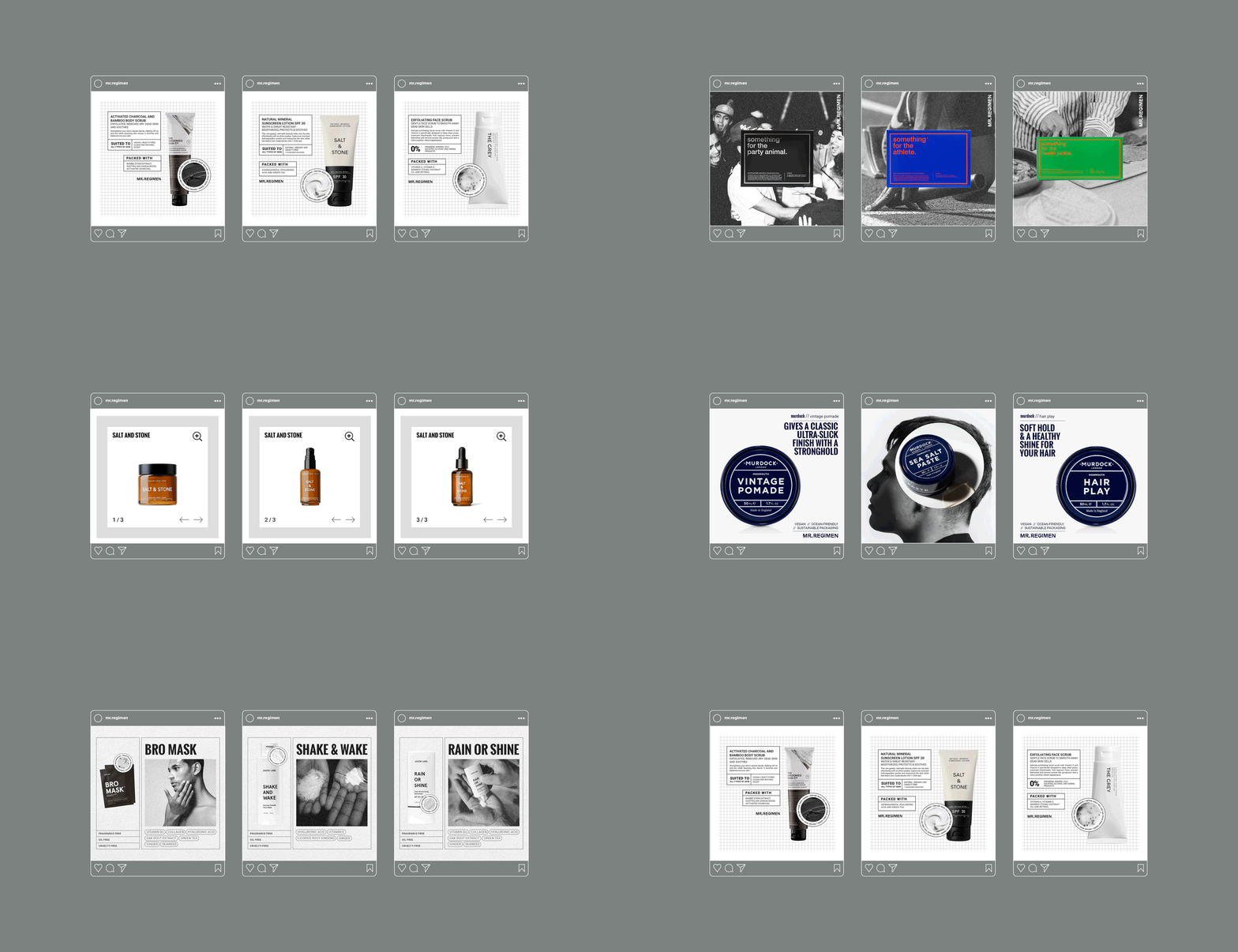
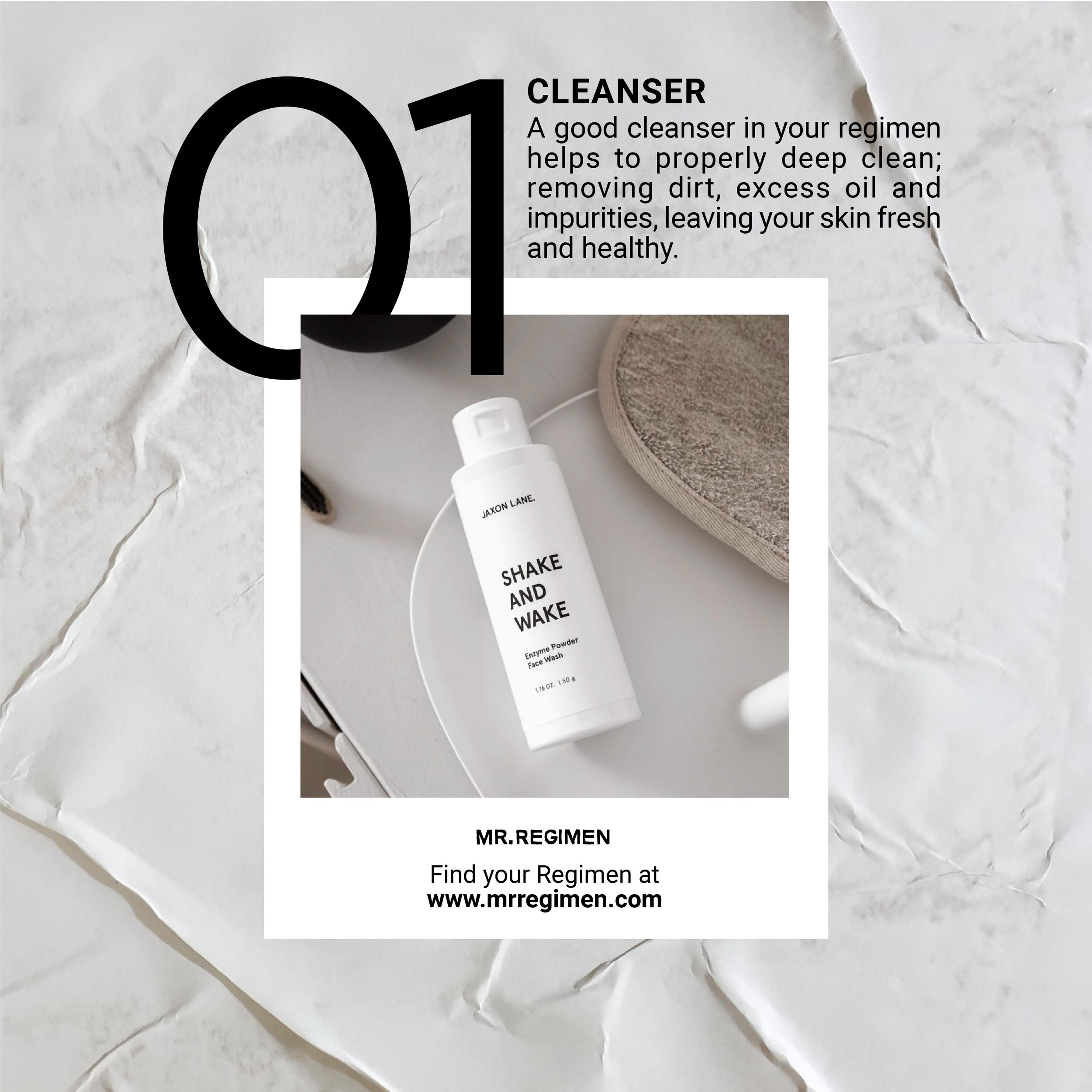
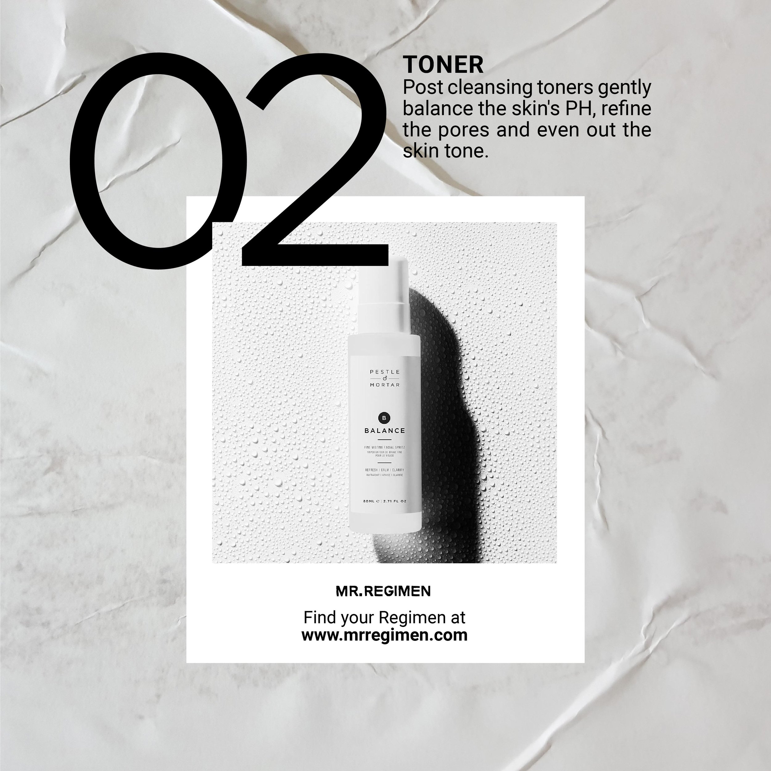
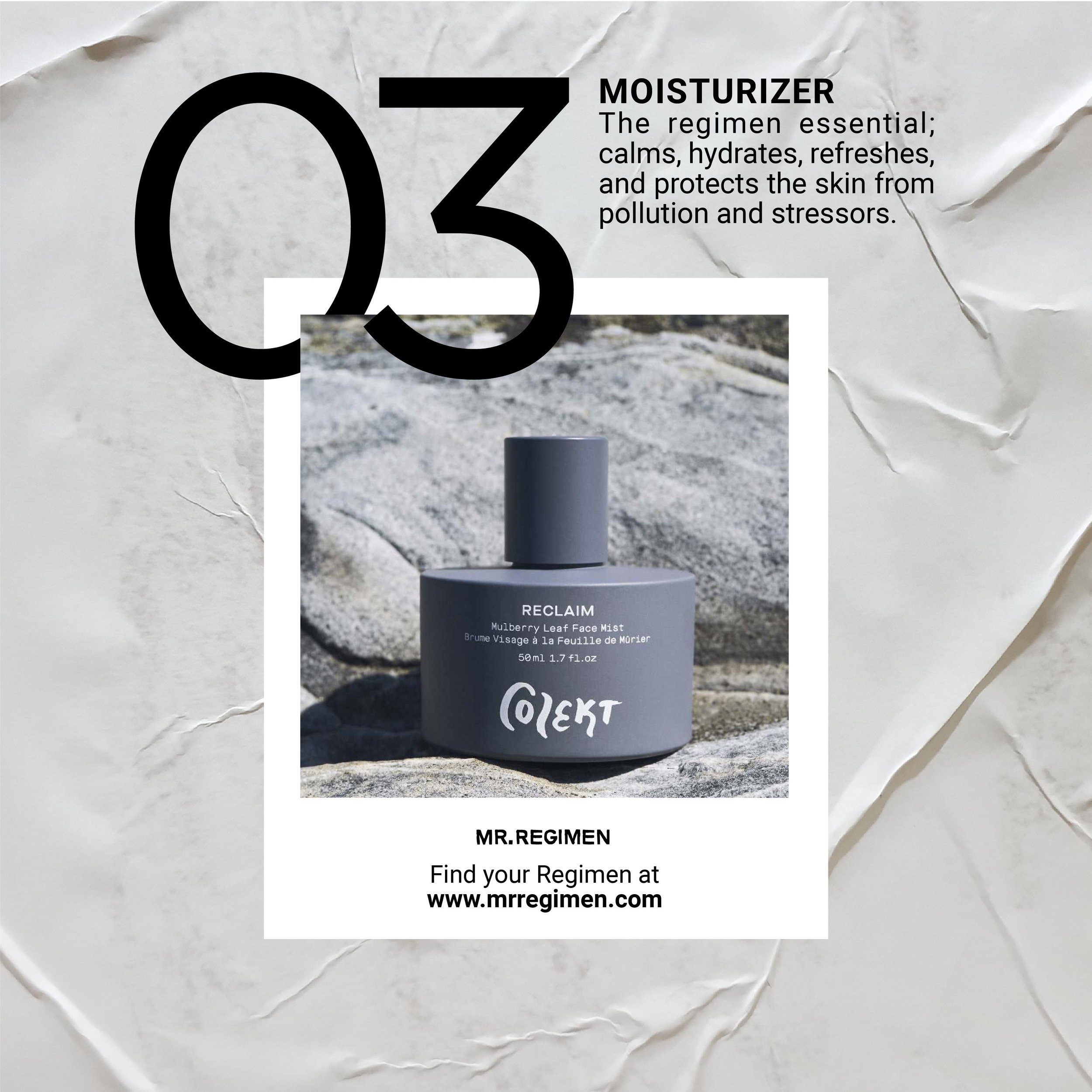
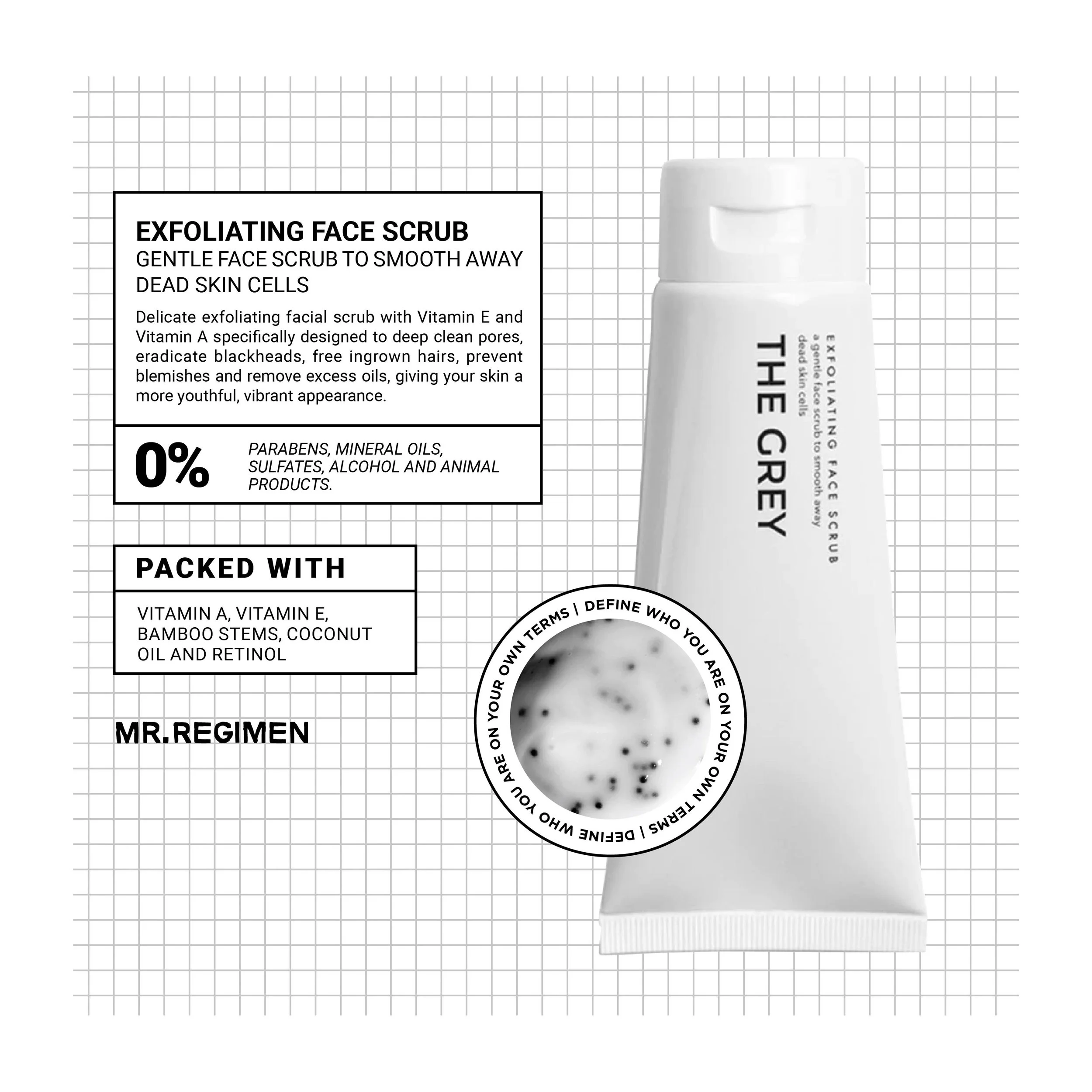
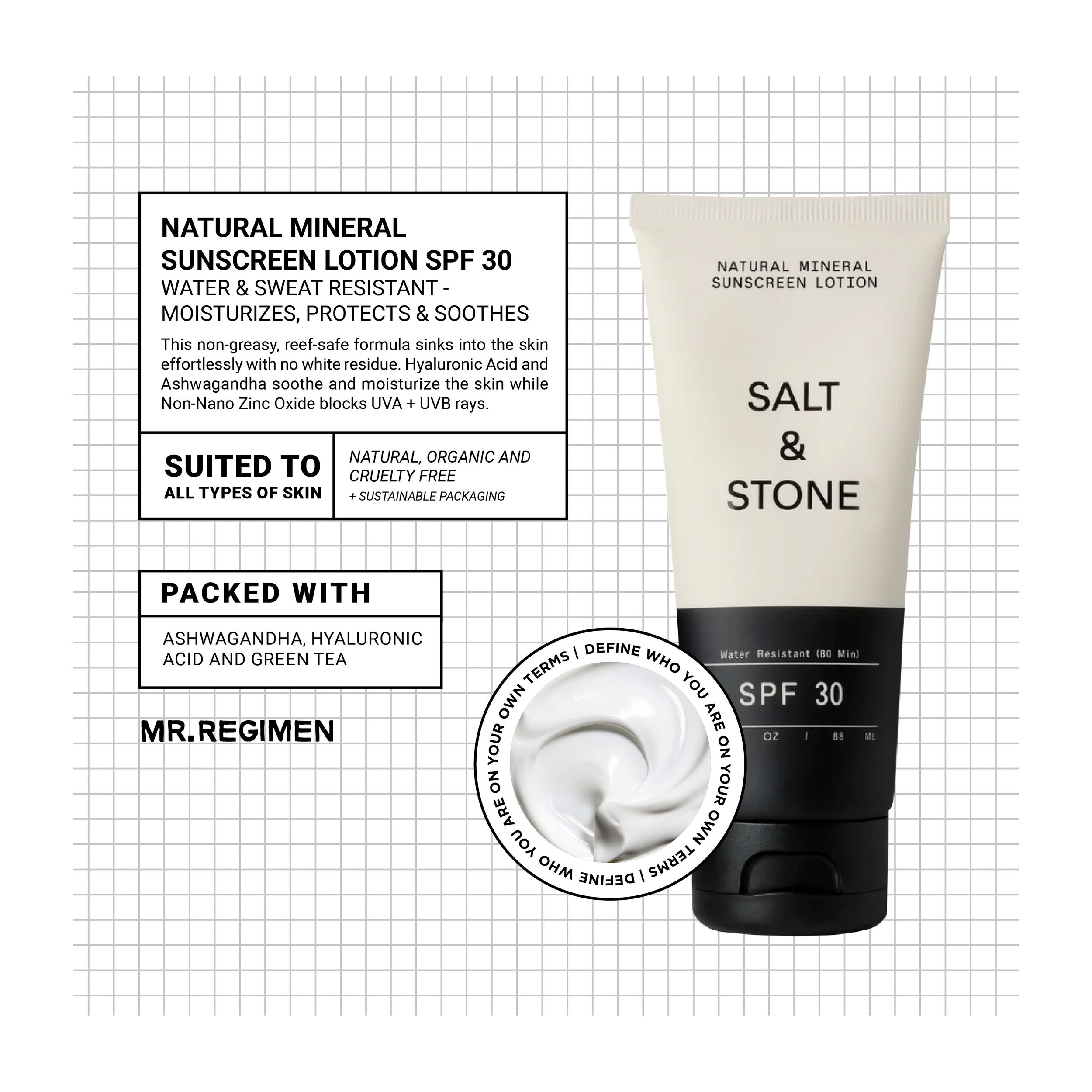
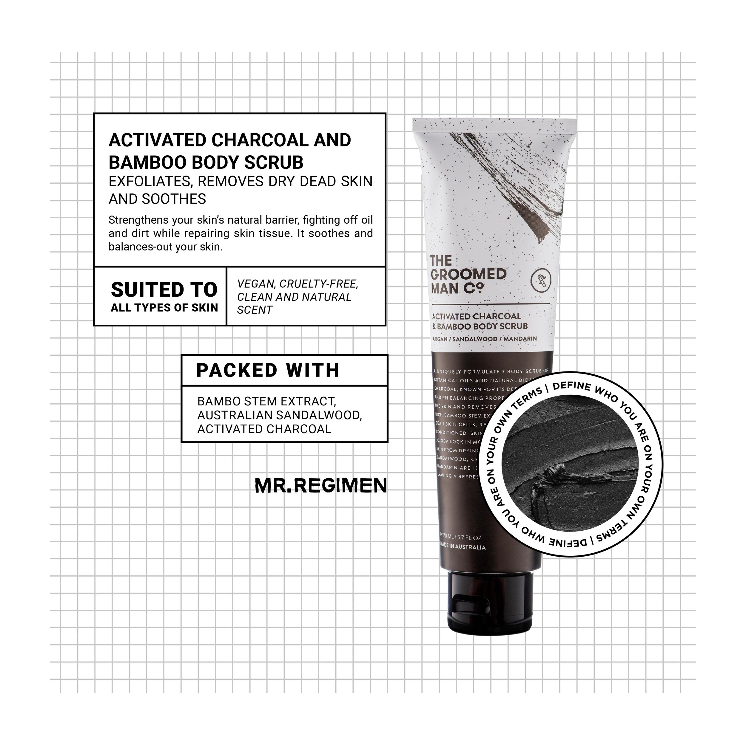
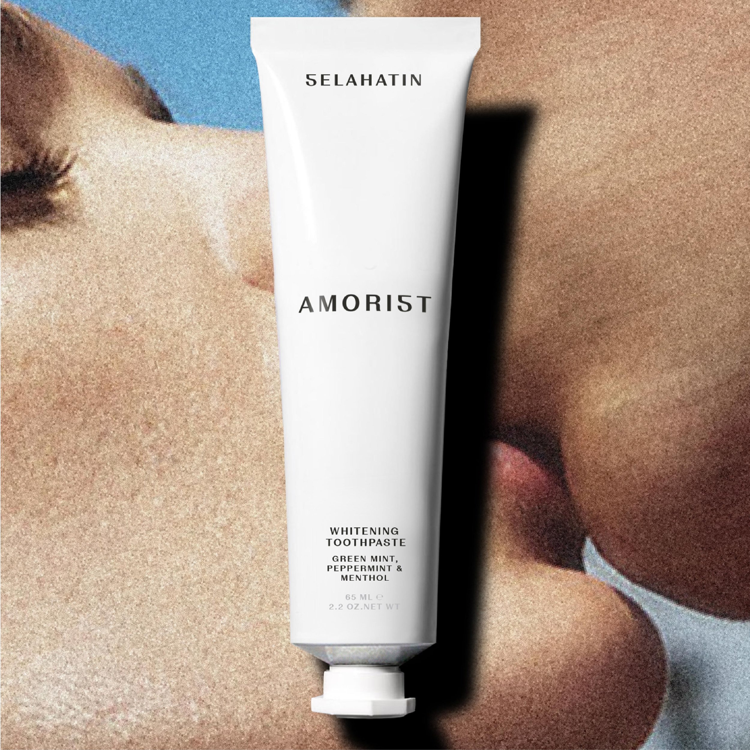
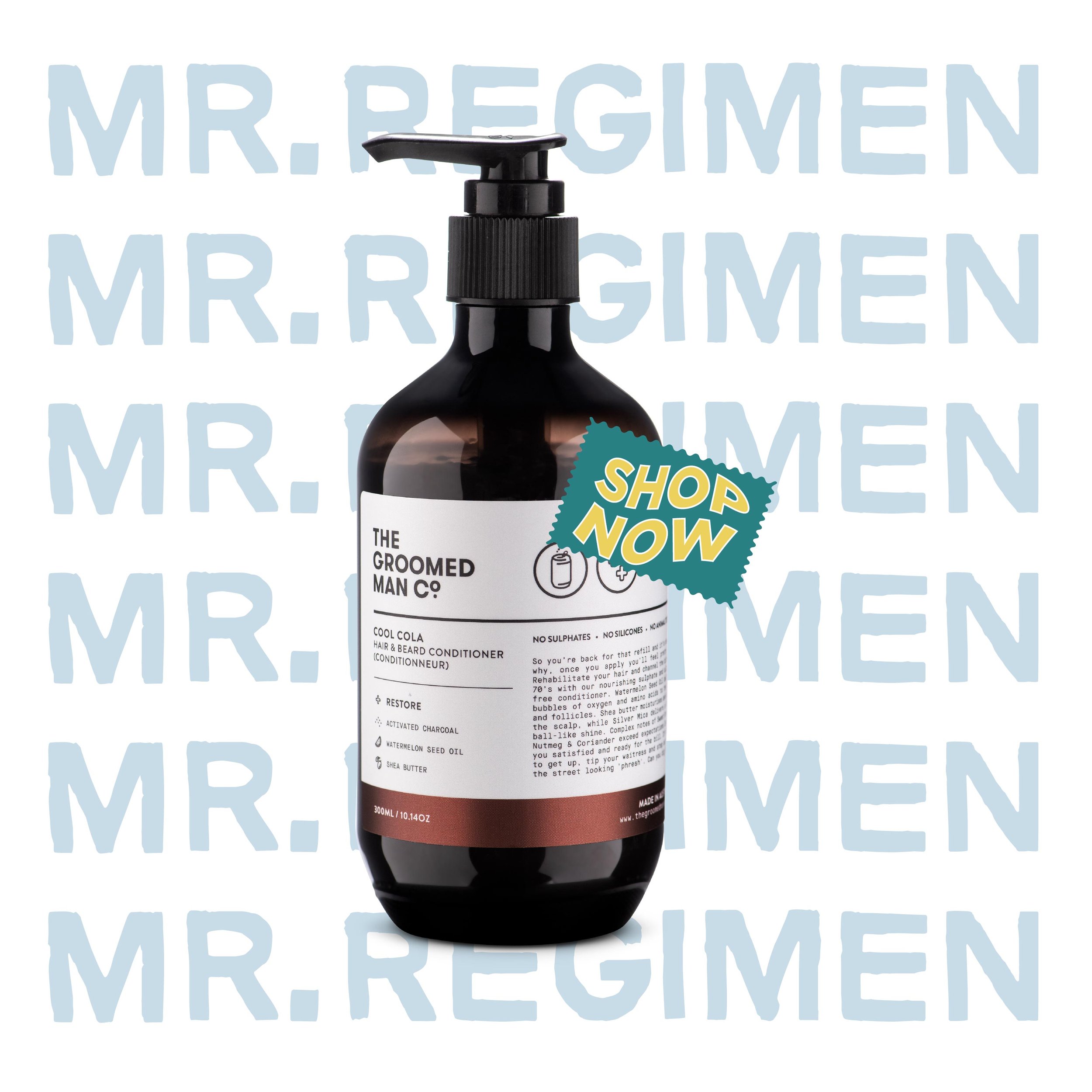
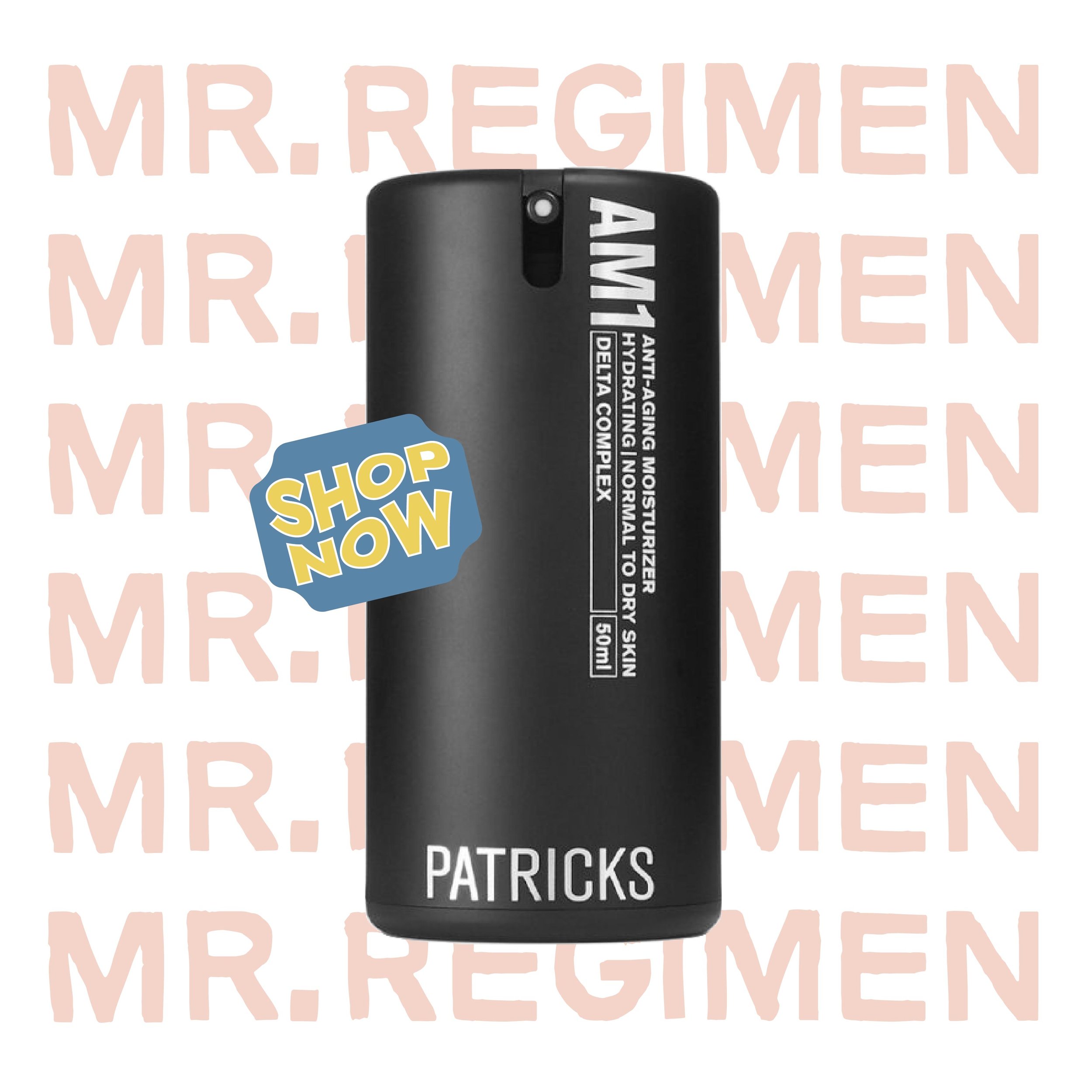
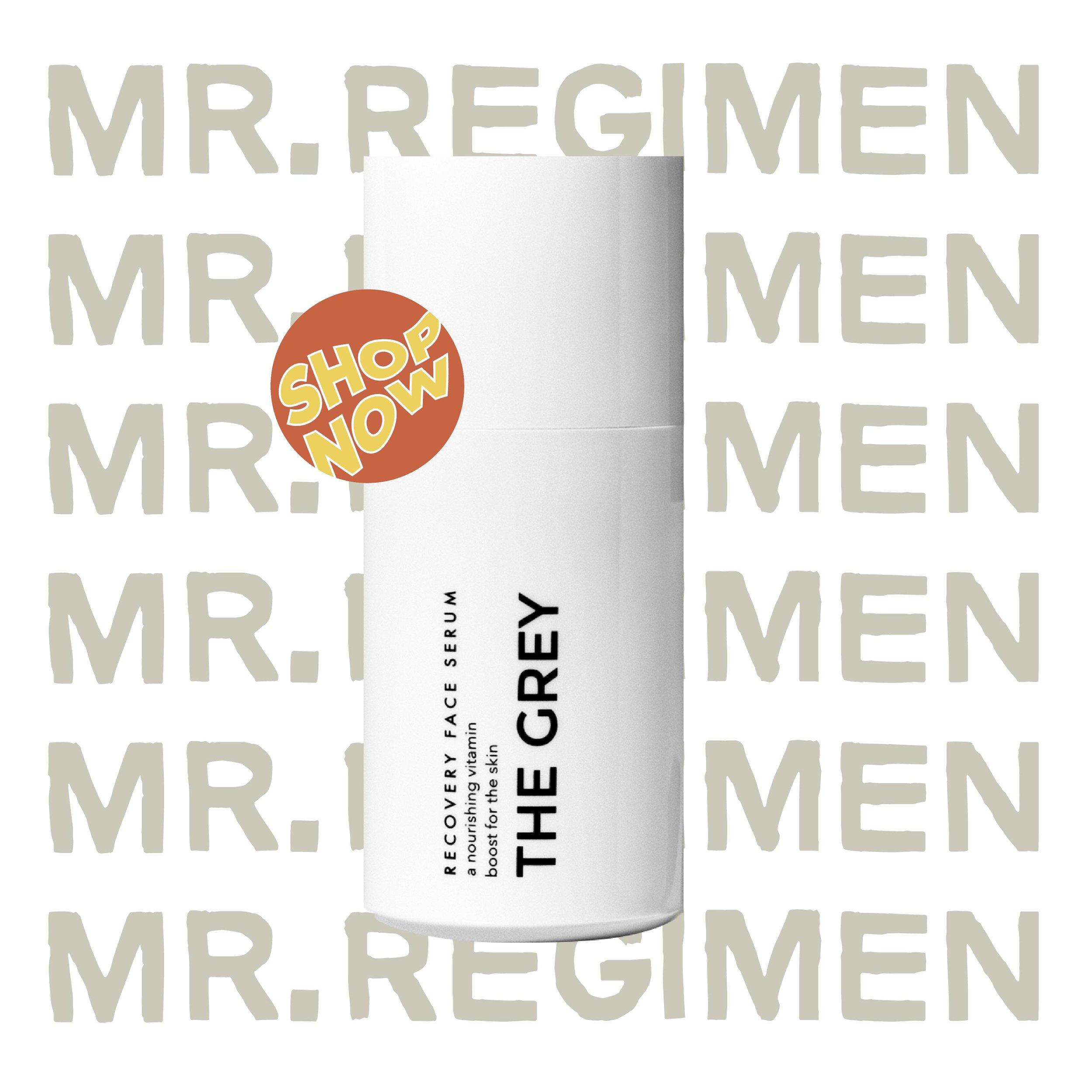
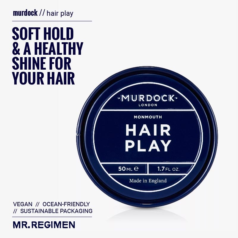
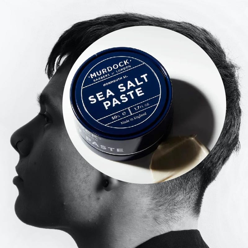
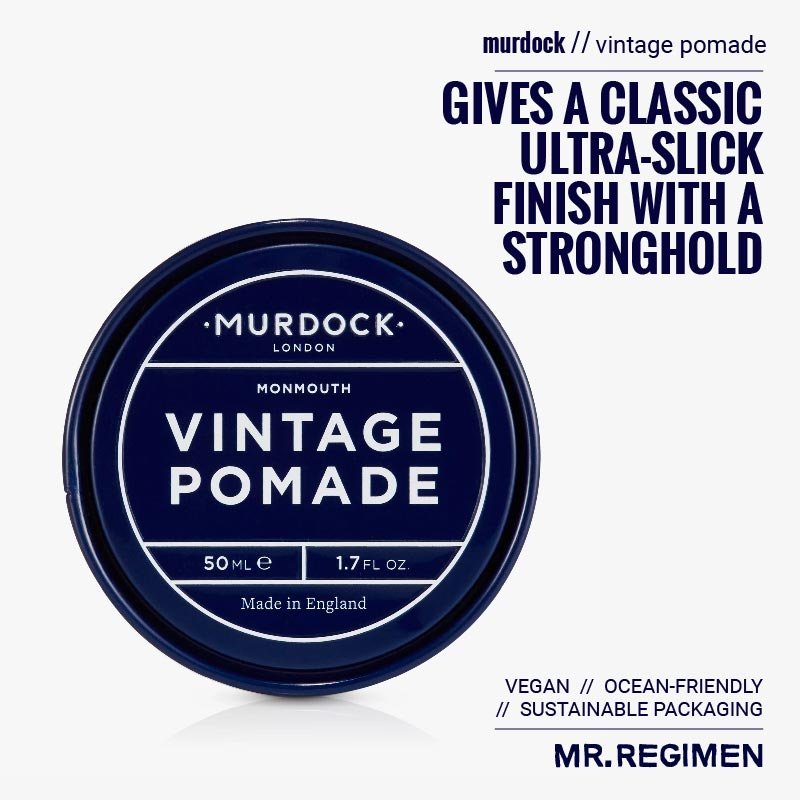
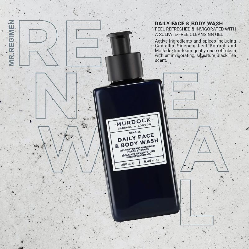
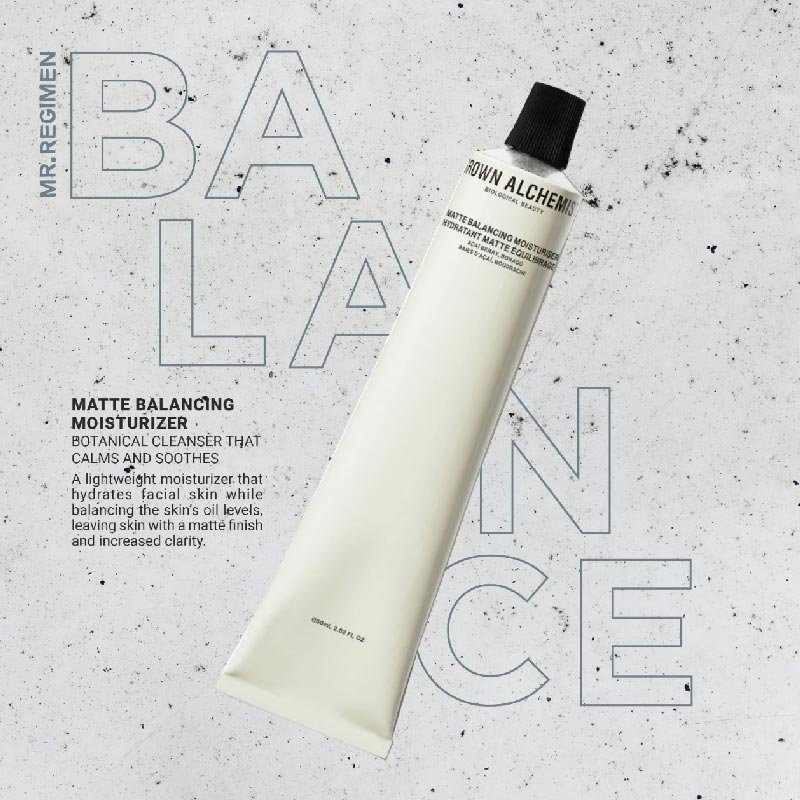
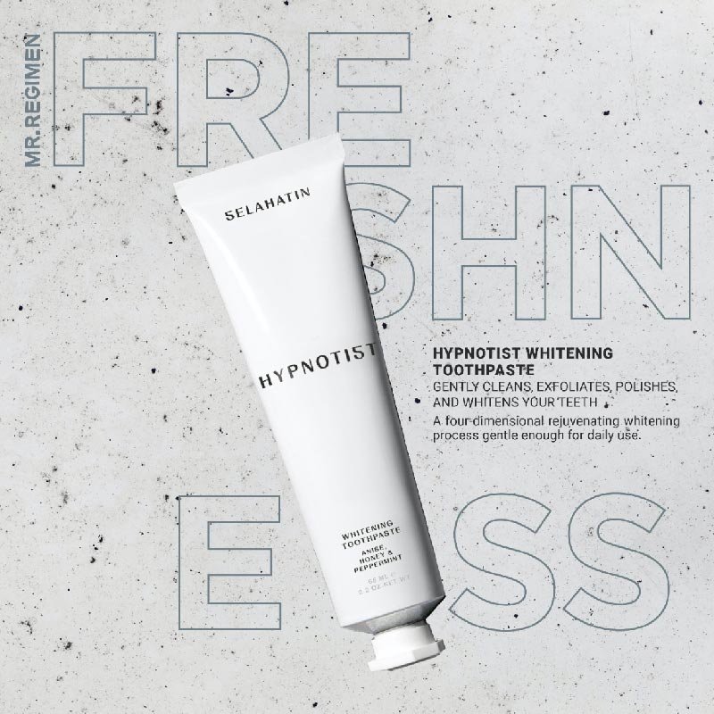
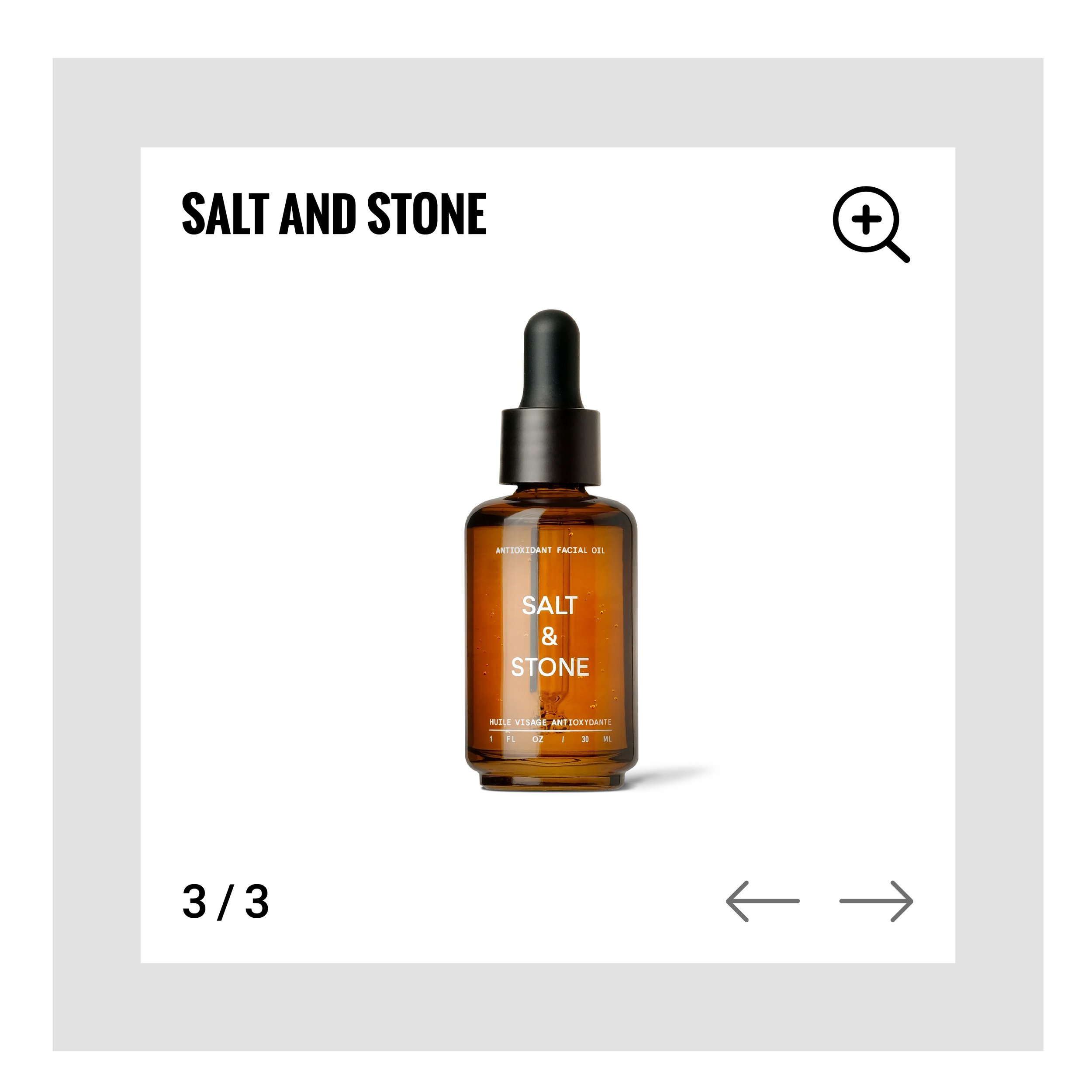
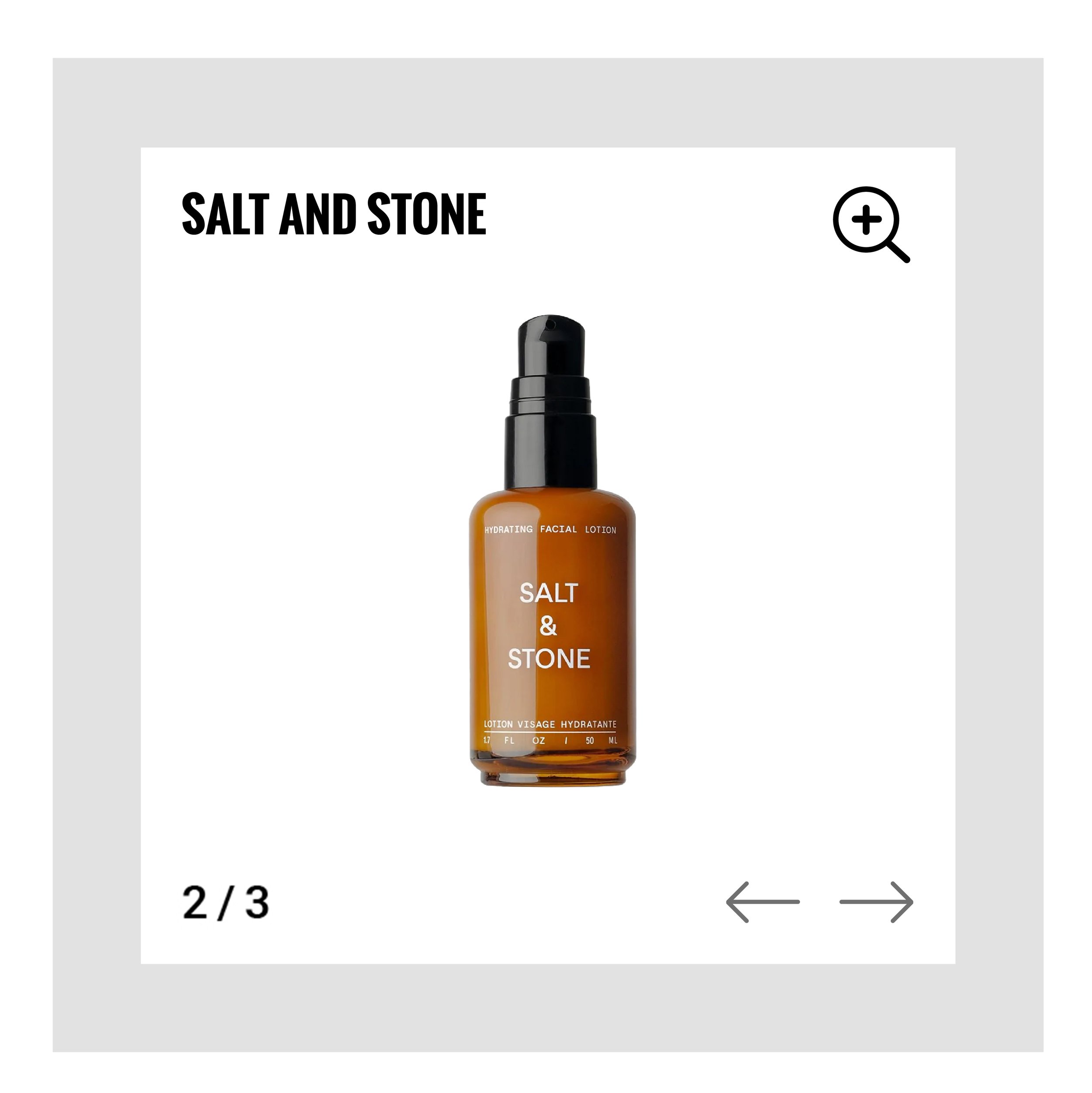
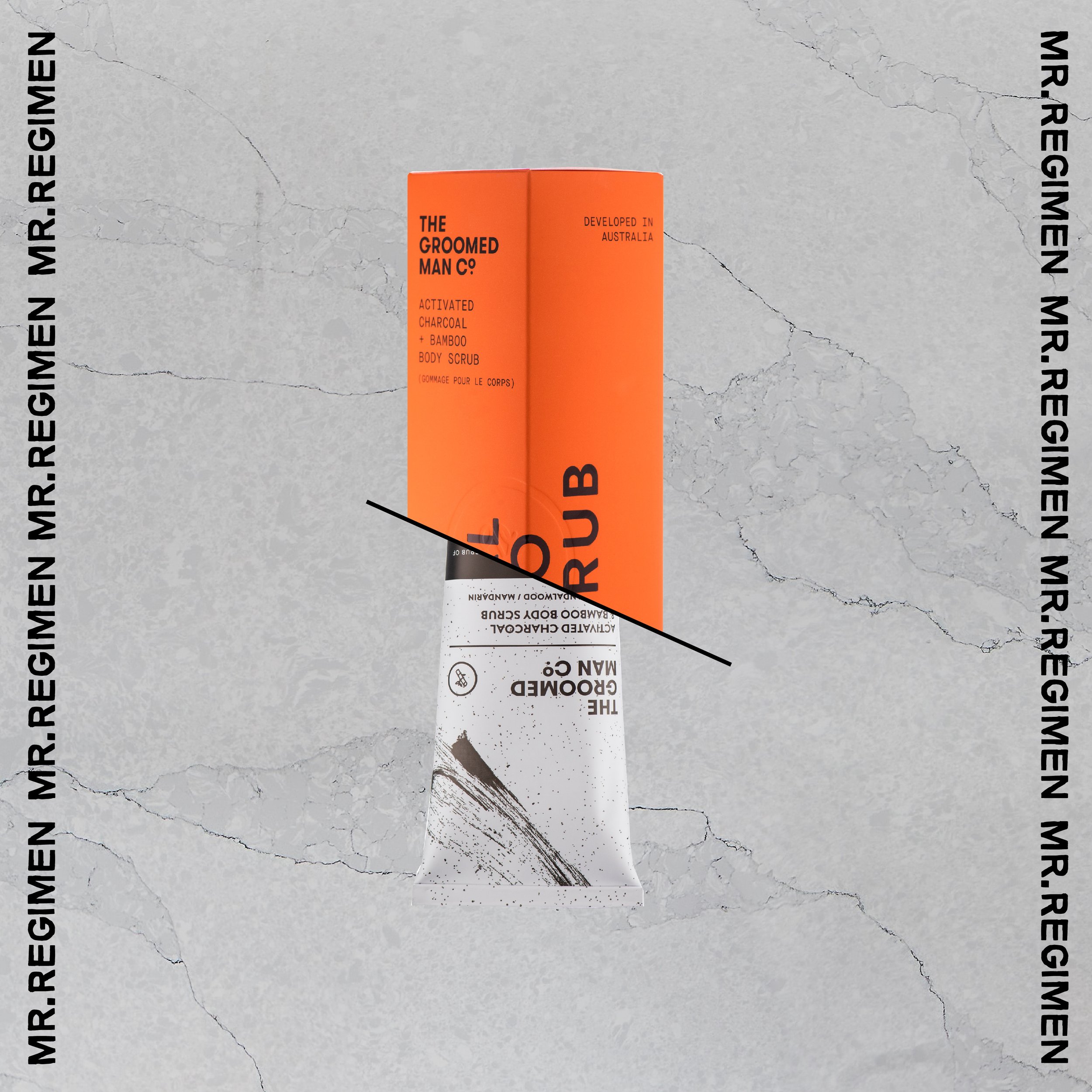
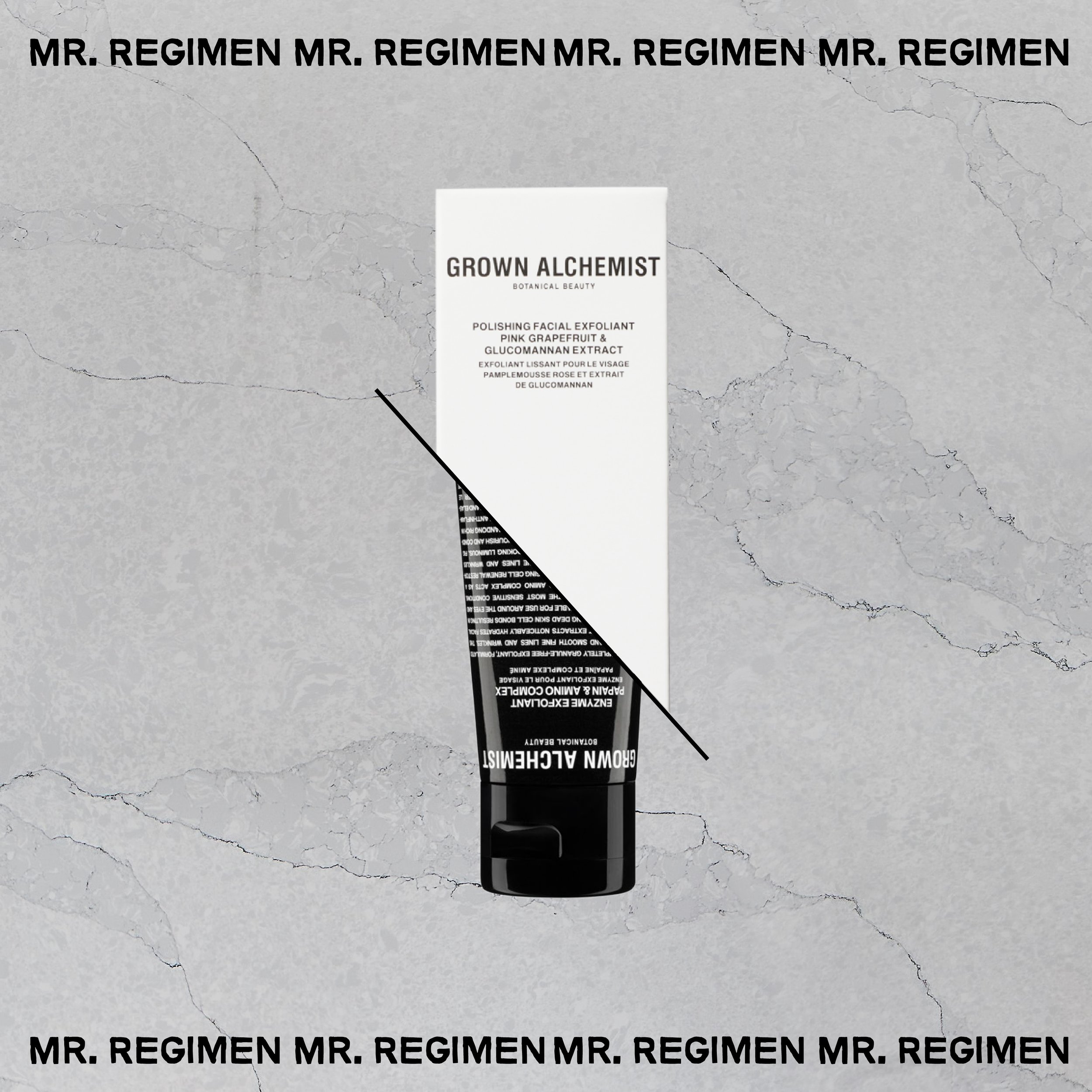
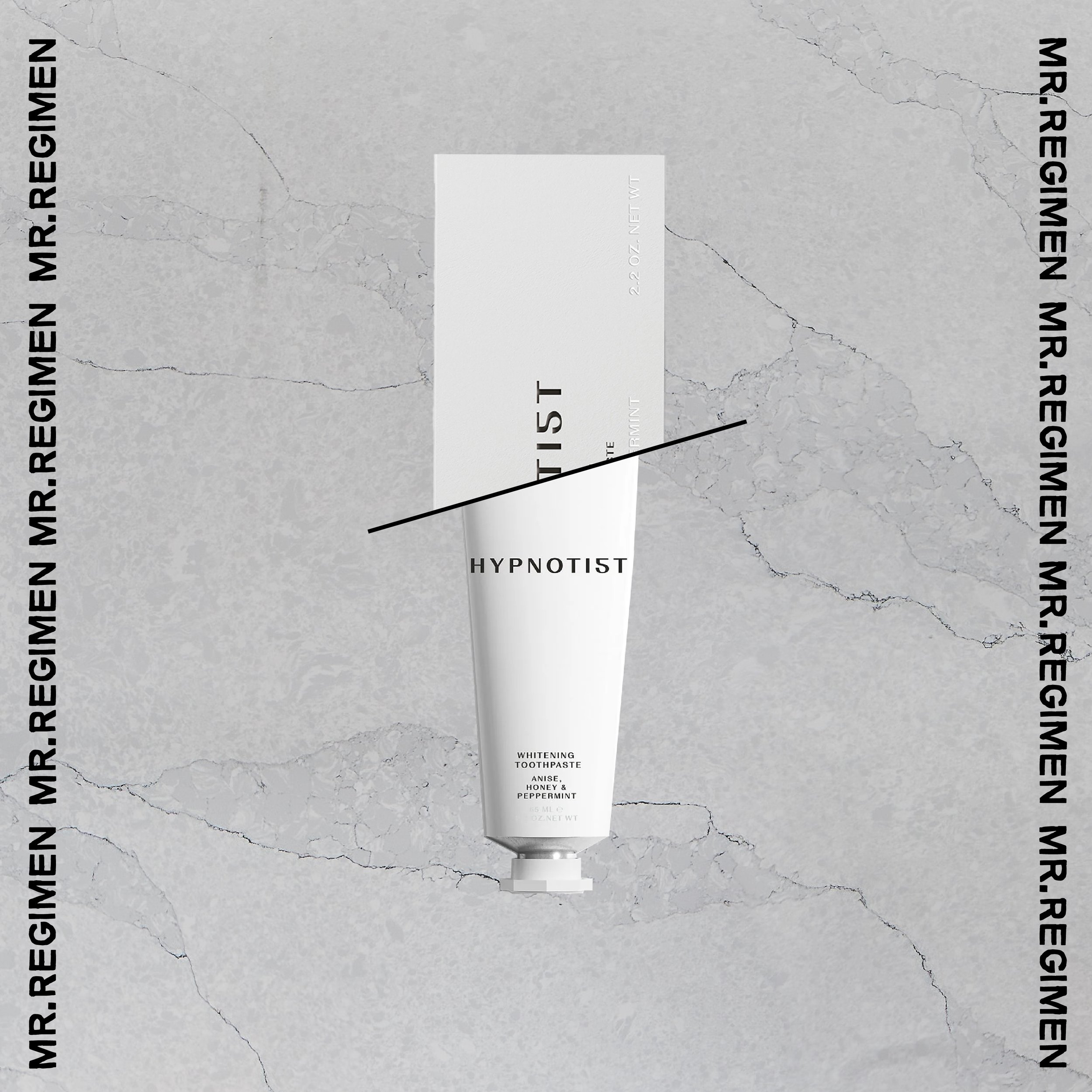
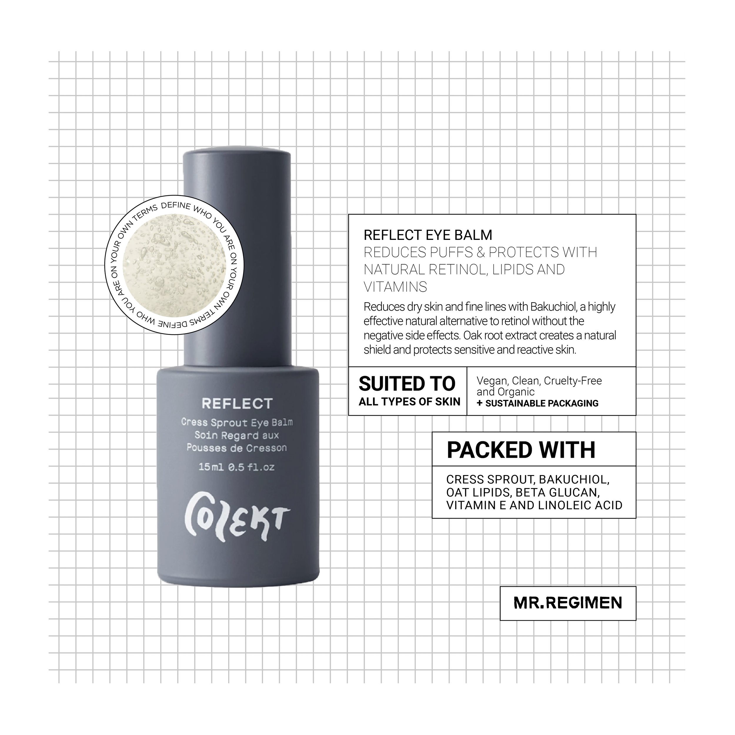
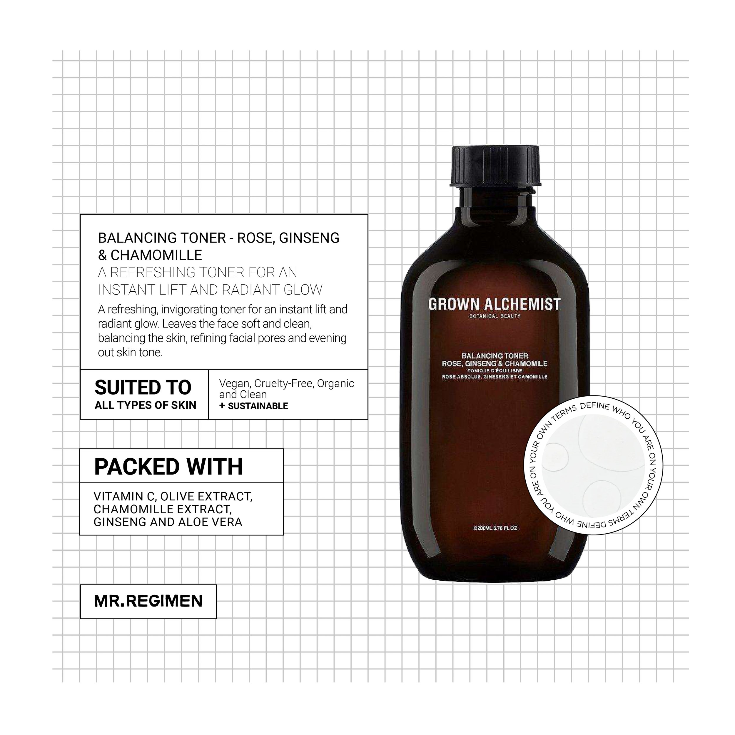
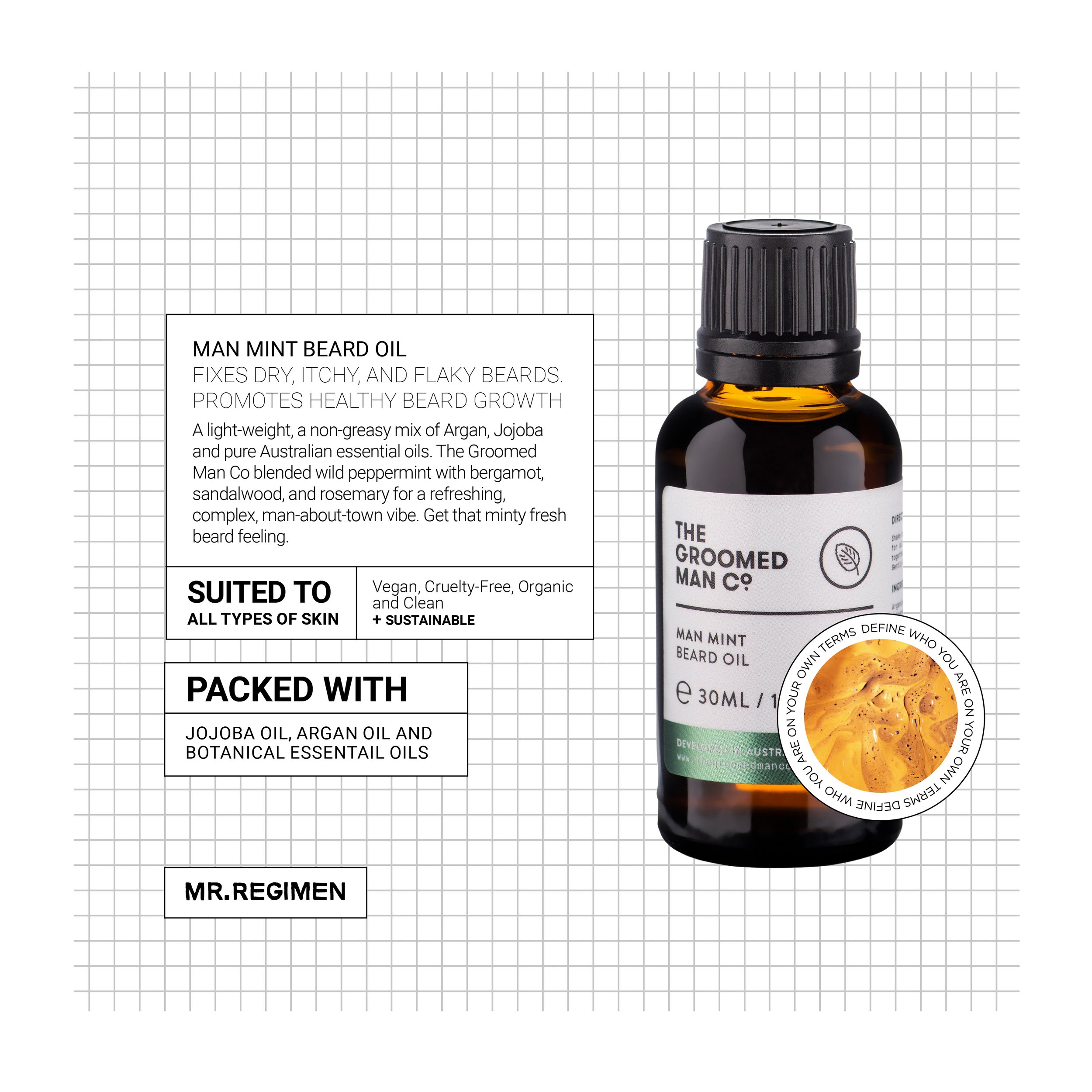
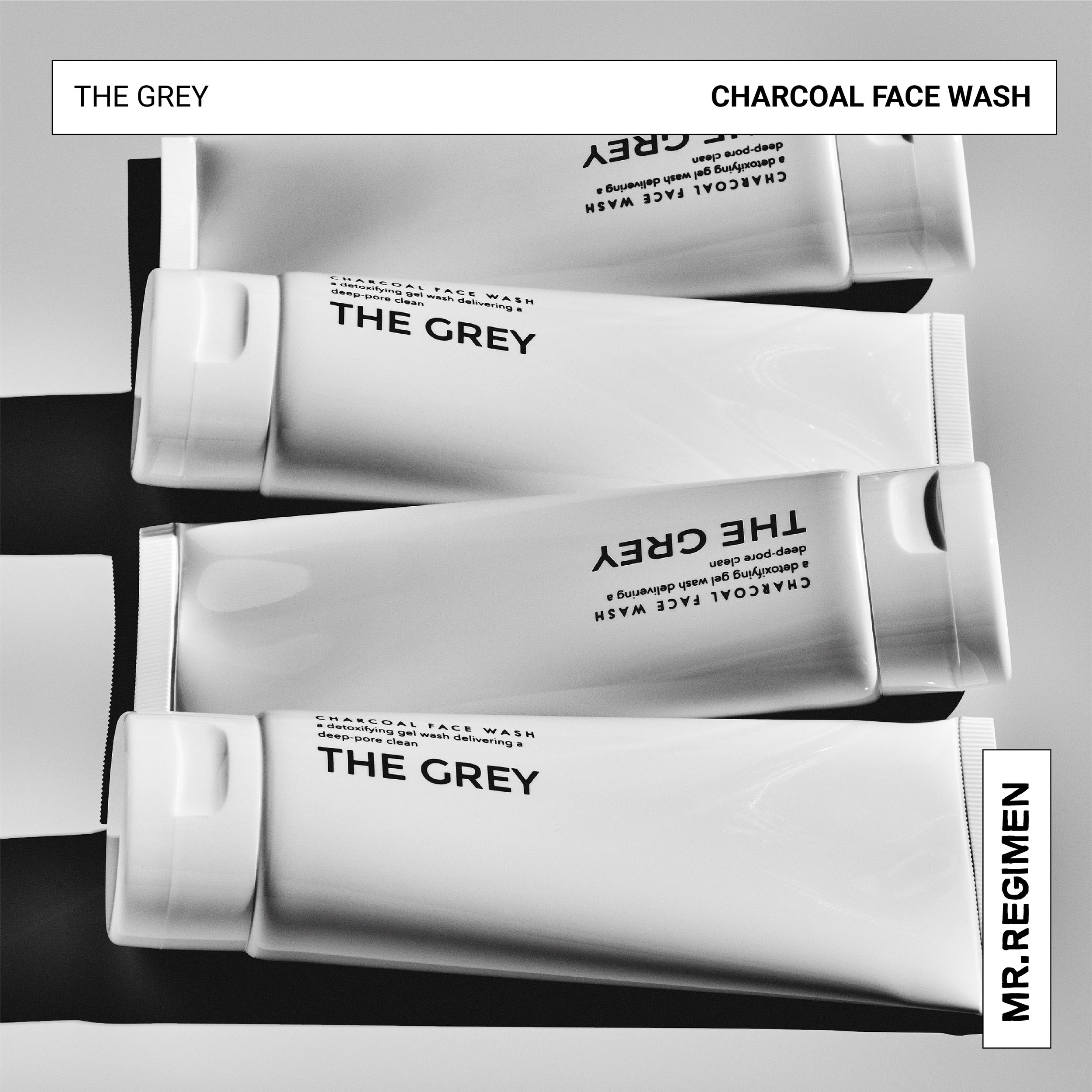
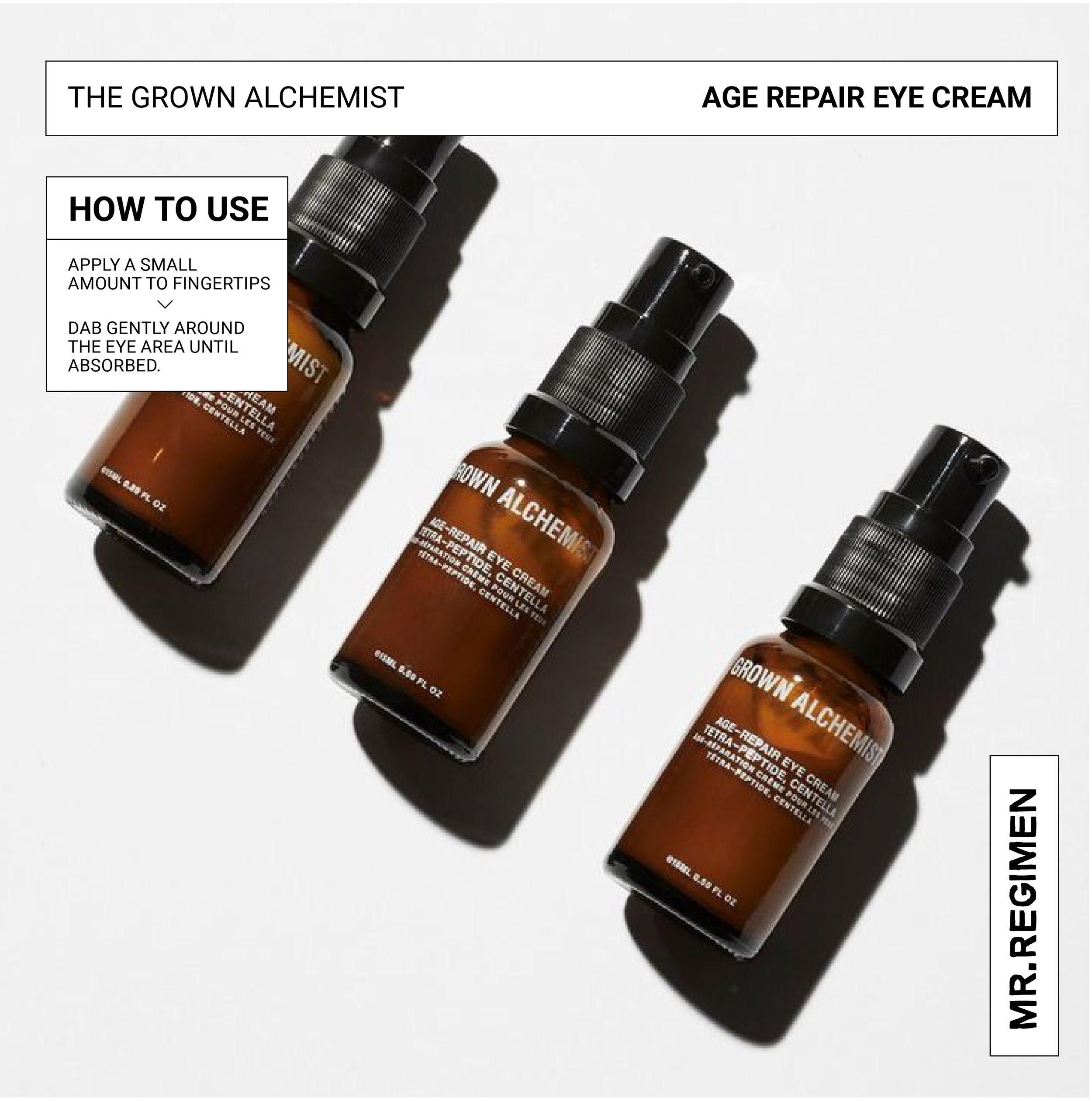
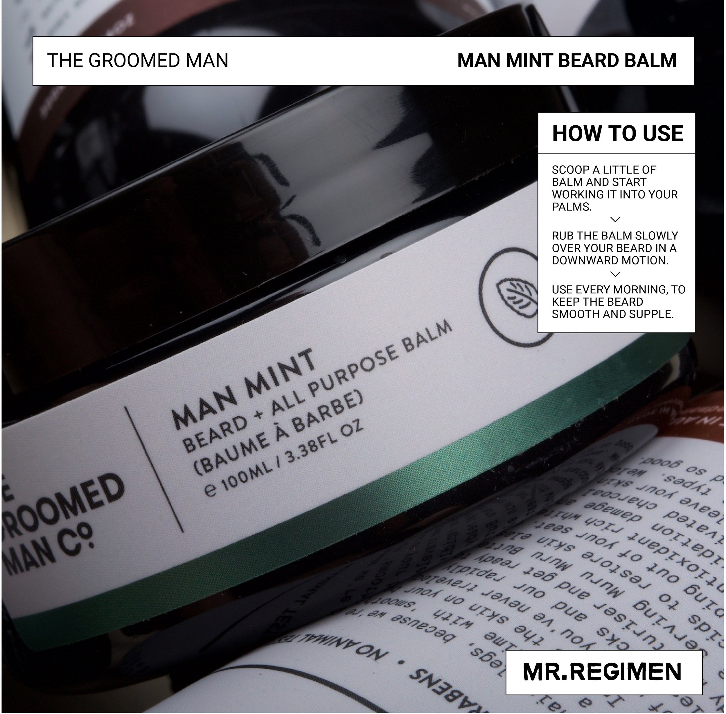
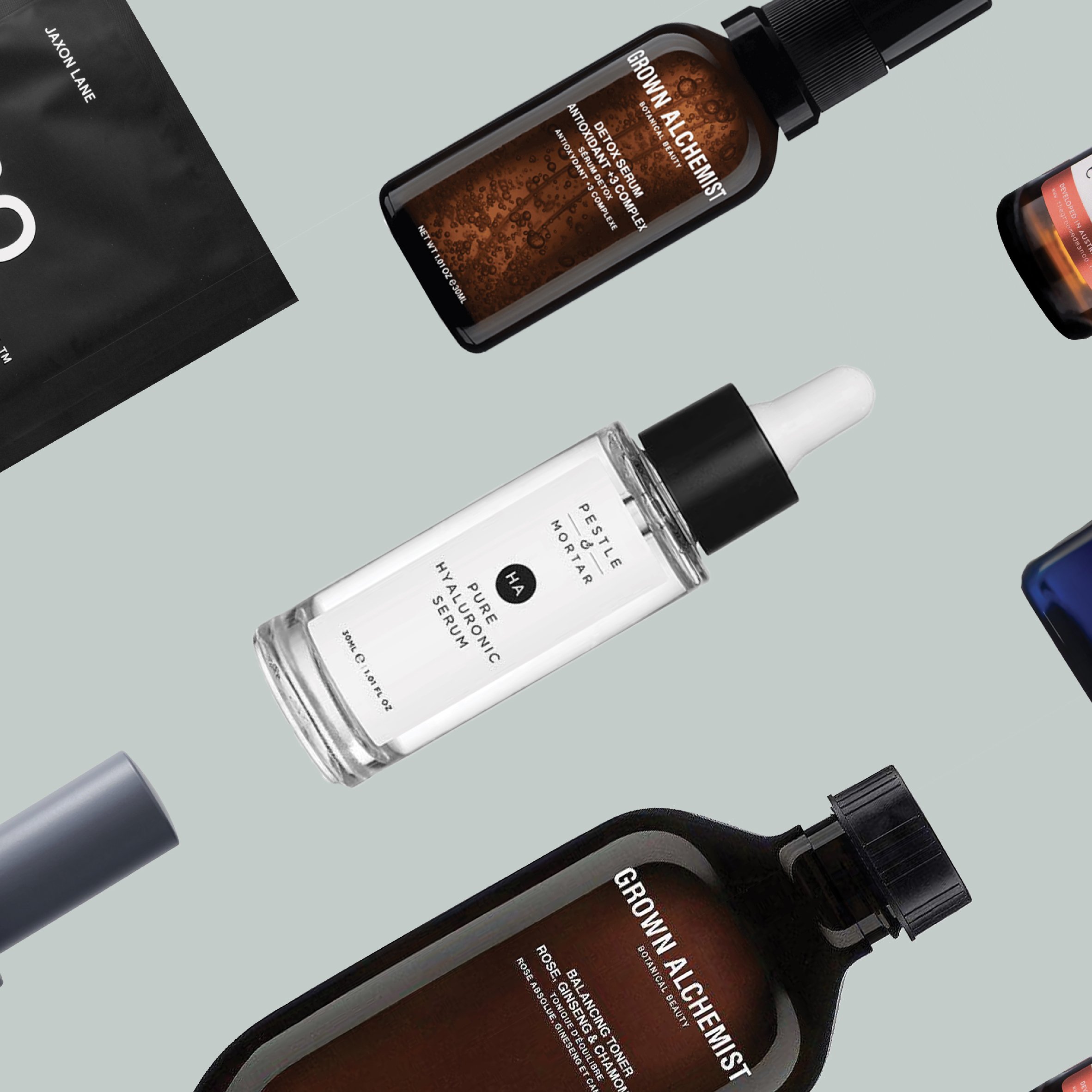
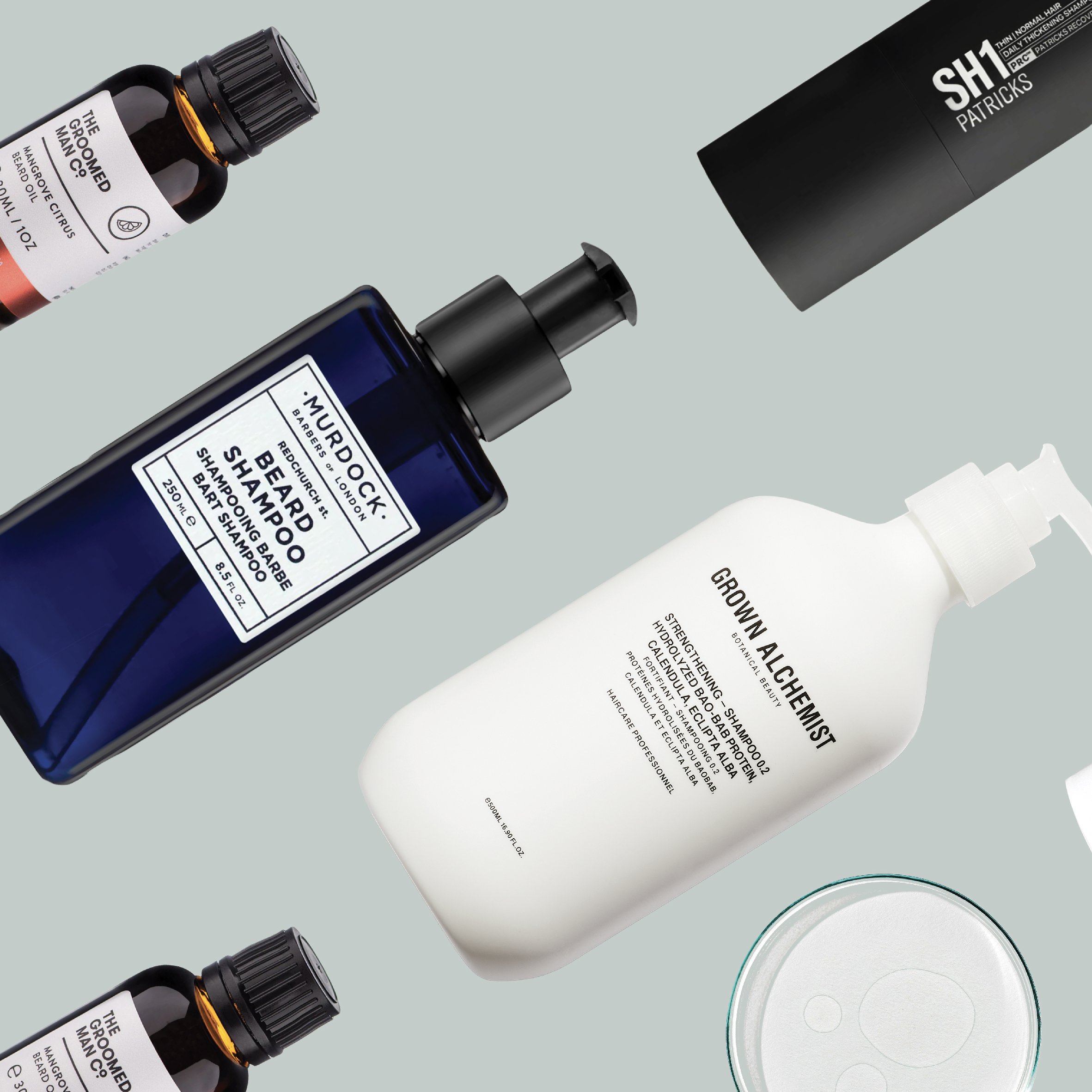
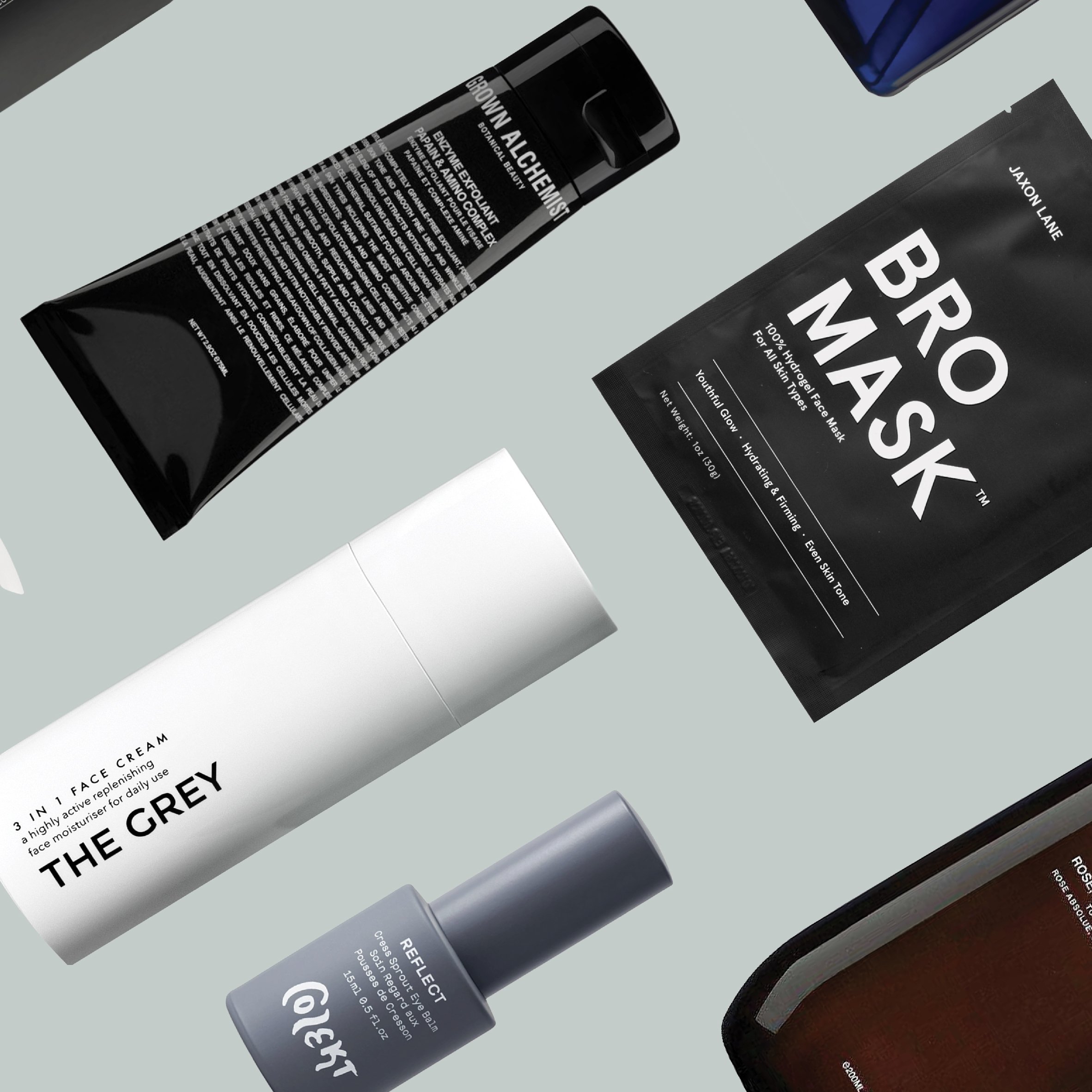
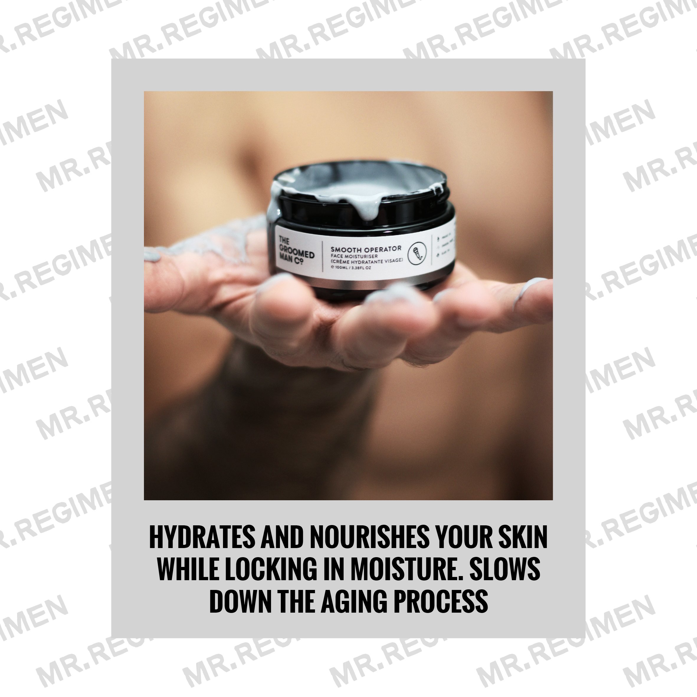
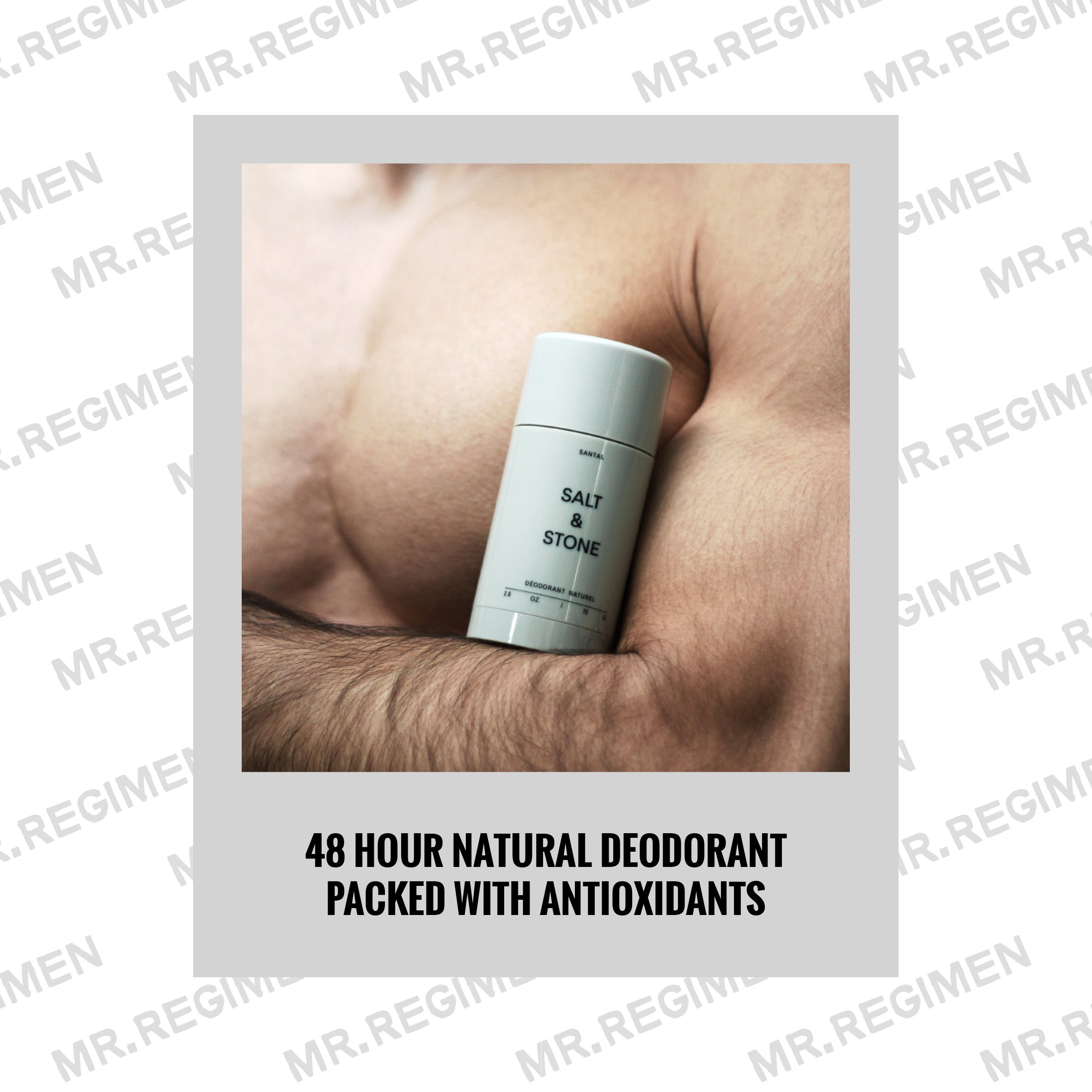
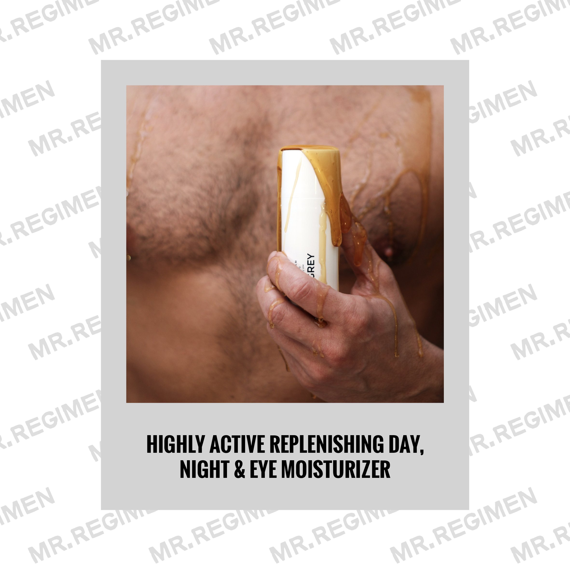
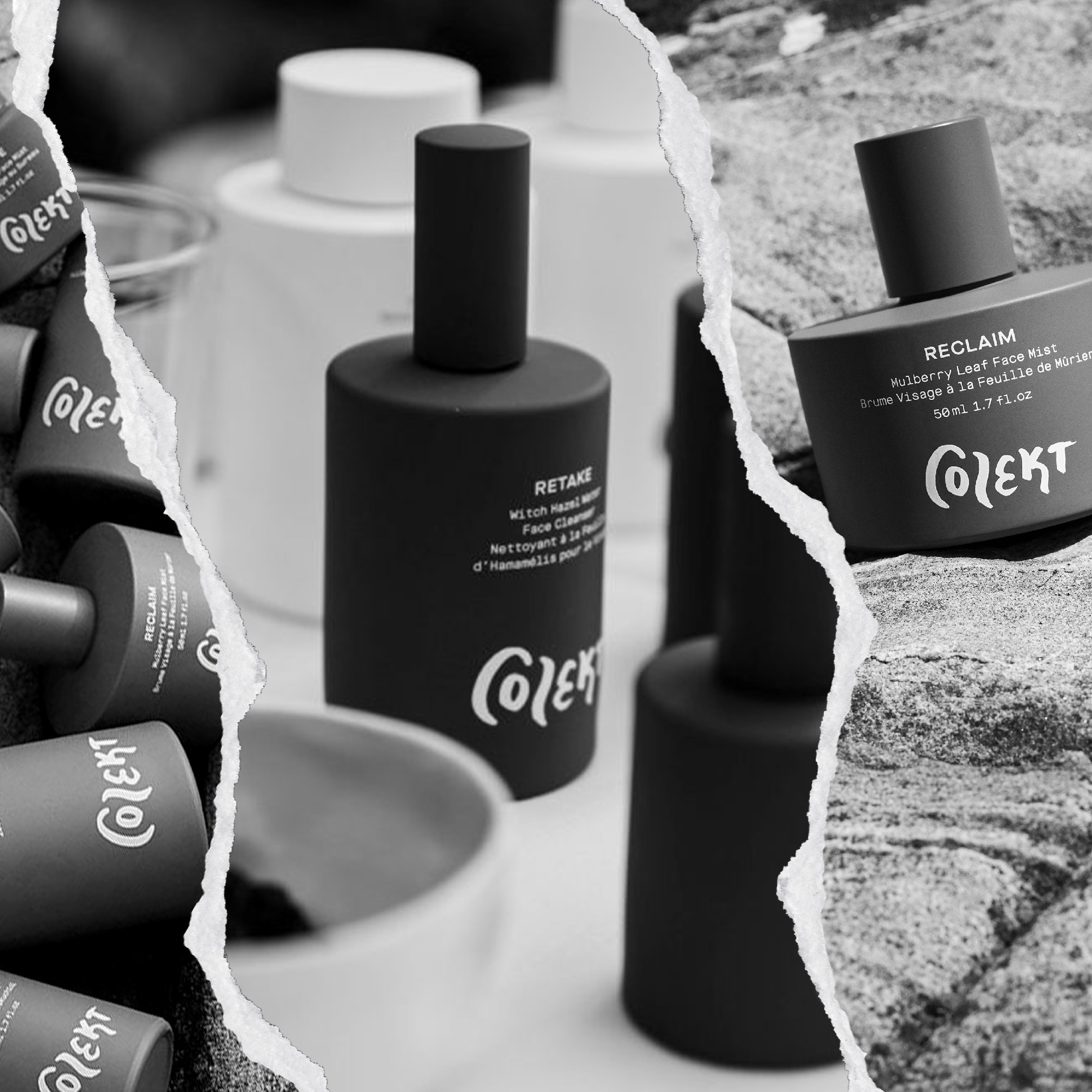
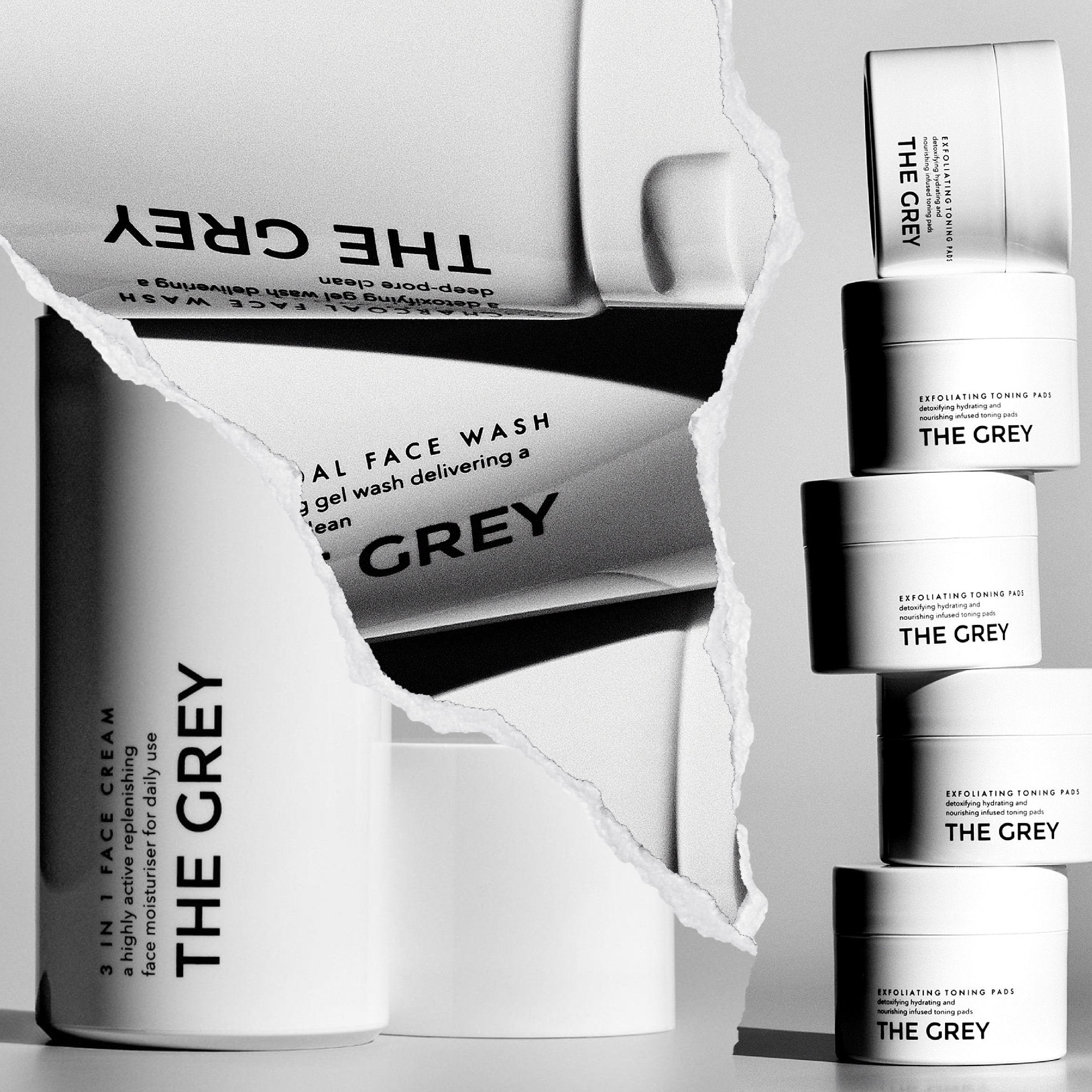
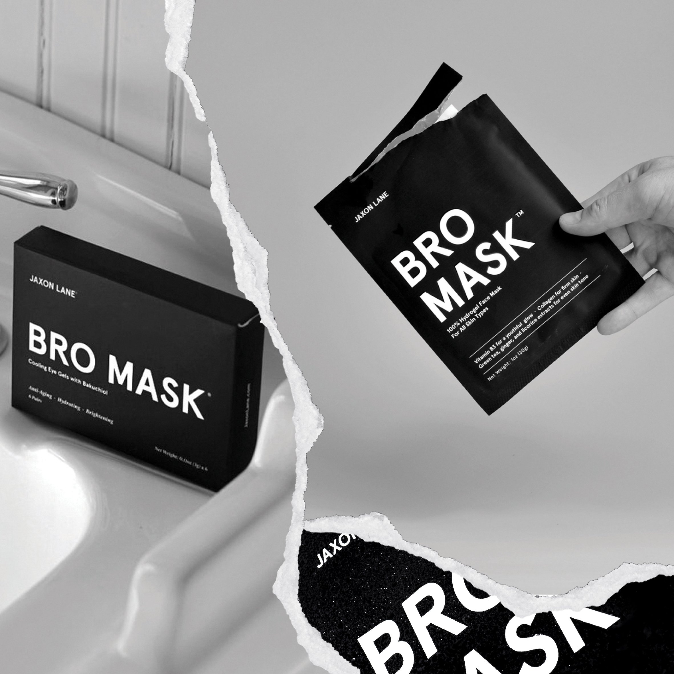
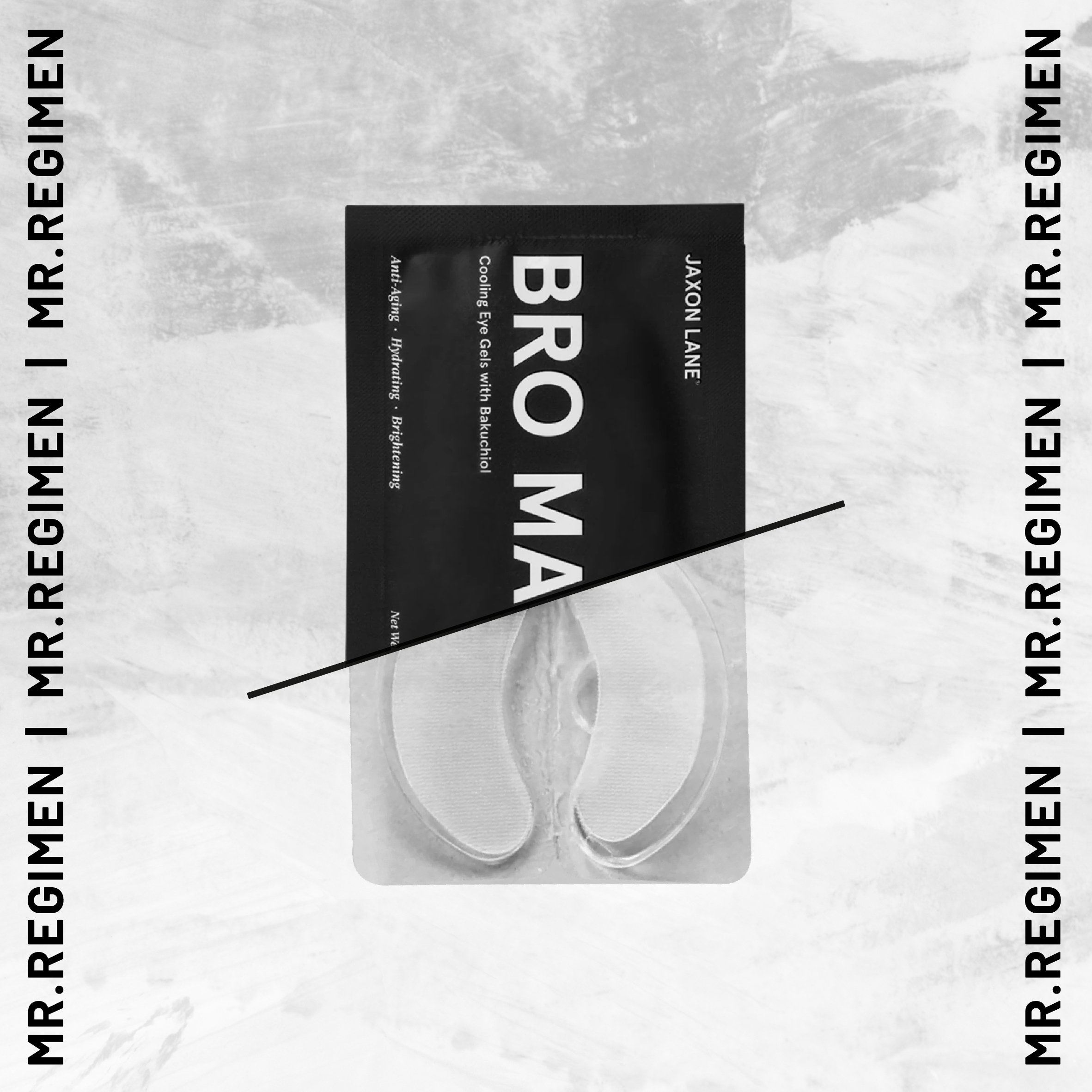
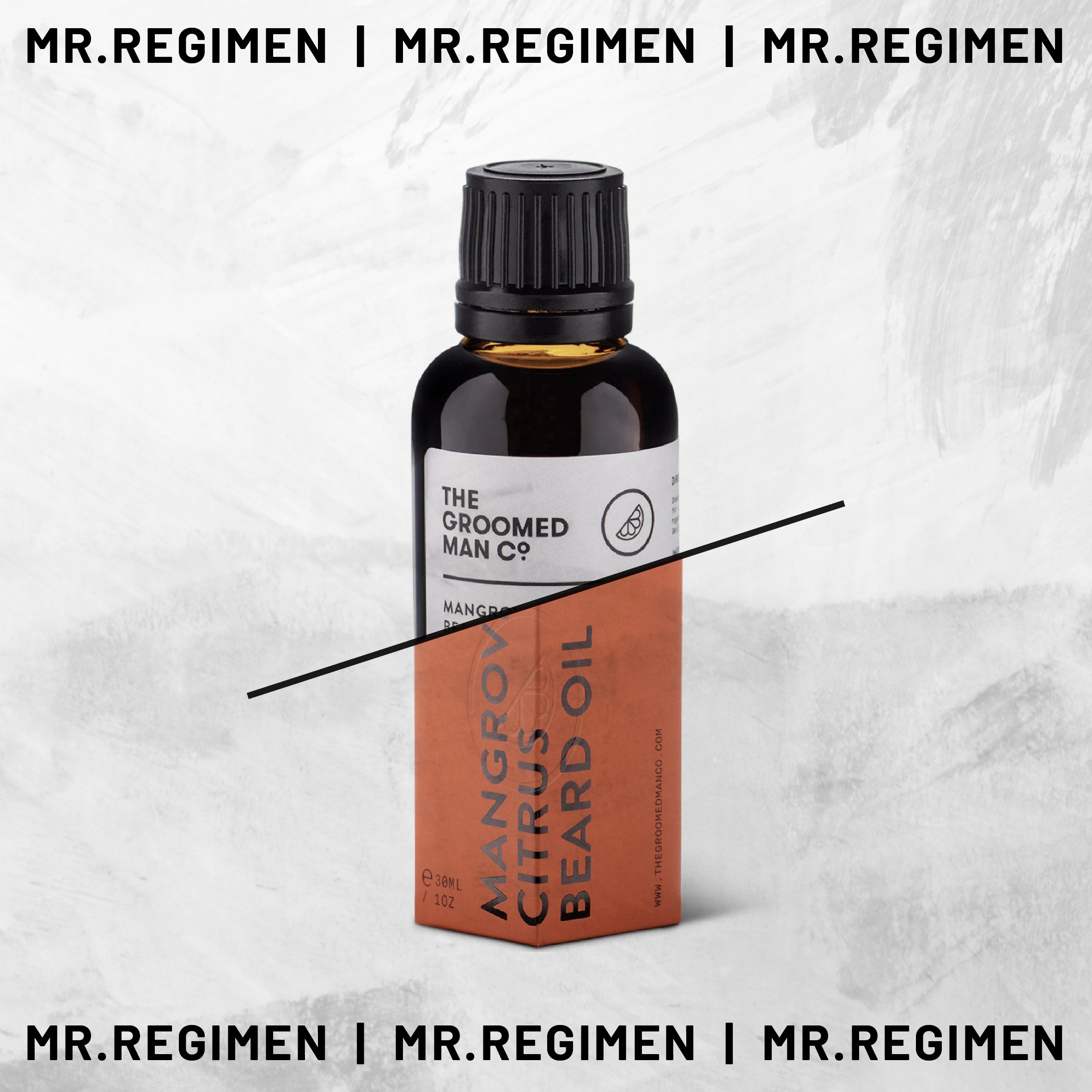
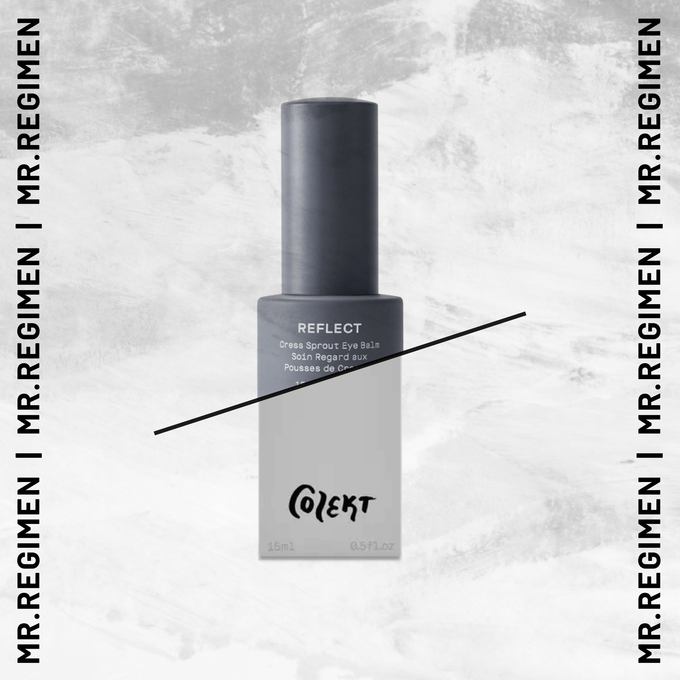
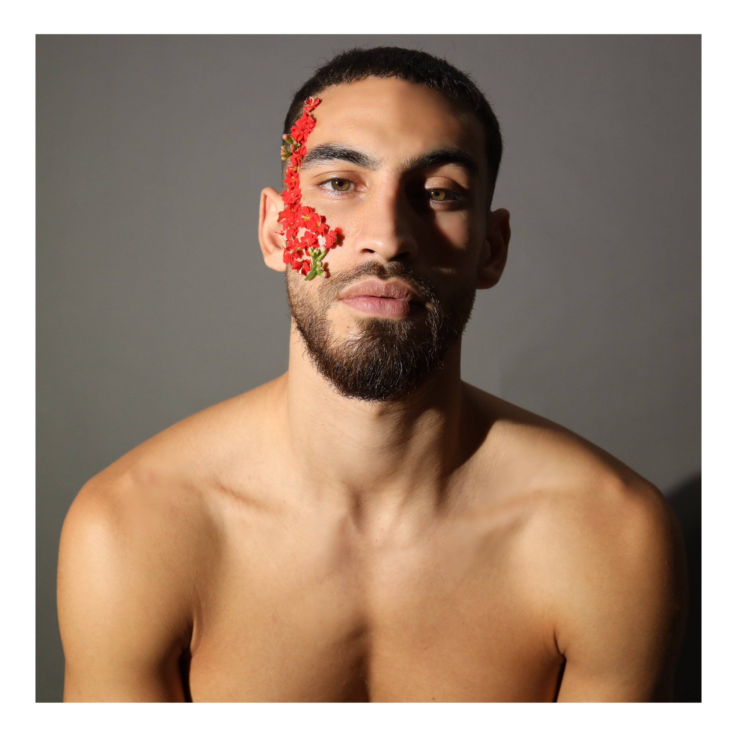
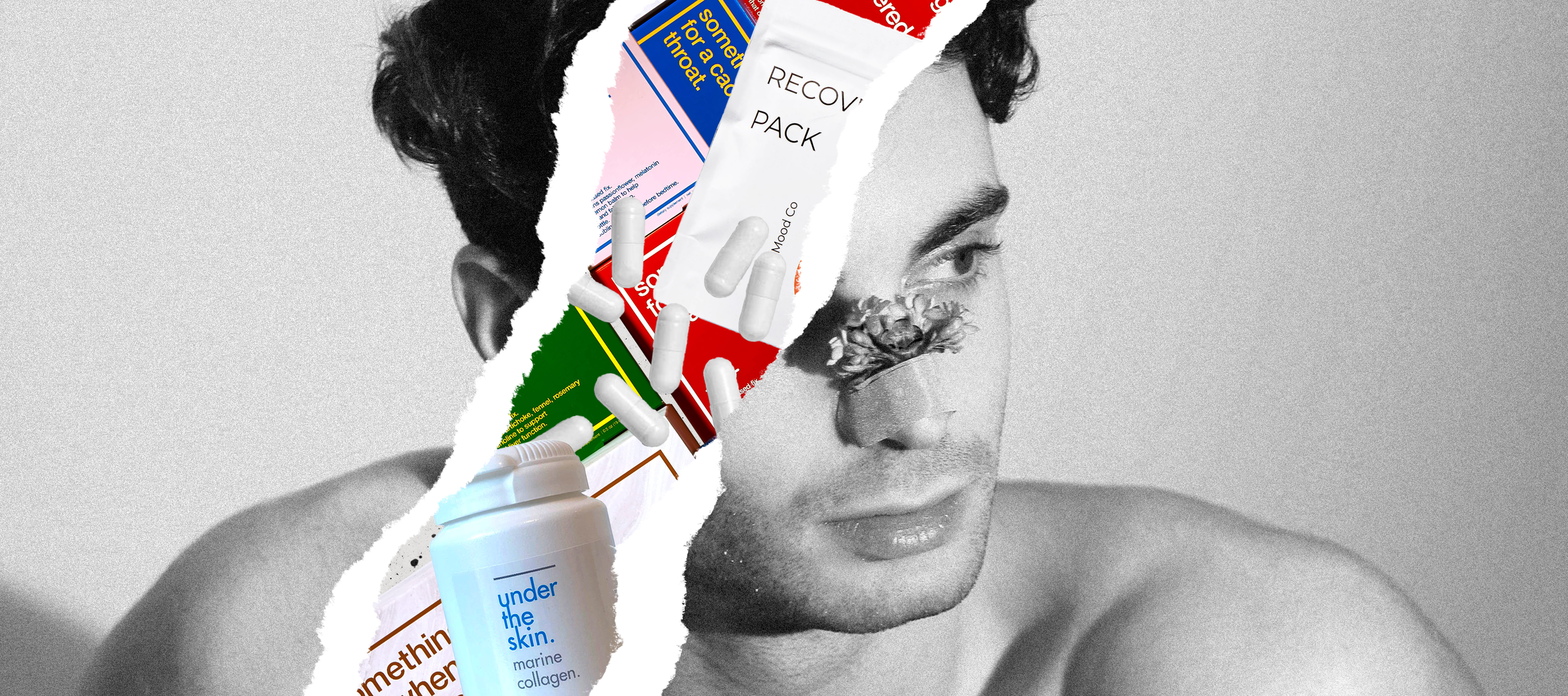
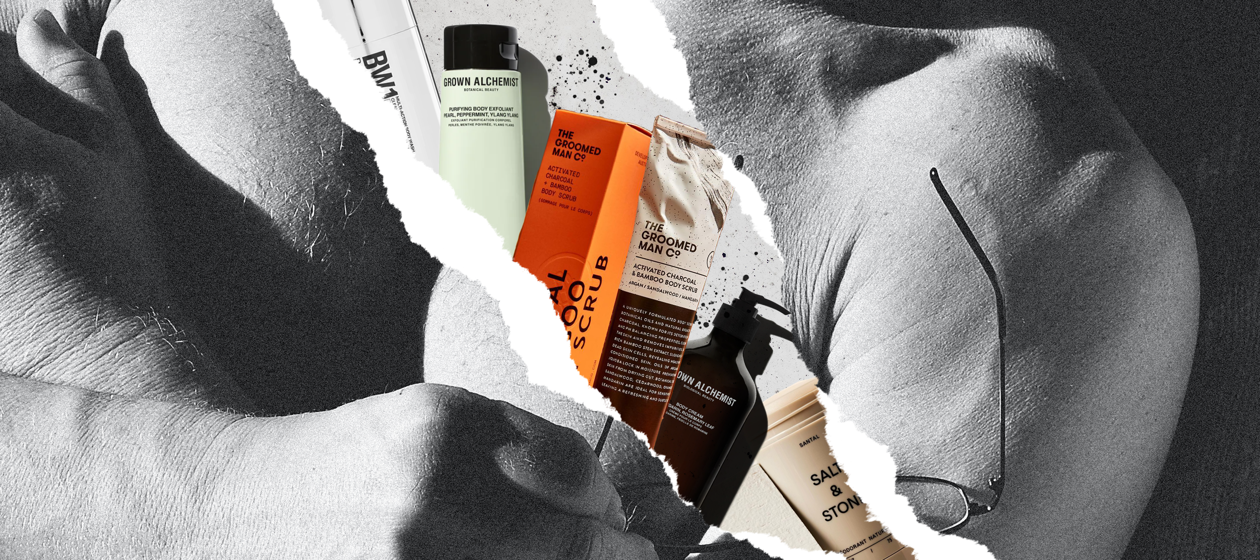
We wanted the brand identity to reflect a contemporary view of masculinity which could also appeal to an Arab audience. We stressed on big and bold type with muted tones to achieve a daring and confident visual identity without feeling too cliched. We were inspired by an editorial punk feel for the social media posts and stories, while also focusing on comprehension and readability. Our modus operandi was to create multiple visual treatments to create variety as we were not in control of the photographic direction of products.
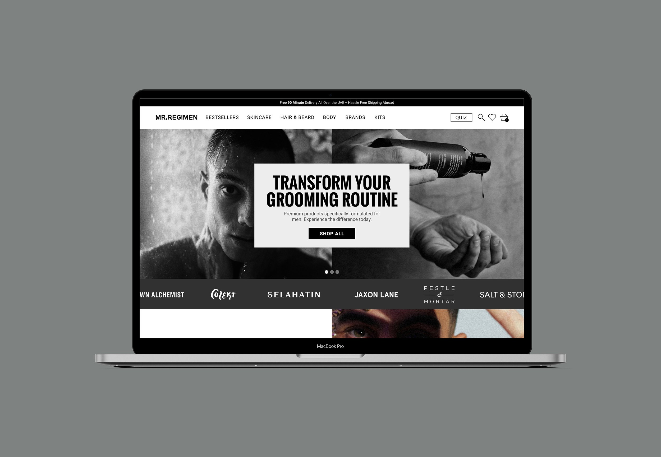
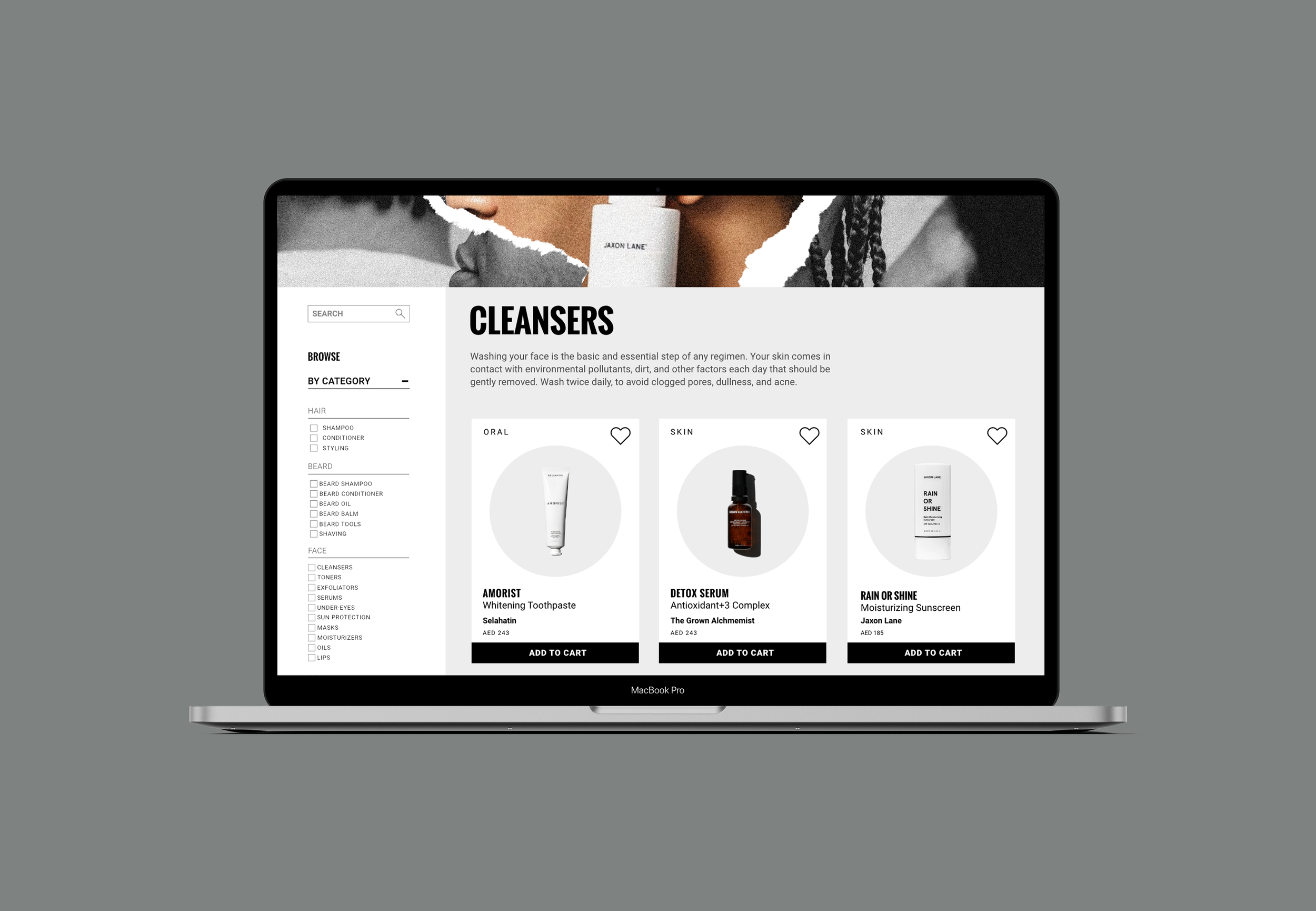
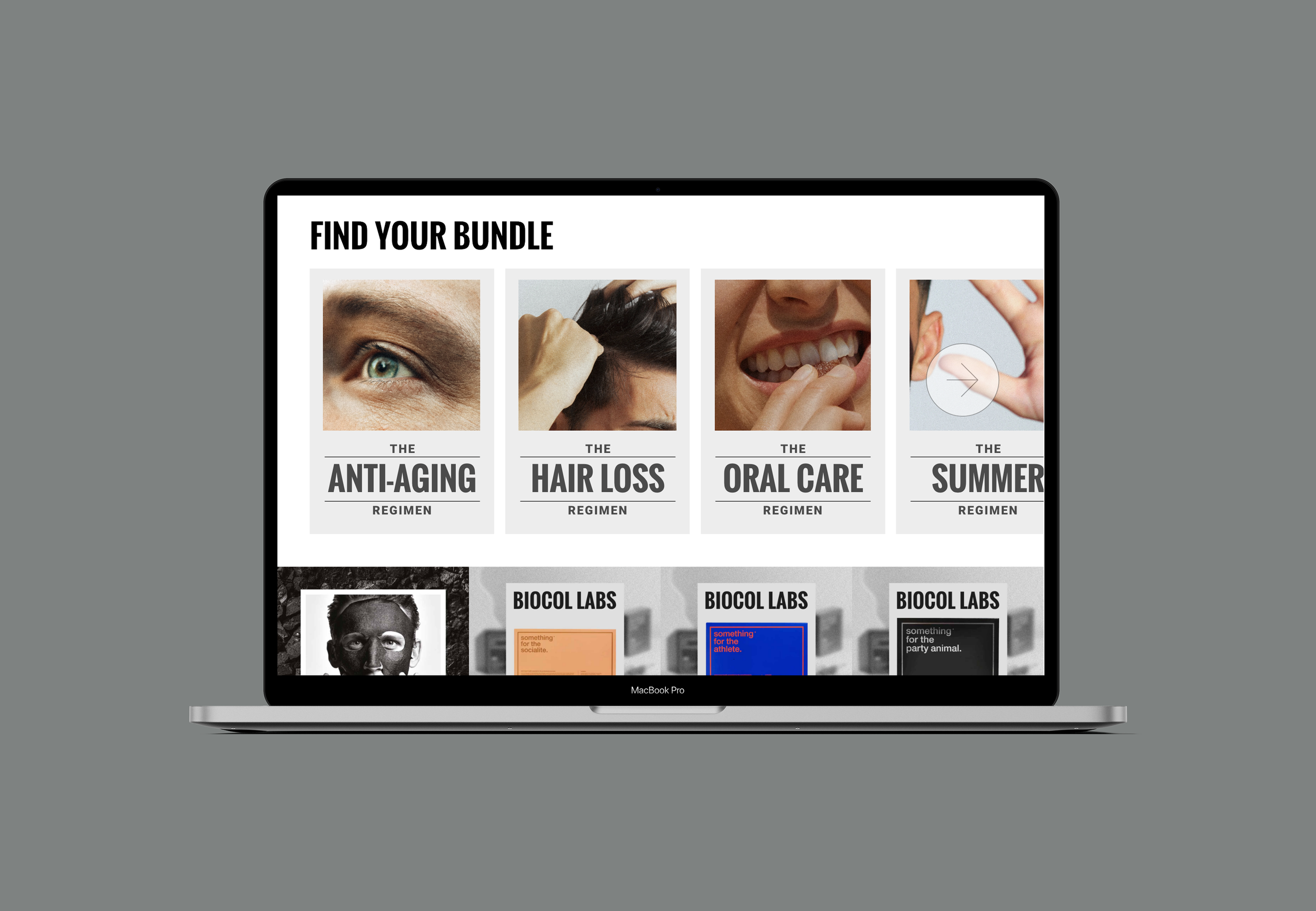
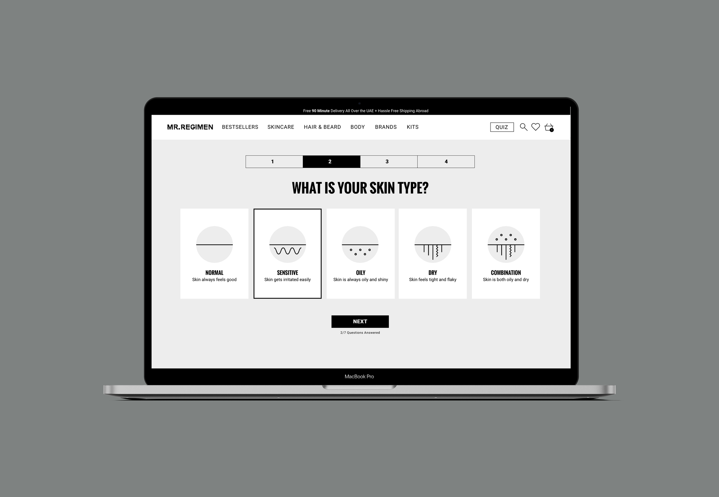
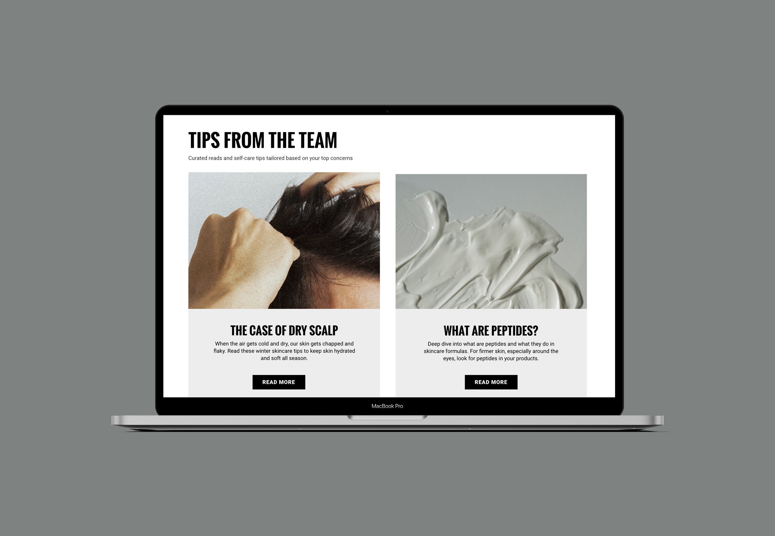
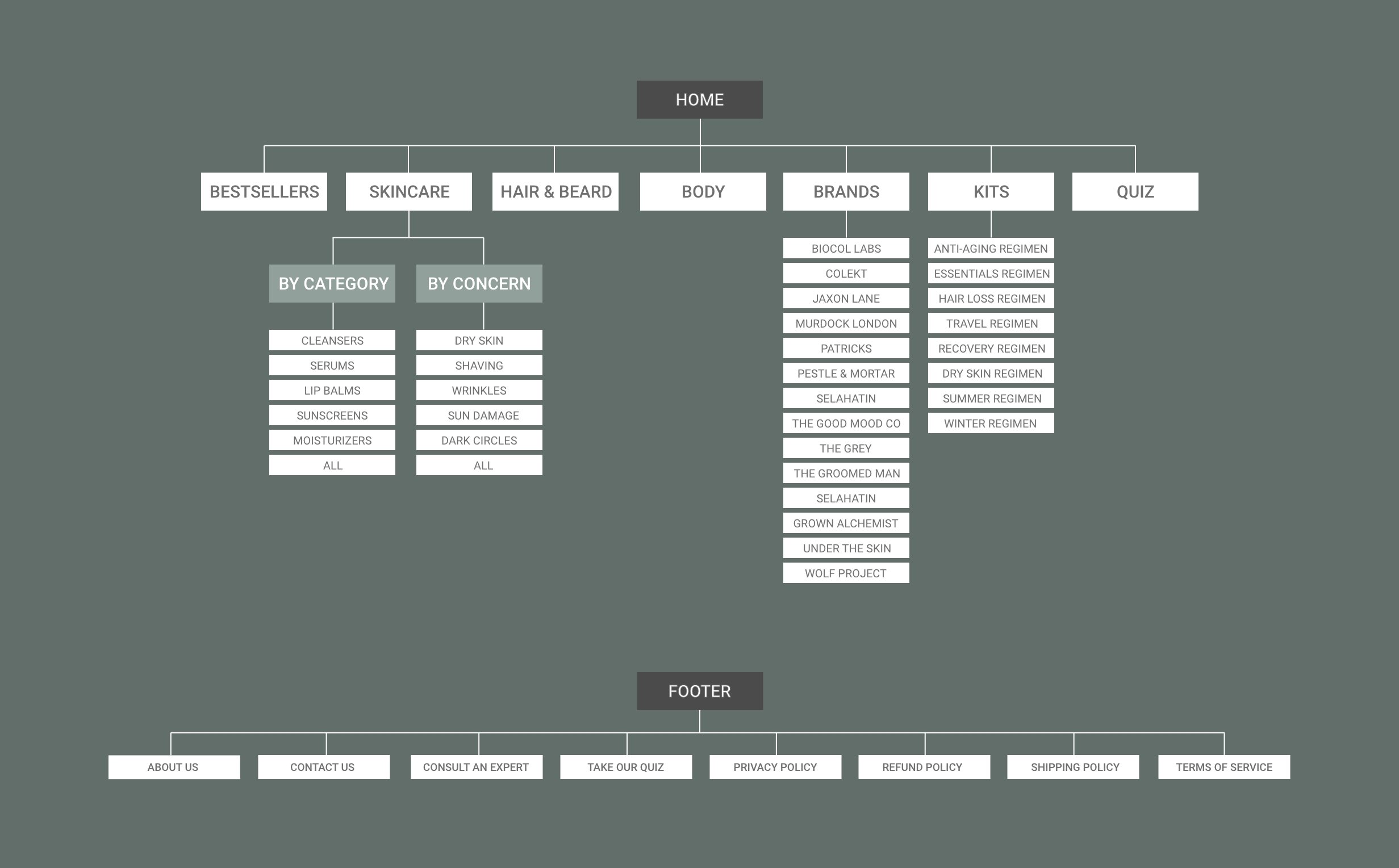
Mr. Regimen functions as both a cosmetics reseller and as a movement, so a big part of the identity centered on text and deconstructed notions to be much more transparent and uncomplicated. We followed a similar design strategy with the website design, focusing on the idea of simplicity through navigation to make the customers experience shopping easier to maneuver. The navigation separates each category into products and concerns, making it simpler for clients to find the exact products they need. The website centered on functionality through careful studies of Mr. Regimen’s audience, to create an accessible and understandable platform.
Mr. Regimen reimagines grooming as a daily practice of self-care and self-creation because feeling confident in one’s skin drives us to do better and embrace who we are.
