Beckley Academy
Naming, Brand Identity, Presentation
Industry: Educational
Date: 2020
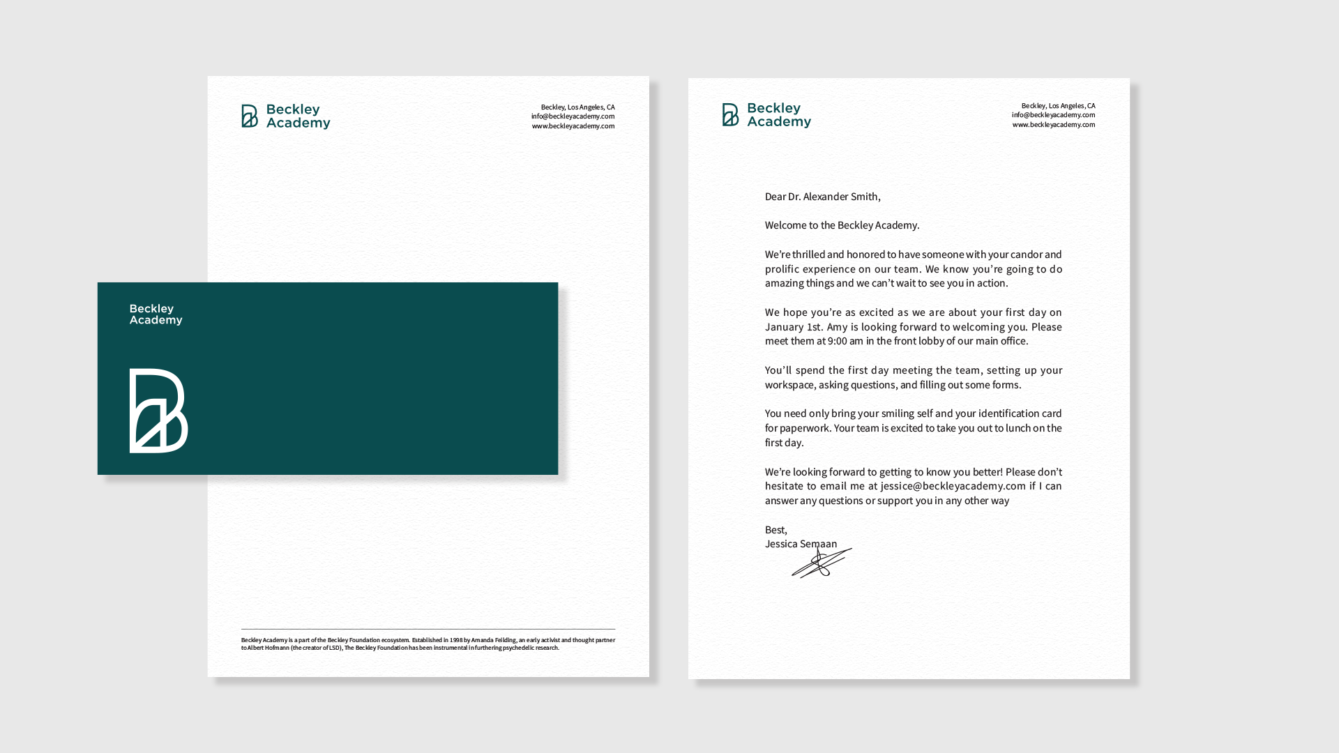
Beckley Academy prepares and trains providers to support patients to heal their mental health challenges with Ketamine, Psilocybin and MDMA. Beckley Academy is a part of the Beckley Foundation ecosystem. Established in 1998 by Amanda Feilding, an early activist and thought partner to Albert Hofmann (the creator of LSD), the Beckley Foundation has been instrumental in furthering psychedelic research and influencing policy.
Beckley trains professionals in the psycho-medical fields in a contemporary approach to therapeutic solutions using psycho-active drugs rather than SSRIs. Thus, the brand identity needed to reflect modernization and scientific innovation to reflect on the company’s progressive techniques, however, we also wanted to highlight the intimacy of psychedelic experiences. These extremely emotional, complex and contemplative psychedelic “trips” resonate deeply with those who encounter them, sometimes causing massive shifts in their personalities, values, and as Beckley proposes, their mental well-being.
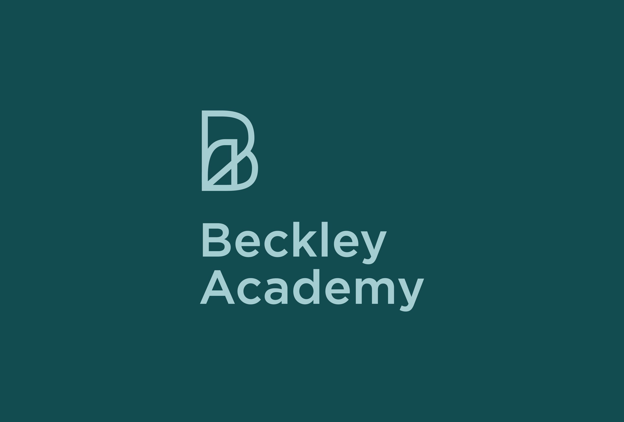
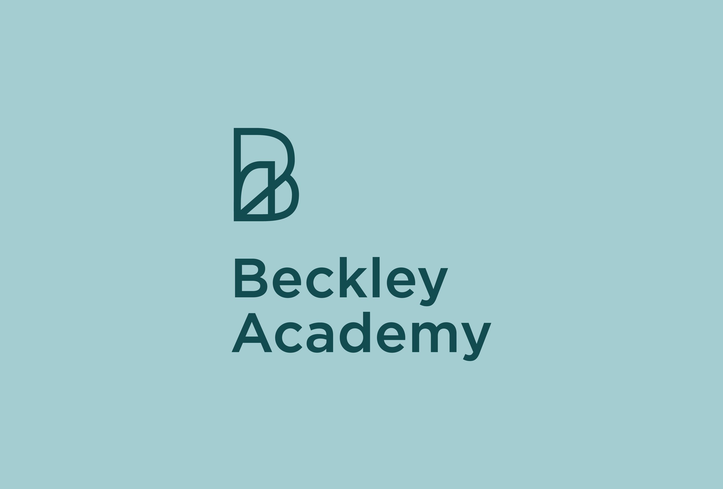
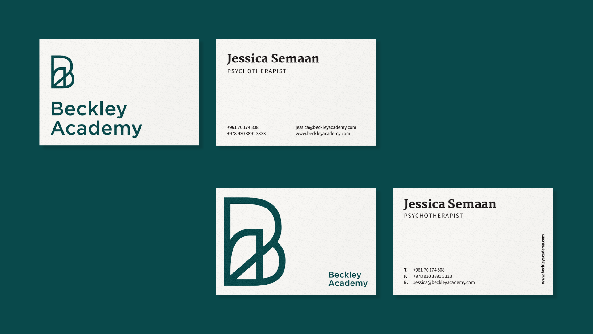
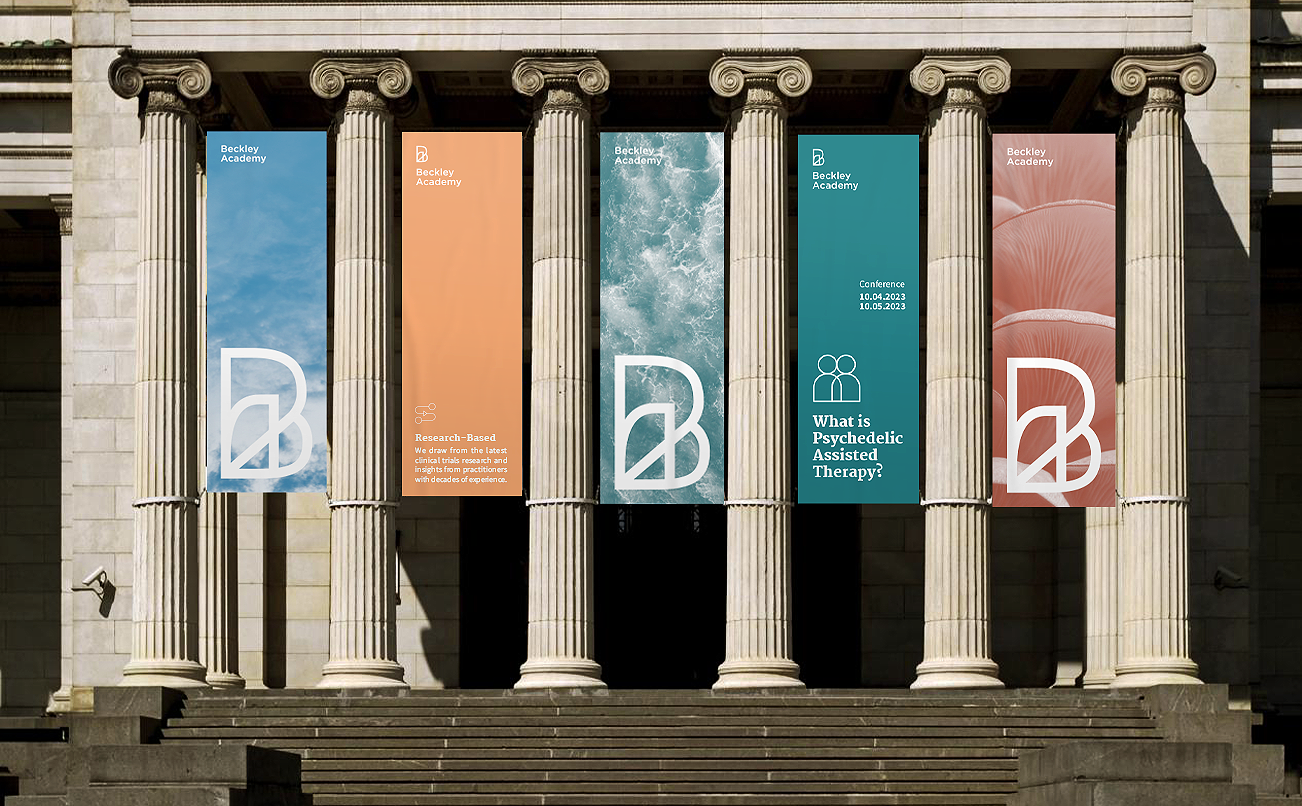
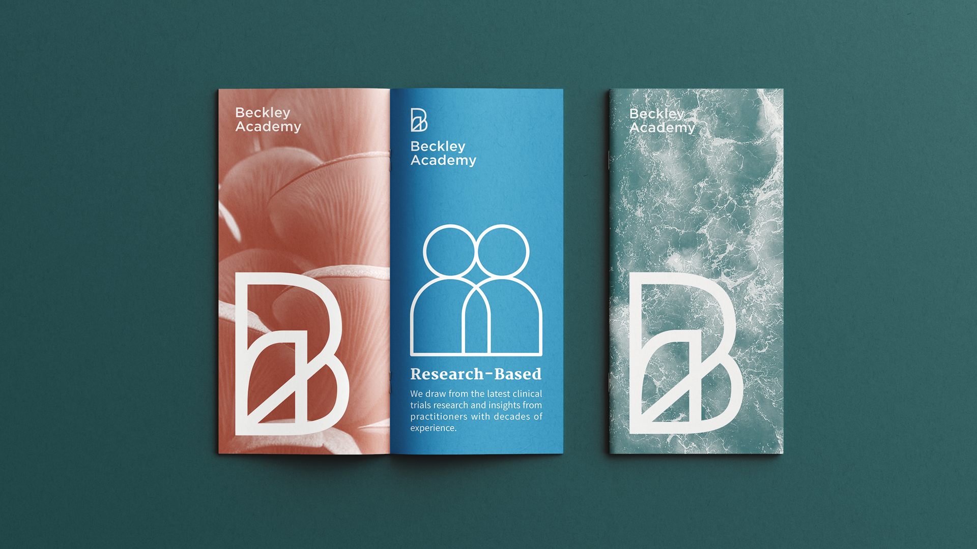
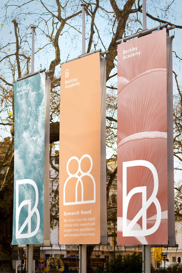
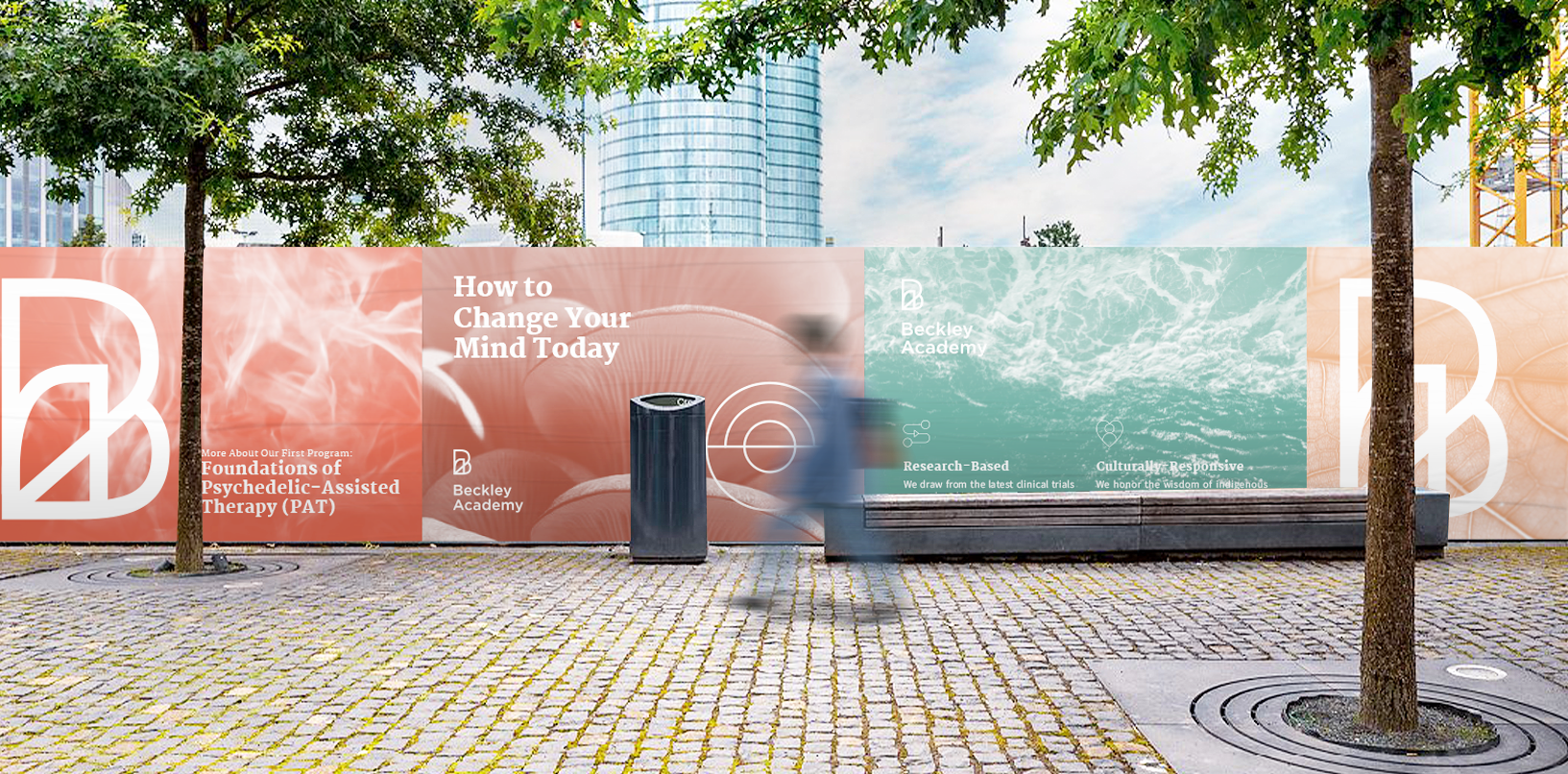
The monogram solution to the logo, combining the letters B and A, creates an overlapping where one letter cannot be visualized without the other. This idea of overlapping, inspired by the relationship between academia and health when it comes to psychedelic drug research would later on inspire a series of similarly designed iconography.
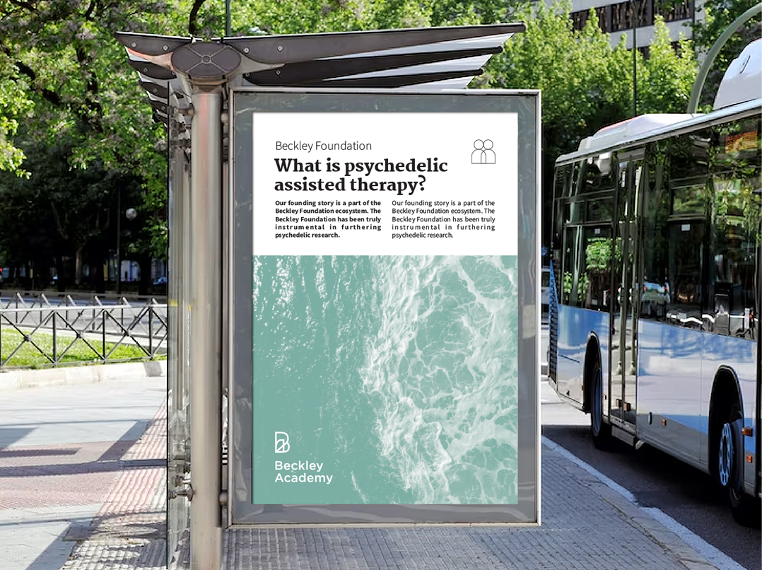
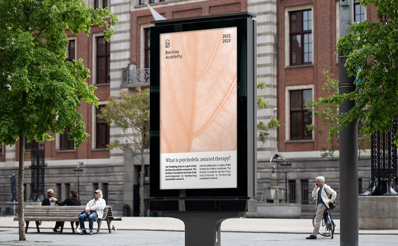
The logo is clean, modern and linear but the connection between the A and the B evokes a connection between the inside and outside of ones body, the conscious and the unconscious of ones mind as well as the connection between science and humanistic psychology. It attempts to showcase the scientific and modern themes, drawing from the extreme minimalism of Swiss design, the clean lines and simple forms are memorable yet unique. We stress on the secondary aspects, the personal and intimate, through our identity elements, including color, fonts, photographic style...
These showcase an inspiration from the experience of being under the influence of such drugs, from recollections of people who have and from articles and images found online. By combining the two fundamentally opposing aspects, scientific vs. emotional, we create the image of Beckley Academy. The typographic palette is sleek and modern, going in-line with the idea of a modernized approach to behavioral therapy. While working on the typeface selections, we kept in mind the importance of text to the identity. As a line of work that is heavily related to research, we stressed on the value of readability.
We relied on color psychology to create the color palette, and decided to separate the secondary palettes into two themes. The cold toned palette, characterized by shades of Blue, Green and Purple, reflects a calm sadness. In color theory, cold tones suggest serenity, a calm and peaceful sense of mind, but also conjure up images of winter and cool weather which in turn inspire themes of loneliness and enclosure onto oneself. In opposition, warm tones suggest stimulation of the mind and body. They are associated with intensity fiery life, gentility, excitement, the flow of blood in ones body, and the brain activity associated with brain scans.
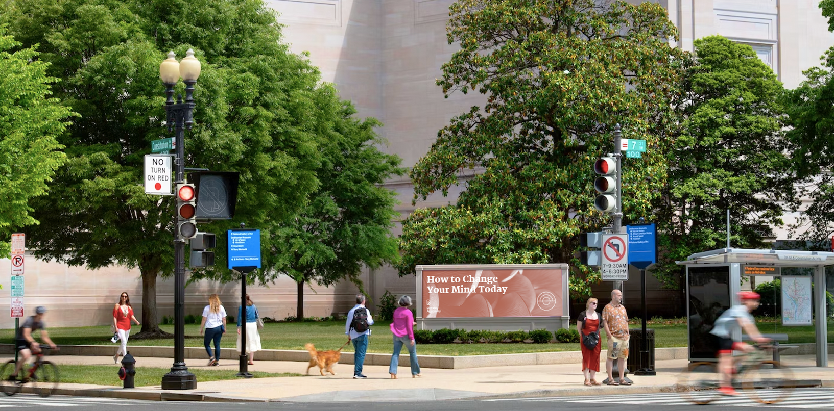
The references to the psycho-active experience were also made through the photographic style with duotoned images reflecting motion, patterns and abstract forms.